What do tax and spending do to inequality and poverty?
- Published
- comments
It may reflect the oddness of my life that I have a favourite Office for National Statistics release. And - joy of joys - it came out, external today. This is the ONS's assessment of the effects of the tax system and a range of public spending on our population for 2013-14. It's worth flagging up a few things which jump out at me from it from this year.
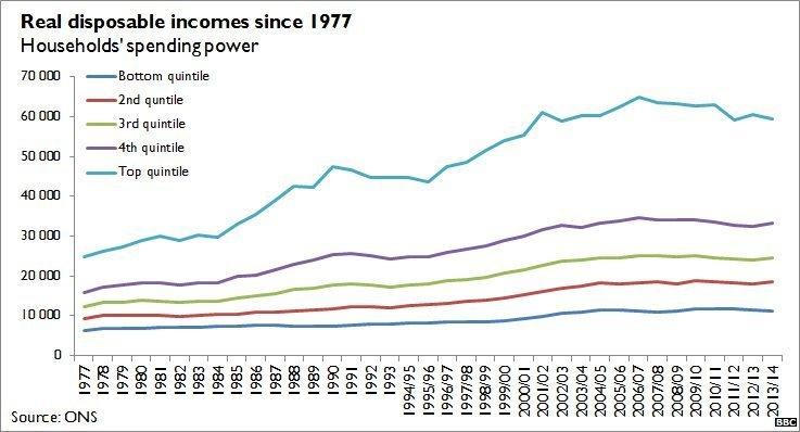
First, you can see in this chart of real-terms disposable incomes that the top-earning fifth of households were still a little way off the living standards they enjoyed on the eve of the financial crisis. It shows up that there was, however, a very slight drift upwards in the incomes enjoyed by the middle quintiles in 2013-14. Richard Tonkin, the ONS official in charge of this analysis, says that this is the consequence of a rise in employment and an income tax cut. Last week, incidentally, the DWP stated its view that these same two forces, external had kept the child poverty rate stable in the same year.
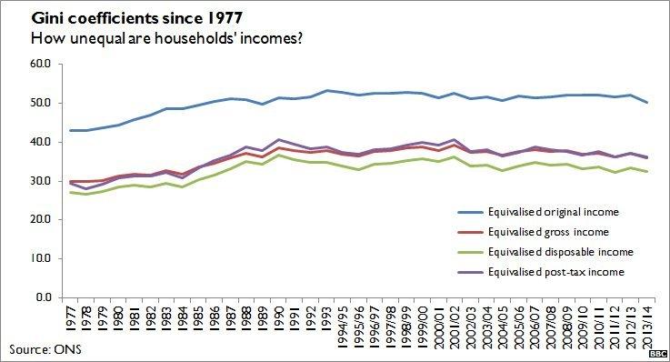
Second, as a result of these shifts, there was a slight fall in income inequality. The Gini coefficient is measured from 0 to 1 (or 0% to 100%, as below), where a higher number indicates greater inequality. Indeed, by 2013-14, at the very least, the coalition's austerity programme was not fuelling a rise in income inequality. This does not mean there were no problems caused by the coalition's reductions in public spending: some subgroups had a rough few years and the effects may come later. But there were no effects big enough to tilt the national numbers by 2013-14.
Third, the release reinforces a familiar trope: the median disposable income of retired households was 7.3% (£1,400) higher in 2013/14 than in 2007/08. For non-retired households, the equivalent number is -5.5%; wages were £1,600 lower once you take account of inflation and the different shapes of the households. Mr Tonkin says this has been driven by "recent retirees who have, on average, more private pension income than previous generations of pensioners. In addition, in recent years the state pension has risen more strongly than wages and other benefits."
Fourth, this document neatly explains a bit of what government does to the raw income distribution. You can see, bluntly, that the very poorest households gain from the overall system, while the richest households bear the cost. As the ONS itself puts it: before the tax and benefit system gets involved, the poorest fifth earn one fifteenth of the richest. After the Treasury has done its work, the gap is reduced to one fourth. These graphs show the effects on the poorest decile (at left) to the richest (at right).
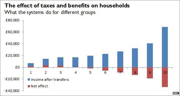
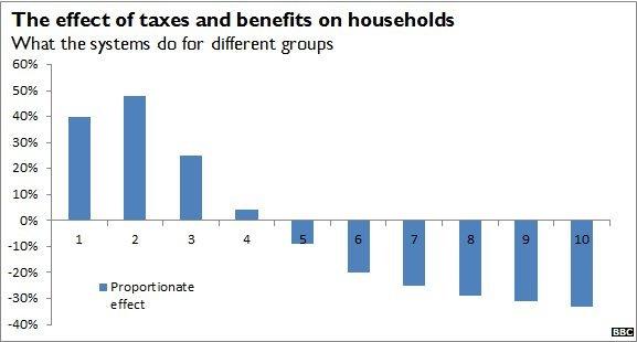
This looks like a Robin Hood distribution: we take from the rich to give to the poor. To an extent, it is. But this sort of analysis can be misleading. A lot of these transfers are not moving money from lifetime-rich to lifetime-poor people. For example, the income-rich net payers may start as poor twentysomethings and become pensioners. So some of this distribution is, in effect, rich people making payments to their future and past selves. It is a progressive system, but if you looked at this graph over, say, a 75-year span using lifetime income, it would look less so.
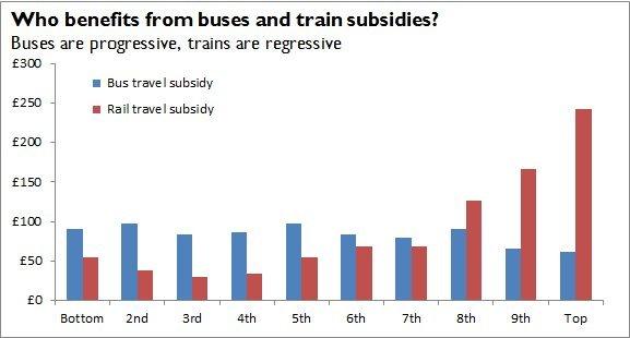
Finally, this document also includes my favourite weird fact about public services: spending on buses is slightly progressive while spending on trains is firmly regressive: the rich commute by rail a lot more than the poor, so they gain disproportionately from public rail spending. Who knew that Thomas the Tank Engine was so political, external?
