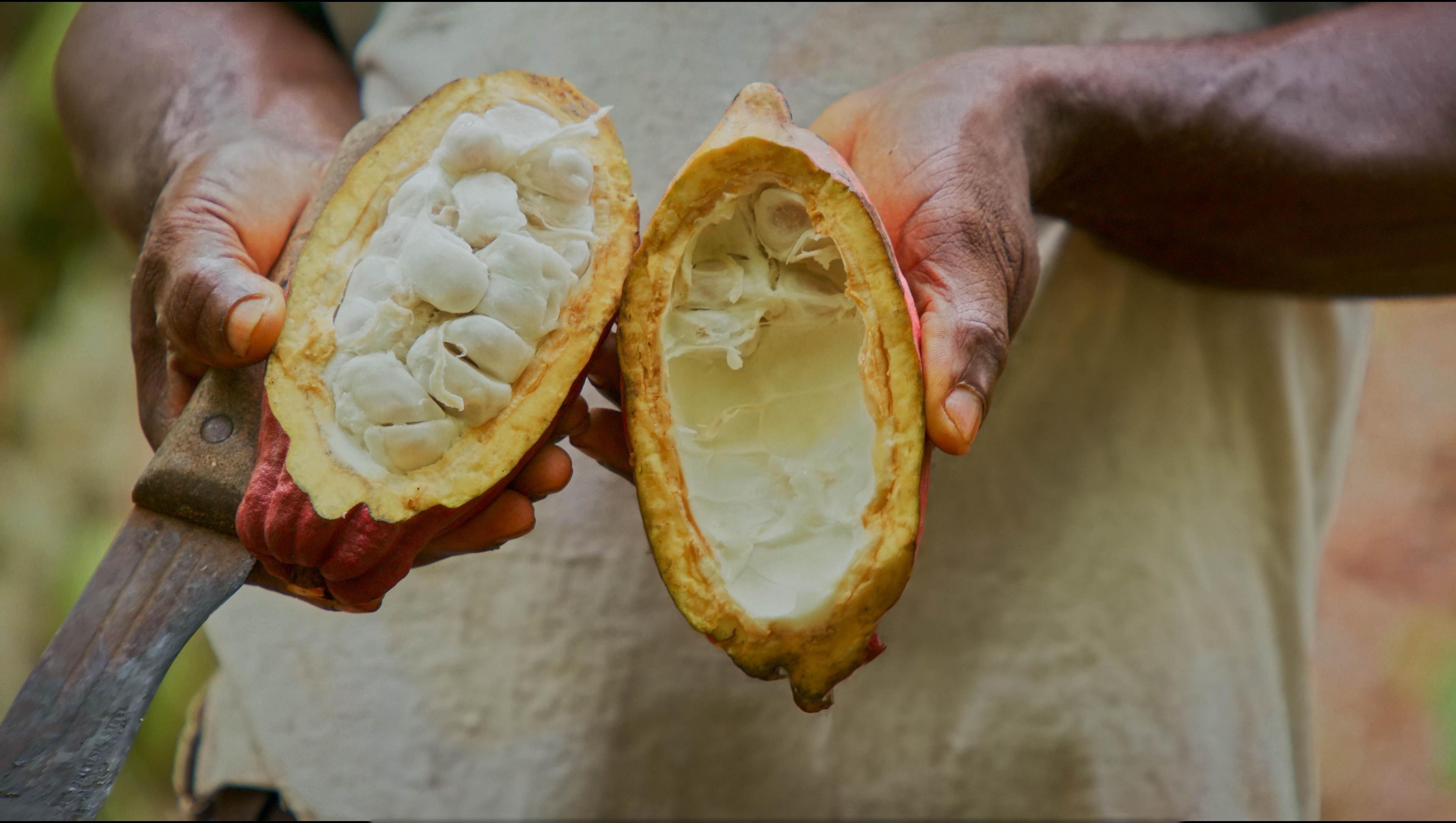
Publishers try skinnier books to save money and emissions
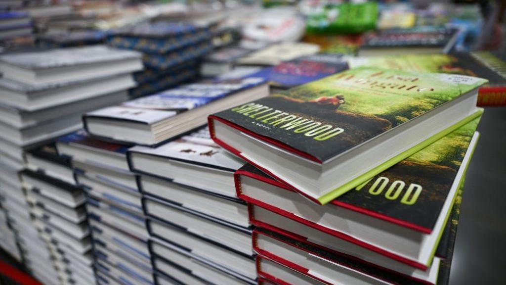
Making books slimmer and lighter could mean significant CO2 savings
- Published
A typical paperback book accounts for around 1kg of carbon dioxide, according to sustainability expert Mike Berners-Lee, external.
Perhaps that does not sound like much. But in the US alone, where 767 million paperback books were sold in 2023, this is equivalent to the electricity use of more than 150,000 homes for a year.
Forest loss, paper production and printing, and transport of books are generally the largest contributors to the carbon emissions of printed books.
So, using less wood fibre, and shipping lighter loads, are important ways to reduce the emissions of print books (as well as the costs of producing them).
One simple method is reducing the thickness of the paper. Some publishers are turning to subtly thinner paper. There are limits to this: the most lightweight paper may be less durable. And for certain types of books, including art books, there’s a preference for heavier paper.
Yet between these extremes, most readers are unlikely to notice the difference.
Nor would most readers notice the design tweaks that allow more text to fit onto each page - as long as designers ensure that the text remains easy to read.
The publisher HarperCollins has experimented with compact typefaces, external that require less ink and paper. This has resulted in savings of hundreds of millions of pages.
A leader in this field is Sustainable Typesetting, a project of the design and typesetting company 2K/DENMARK. One of the company’s focus areas is complex typesetting for long texts, including Bibles.
Andreas Stobberup, project lead at 2K/DENMARK, says that Sustainable Typesetting can achieve page count reductions of up to 50%, although he recommends less dramatic changes for novels.
While it’s common to simply increase the point size to make text easier to read, Mr Stobberup says that readability is actually determined by x-height. The x-height is the height of most lowercase letters in the Latin alphabet, and makes up nearly all of the printed marks on a page.
The x-height can be increased without enlarging all of the text. For many designers, increasing the x-height is key to increasing legibility .
One of the typefaces 2K/DENMARK has designed is called Sustainable Serif. This has a larger x-height than, for instance, the popular typeface Garamond.
Compared to Sustainable Serif at 12 point size, “for Garamond to have the same size of the letter, it has to be scaled up to 15.2 point size,” Mr Stobberup says.
Typefaces like Garamond also have thinner lines and strokes, which can fade on the page as point size is reduced. Sustainable Serif has thicker strokes.
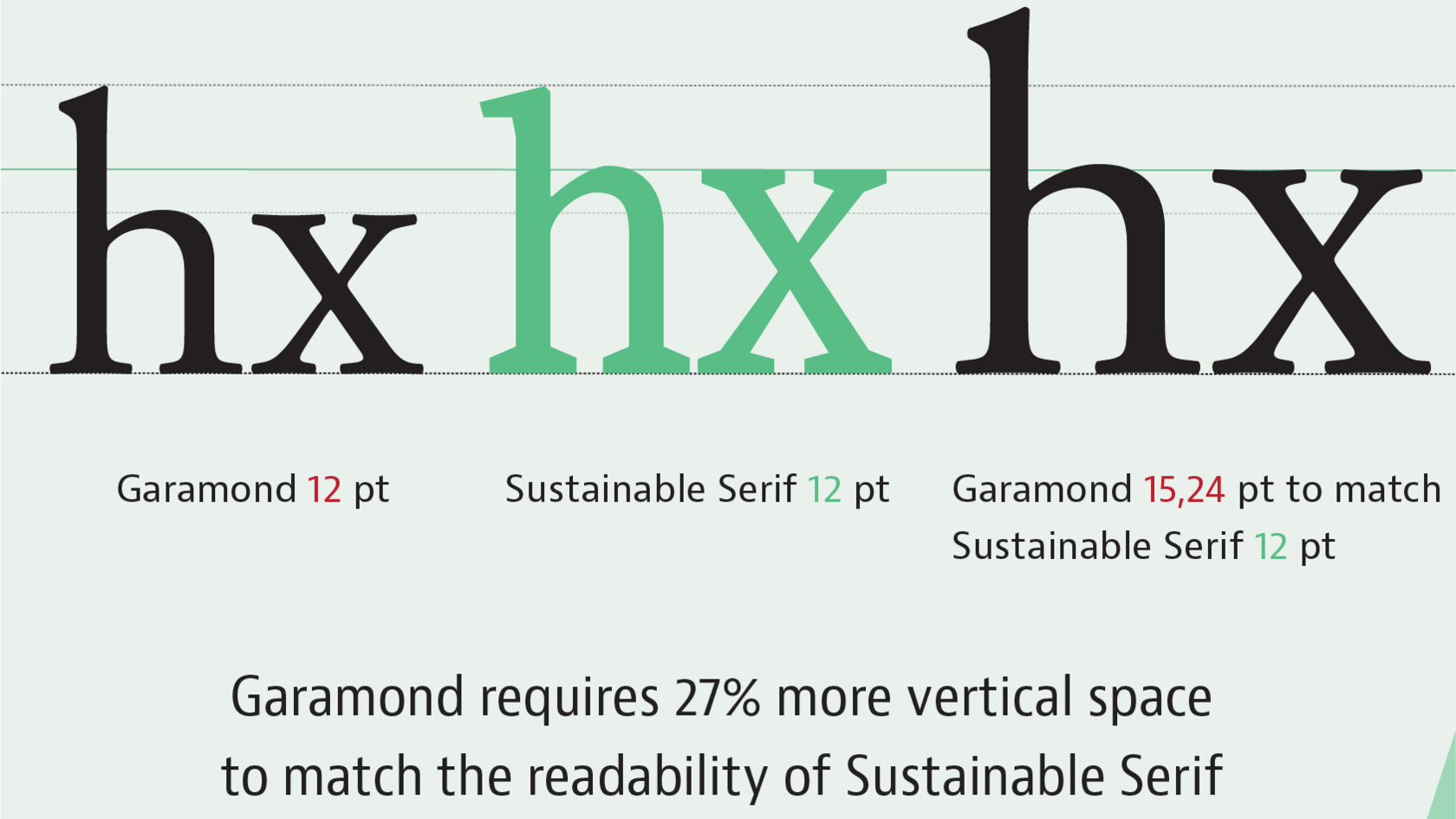
The height of lowercase letters like x is they key to readability
Reducing point size is not always the optimal way to reduce the physical size of a book, Mr Stobberup emphasises.
Perhaps some lessons can be drawn from large print books, which are aimed at older readers or those with visual impairments.
They feature larger point sizes, which can lead to bigger books.
But other design features of large print books include more blocked letters and, if images are involved, more attention to the contrast between the foreground and the background.
“It’s a totally different typeface,” says Greg Stilson, head of global technology innovation for the American Printing House for the Blind.
Mr Stobberup concedes that incorporating such design in regular books "will not look as aesthetic".
But he believes that most readers will not care about the typeface used for the bulk of the book. Meanwhile, more artistic fonts could be used on places like book covers.
And the savings might well justify the change - according to Mr Stobberup, a 20% reduction in pages would be equivalent to a roughly 20% reduction in carbon emissions.
However, the saving depends on many factors, including the size of the print run, the type of energy used for printing, the transport distances, and even the ink used.
Then there’s the word count: a textbook or Bible can achieve more drastic reductions in weight than a book of poetry.
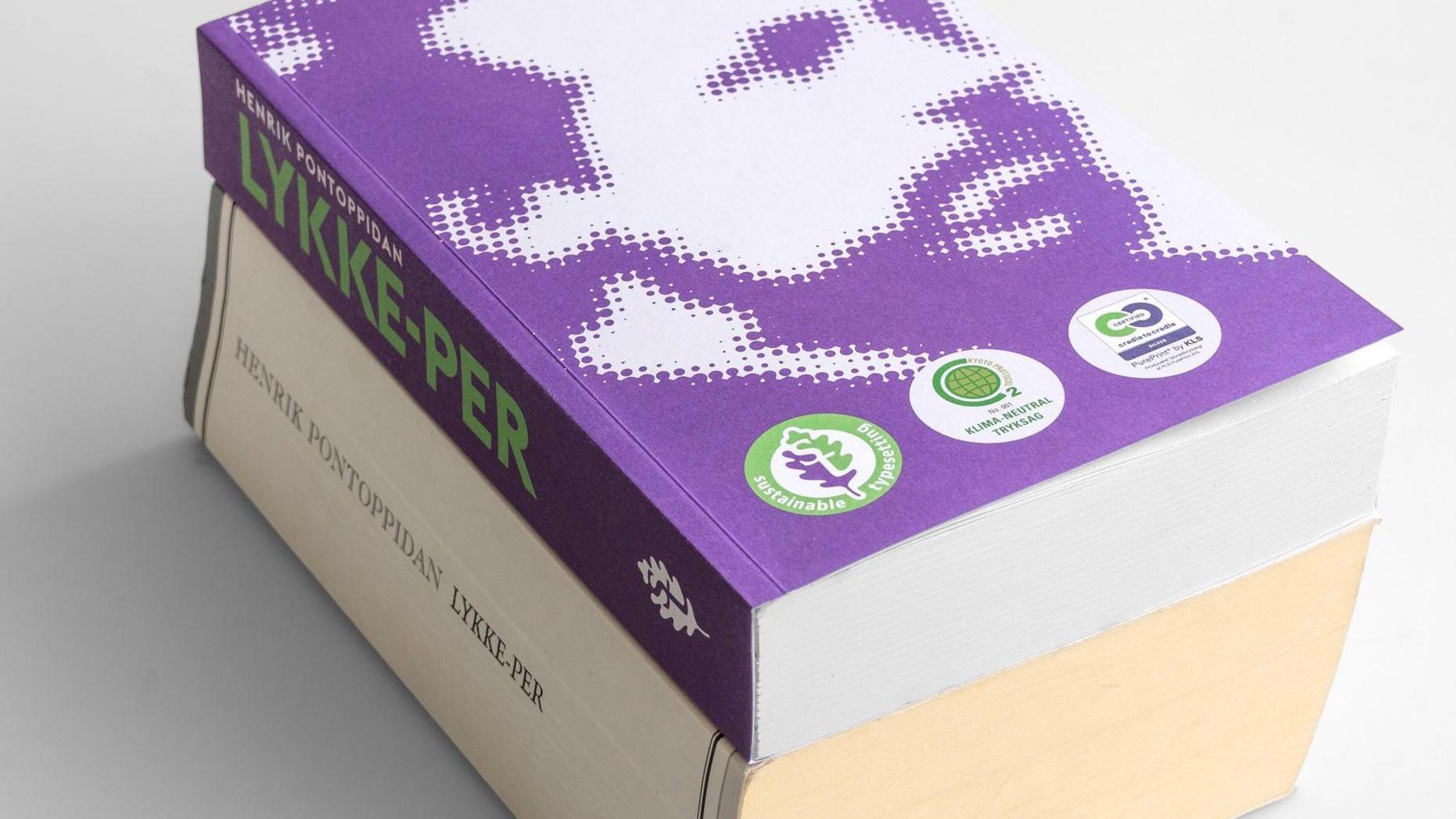
Changing to a more efficient typeface can make the same book much slimmer
Mr Stobberup is keenly aware of the financial pressures affecting the publishing industry.
“We need to make sustainability cheaper,” he says. “We simply need to show that we don’t think it’s a compromise. We think it’s a better product.”
David Miller is the president and publisher of Island Press, a small non-profit publisher of environment-themed nonfiction.
Printing costs have soared in the last few years, he says. The Covid-19 pandemic led to supply chain issues.
Meanwhile, paper manufacturers have been switching over to making cardboard due to the boom in the delivery businesses.
This has driven up the expense of producing books. In some cases Island Press has simply had to absorb the extra costs itself rather than passing them onto consumers, according to Mr Miller.
Initially he wasn’t sure about Sustainable Typesetting. But after seeing that a 19% reduction in pages could lead to at least a 10% cost savings, while readability actually improved, Mr Miller has become a fan.
Sustainable Typesetting has been applied to two Island Press books published so far. And he’s interested in going even further than a 19% trimming.
Mr Miller calls this a technology that is “only starting to poke its nose out behind the door” within different segments of the publishing industry.
“It’s a sort of revolution in thinking about what typography can be and how it can be put to use in a very productive way.”
More Technology of Business
- Published10 September 2024

- Published6 September 2024
- Published27 August 2024
