Cambridge Utd fans get a say on club's new identity
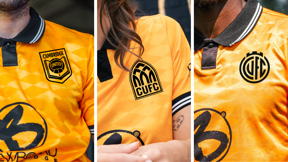
Supporters will be given the opportunity to provide feedback on the three crest designs
- Published
Cambridge United supporters will be able to vote for their club's new crest ahead of a change in identity for the 2025/26 season.
Three different designs, based on fan feedback, have been developed over the course of the year so supporters can have a voice about the direction the club should go in.
CEO Alex Tunbridge said the club believed modernising the crest and identity was important to growth and development "at a time of ever greater sporting and financial competition".
Supporters will have the opportunity to provide feedback through consultation events. An online survey will open on 5 August.
Direction One: Evolution
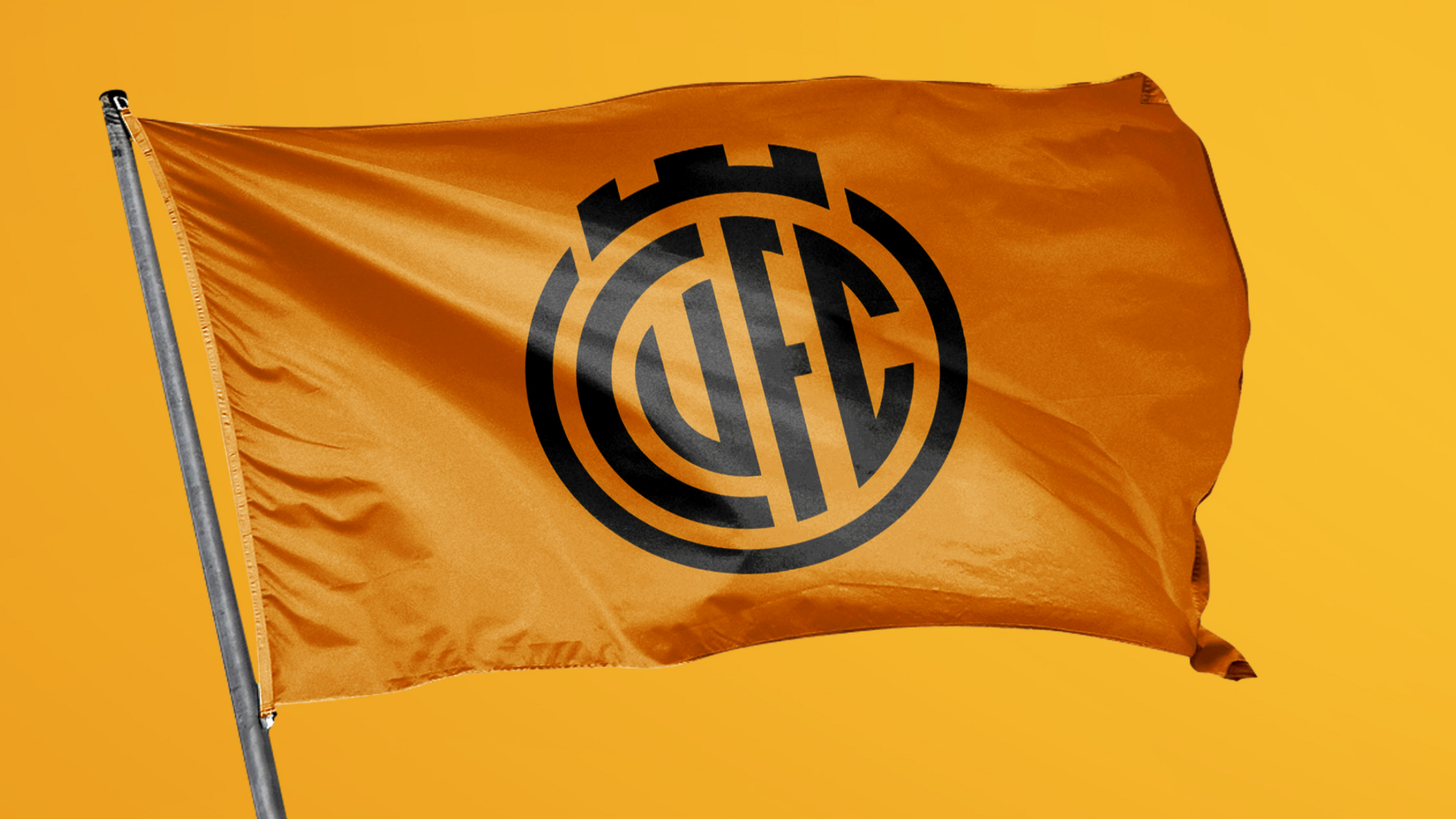
Direction One is an evolution of the current crest to a simpler, sleeker and more modern design
Direction One, external keeps some of the key features of the current crest, including the shape and the representation of the Magdalene Bridge.
Instead of the "CU" initials being shown front and centre, it displays the full "CUFC" initials, and the monogram style nods to the club's original crest - the Abbey United shield.
Designer Chris Payne said: "We worked really hard to retain key features of the existing design, such as the bridge and the turrets and the basic shape of the crest.
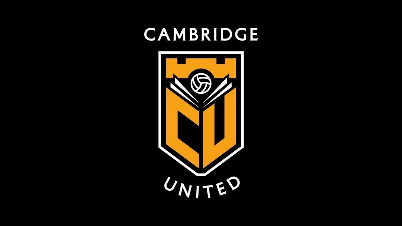
"We also we saw this as an opportunity to take out some of the features of the current design that might not be working so well in this modern age, such as the 1980s football, the small banner at the bottom of the crest and the CU lettering - which we understand is offensive in a few different languages.
"So, as part of the identity's evolution, we simplify the design and reintroduce the club's full initials, CUFC."
Direction Two: Abbey Inspired
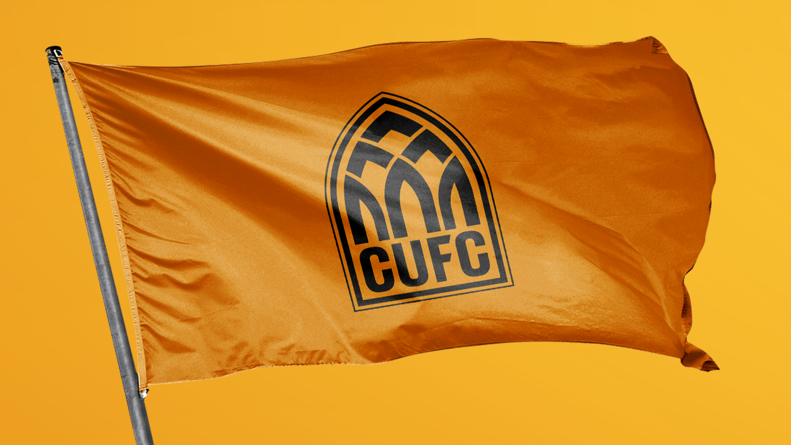
This design takes its inspiration from the arched windows and doorways of the city
The origin of Cambridge United can be found in Abbey United, the club’s name from 1912 to 1948, which is believed to come from Abbey Church on Newmarket Road.
Direction Two, external aims to celebrate the club’s origins and former name by bringing elements of the abbey and Cambridge’s city-centre architecture into the badge.
Mr Payne said Direction Two was designed for fans who wanted the new identity to be bold.
"The Abbey Inspired design is highly unique, yet its inspiration is rooted in Cambridge United's beginnings," he said.
"I spent a lot of time in Cambridge researching this project, and one of the first things I noticed was this arch shape in abundance.
"You just have to spend five minutes in Cambridge city centre and you will see this arched shape everywhere, from iconic buildings and bridges to arched windows and doors. This shape is a key part of Cambridge's identity."
Direction Three: Book and Ball
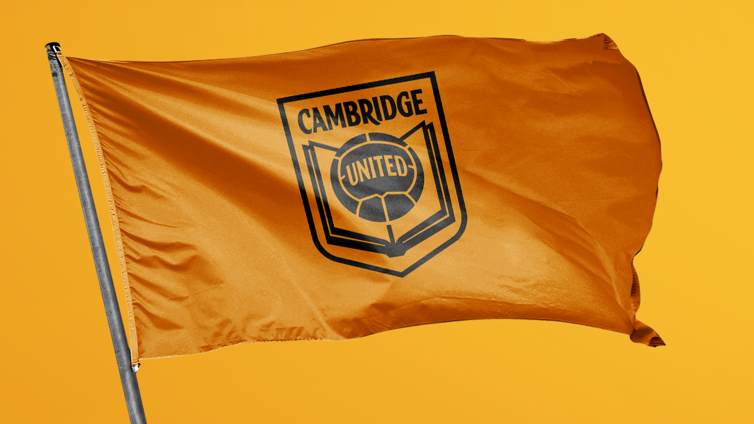
This design aims to reimagine the Book and Ball
Direction Three, external is a more traditional design with balance, symmetry and simplicity, incorporating all the design elements within the classic shield.
This design offers an option to supporters who would like to see a more traditional crest and the return of the book and ball.
Mr Payne said they wanted to offer fans a more traditional design alongside Directions One and Two, which he said were more abstract.
He said: "The Book and Ball is such an interesting idea and it's a concept that is not new to Cambridge United fans. We spent a long time looking at the book and ball design of the 1970s and sought to reimagine it.
"Similar to Direction Two, the strength of this design is its story.
"The book and ball ties back to past identities, as well as the rules of football being formalised in Cambridge. It also provides a subtle nod to Cambridge's renowned education system."
Mr Tunbridge encouraged fans to have their say.
"We believe that modernising our crest and identity is important to our growth and development at a time of ever greater sporting and and financial competition," he said.
"We also all recognise that this is a sensitive subject where people understandably have strong views, so our start point has always been to do this in full collaboration with the fans.
"It is why we didn’t push through the proposed new design this time last year."
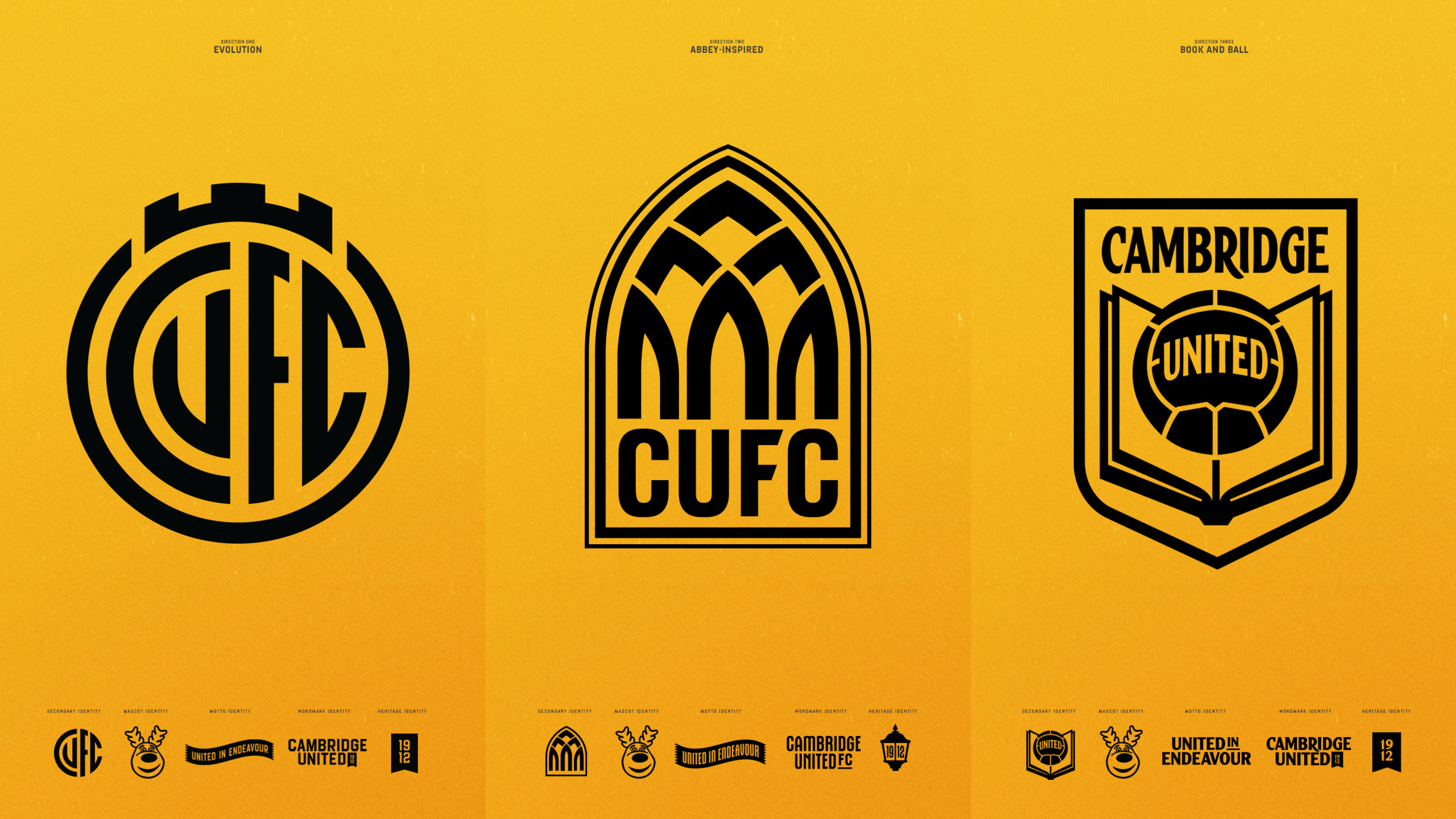
After consultation feedback a final design will be selected by the Owners, Board of Directors and Shadow Board, which will be used from the 2025/26 season
Follow Cambridgeshire news on Facebook, external, Instagram, external and X, external. Got a story? Email eastofenglandnews@bbc.co.uk, external or WhatsApp us on 0800 169 1830
More like this story
- Published16 September 2023
- Published5 April 2024

- Published1 June 2024
