Are we really any better off than we were?
- Published

The government claims most people are now better off than last year
The government has released figures which claim to show that real take-home pay has increased for most people in the last year.
Using the Annual Survey of Hours and Earnings (ASHE), the government said pay has increased for all but the top 10% of earners.
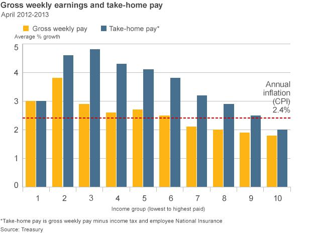
According to this analysis, take-home pay between April 2012 and April 2013 outstripped inflation for most people.
But how true is that? The answer, as so often, is that it depends on which data you look at.
Beating inflation
First, you have to take account of inflation. Only when wages are rising faster than inflation will living standards rise.
And let's face it, according to the Office for National Statistics (ONS), inflation has been running higher than wage increases for five years now.
In the year to April 2013, inflation as measured by the Consumer Prices Index (CPI) was 2.4%.
In December, the ONS reported that earnings were rising by just 2.1%, suggesting that real terms pay was still falling.
But those figures do not take account of tax and national insurance payments.
When personal allowances are taken into account, the government says 90% of people were better off over the period.

Amongst the least well-off, take-home pay in the year to April 2013 was up by 3%. Since that is higher than inflation, it looks like their living standards improved. In nine of the 10 income bands, the same is true.
Only in the top 10% of earners did living standards fall. They saw take-home pay increase by 2%, below CPI at 2.4%.
But even before tax is taken out of the equation, the ASHE statistics appear to support the government's argument, in part at least.
When the latest data were published in December, they clearly showed earnings running below inflation for the fifth year running.
But now we know that CPI inflation has fallen to 2%, we can certainly surmise that the two lines on the graph have now crossed over, and that earnings are indeed rising faster than inflation.

Different story
But other figures tell a rather different story.
As well as producing its Annual Survey of Hours and Earnings, the ONS produces figures for average weekly earnings.
Whereas ASHE is a once-a-year survey, weekly earnings figures are produced every month. They are taken from a much smaller survey sample, but they are more up to date.
The latest figures actually show that earnings increased by just 0.9%, between the autumn of 2012 and the autumn of 2013.
That is well below the rate of inflation.
When asked about the difference between the two surveys, an ONS spokesman was merely able to say that ASHE was a bigger survey, although a little more historic.
And it is the weekly earnings figures that have been seized on by Labour to suggest that real wages have fallen by £1,600 a year.

According to the Institute for Fiscal Studies (IFS), the average earnings figures between May 2010 and September 2013 do support that analysis.
But only if you use the Retail Price Index (RPI), rather than CPI, to measure inflation.
RPI includes housing costs, and is generally higher than CPI.
And, says the IFS, if you really want to measure whether people are worse, or better off, you should look at figures that include tax and national insurance deductions.
Much like the government has done.
Labour says the government's figures do not take account of cuts in welfare payments, such as tax credits and child benefit.
However, the bulk of the welfare cuts did not take place until after the period in question.
In any case, with average earnings figures showing that weekly pay has increased from £472 to £475 over the last year, not many workers will be celebrating yet.