Inside Dame Zaha Hadid's 'womb-like' Science Museum gallery
- Published
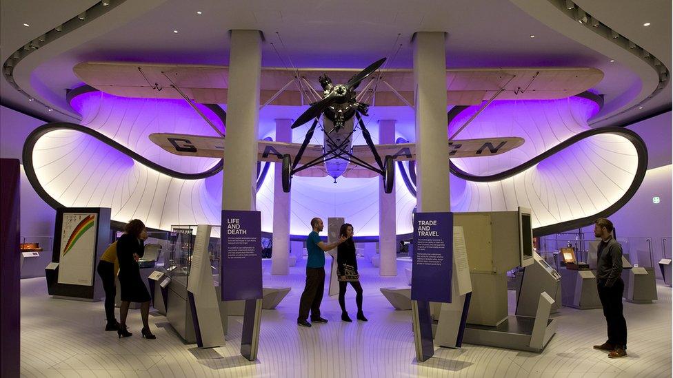
A 1929 Handley Page bi-plane hangs in the gallery's entrance
The Science Museum in London has unveiled its new mathematics gallery, which was designed by the late architect Dame Zaha Hadid - the first of her projects to open in the UK since her death in March 2016.
Dame Zaha Hadid was a mathematics graduate and a master of the unexpected.
Which explains - perhaps - why the first thing you encounter when walking into the Science Museum's new Maths gallery is a 1929 Handley Page bi-plane suspended from the ceiling.
This was to be Dame Zaha's design touchstone, the airflow from its wings dictating a dynamic design of sweeping curves and a huge sculptural form that frames the gallery's central space.
There is, though, a function beyond the decorative to this particular form. It acts as a barrier to stop visitors using the gallery as a thoroughfare, which had been the case before its £5m upgrade.
The space is lit with a serene purple light, giving it a womb-like feel, creating a contemplative aesthetic, which is badly undermined by noises off; namely the arcade-like soundtrack emanating from the interactive displays in the Energy Gallery nearby.
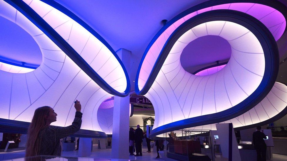
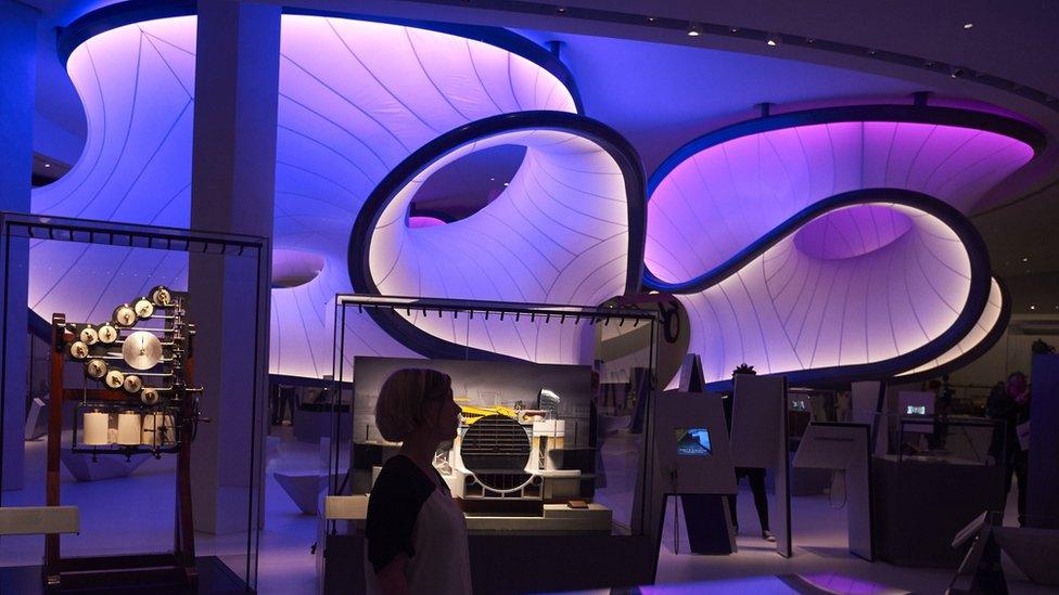
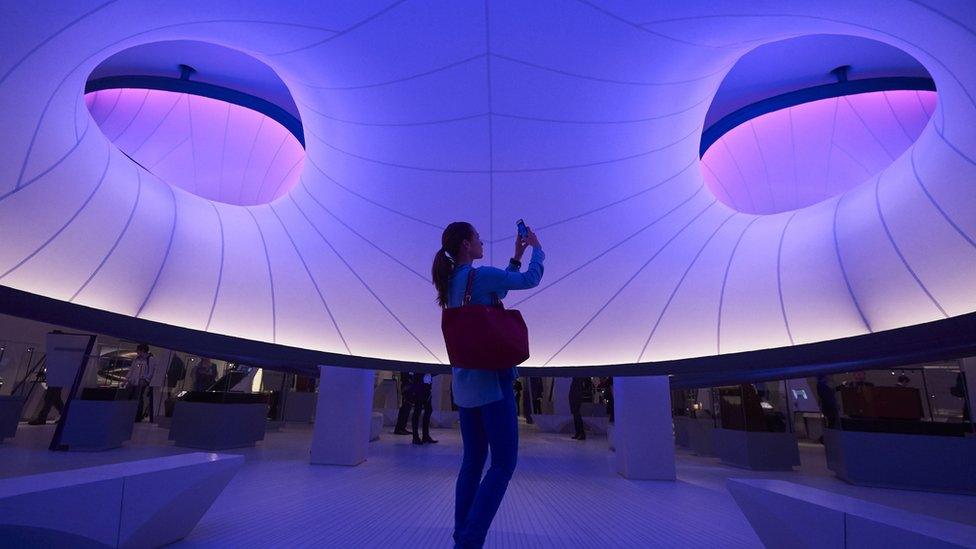
The new gallery opens to the public on Thursday
Had the architect lived to see her design realised, I suspect she would not have tolerated such audio pollution of her thoughtful, peaceful vibe.
The displays are arranged around broad themes: Trade & Travel, War & Peace, Maps & Models, Life & Death, Trade & Travel, Form & Beauty.
The idea is to show how maths plays a central and essential role in our everyday life, and is not some abstract activity undertaken by nerdy individuals in back rooms.
Stories are brought to the fore illustrating where maths is present in our lives, which is a perfectly understandable curatorial strategy. But it does relegate the hard arithmetic, calculus and geometry that enabled the creation of the objects on display to a very minor role.
I think that's OK. This gallery is an introduction to a massive subject, and is aiming to offer as wide an audience as possible a way into what can be perceived as a very dry subject.
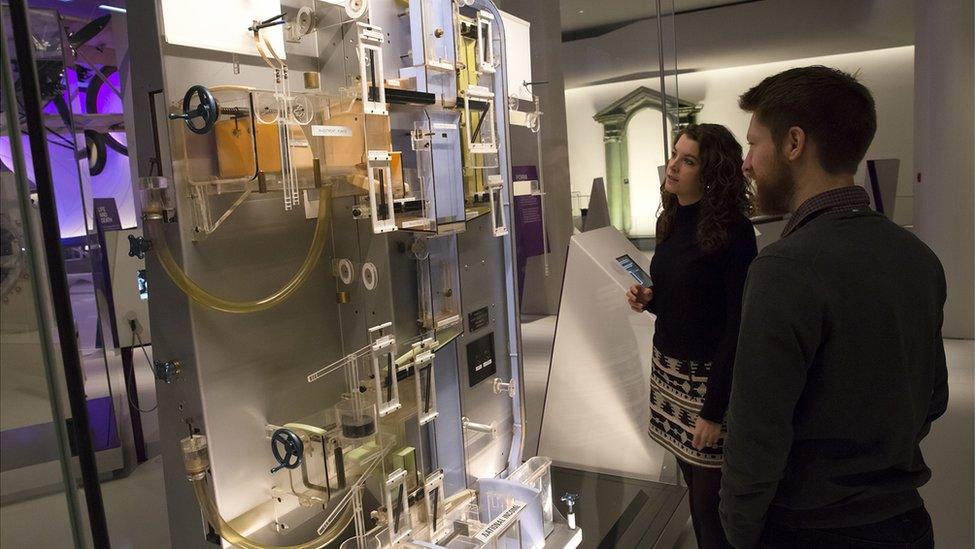
The Moniac machine uses flowing water to represent the economy
There are some real hits. The Heath Robinson-looking Moniac machine is a real winner.
It was designed by Bill Phillips in 1952 for the London School of Economics to model the British economy. For two decades, this marvellous looking contraption, where water=money, was used to teach some of the world's finest economic minds Keynesian principles. It did have one major shortcoming, though. It didn't account for human behaviour…
There's plenty more in the Winton Gallery to enjoy. William Froude's Swan and Raven hulls, for instance, are really compelling. Here we are shown how the engineer's quiet experiments on the River Dart led to the redesign of the world's super-tankers.
I could go on. The Turner sketches on perspective are great. As is the PDP-8 minicomputer (1965), which the display label tells us was the first successful computer small enough to fit into offices. It couldn't do much, but by golly, it looked good.
So does this new gallery. That's down to Dame Zaha's team.
But the imaginative and instructive displays were put together by the Science Museum's David Rooney. He has taken a calculated risk by privileging story-telling over pure maths, which won't please everyone but I think - on balance - is a good decision.
You could say: the sum is great and so are the parts.

Follow us on Facebook, external, on Twitter @BBCNewsEnts, external, or on Instagram at bbcnewsents, external. If you have a story suggestion email entertainment.news@bbc.co.uk, external.