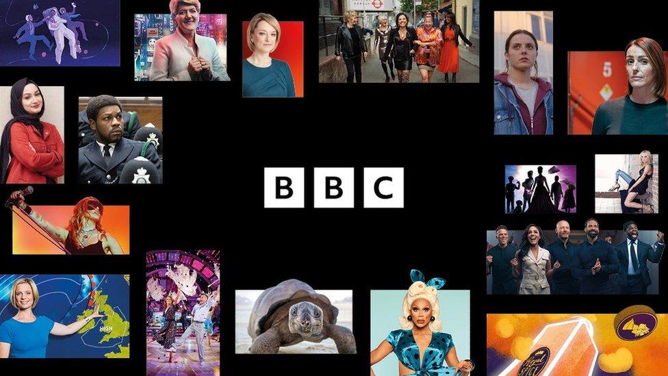
BBC reveals new logos in modern makeover
- Published

The new logo was unveiled by the BBC on Tuesday
The famous BBC logo has had a makeover after audiences told the corporation its services looked "old-fashioned" and "out of date".
The three blocks incorporating the letters BBC will be slightly wider apart and will feature the corporation's own Reith font.
Named after the BBC's founder, it will replace the current Gill Sans one.
News and Weather will also have new symbols made up of three blocks placed at different angles for each service.
BBC Sounds, iPlayer, BBC Sport and BBC Bitesize will have similar icons in various different colours.
And services like the iPlayer will become easier to use and navigate, the BBC said.
"As we update our digital services, it makes sense to modernise how we present them too," said the BBC's chief customer officer Kerris Bright. "Updated, recognisable colours, logos and graphics will identify each service and help improve navigation between them."
Here's a look at some of the new logos:
On TV, viewers will see BBC One, Two and Four using updated designs in the segments between programmes from Wednesday (20 October).
Other changes will be brought in gradually over the coming months.
The BBC said it wanted to modernise "all aspects of our services so the experience feels coherent wherever you access our content" adding that it wanted to "join the dots" between the different BBC services "through simplified layouts and graphics".
The new BBC logo had a soft launch late last year when it began to appear on BBC Select, the corporation's streaming service for the US and Canada.
Some critics felt the new version wasn't significantly different to the old one and questioned the cost involved.
But the BBC told The Sun, external earlier this year: "We are using our own font - which we own the intellectual rights to - when we update content or BBC products.
"It would be wrong to suggest the costs of the design of the blocks was significant."
It's understood the precise design costs will not be published as they are commercially confidential.
Many users on Twitter had fun making light of the new logos, with some pointing out an apparent similarity between the new logos and the fictional one in BBC comedy W1A, which lampoons the inner workings of the corporation.
Allow Twitter content?
This article contains content provided by Twitter. We ask for your permission before anything is loaded, as they may be using cookies and other technologies. You may want to read Twitter’s cookie policy, external and privacy policy, external before accepting. To view this content choose ‘accept and continue’.
Hugh Bonneville, who plays the BBC's Head of Values Ian Fletcher on the show, joked online that the fictional Fun Media PR company would have a job on their hands proving in court that the logo had been copied despite their similar-looking pitch in one of the episodes.
Allow Twitter content?
This article contains content provided by Twitter. We ask for your permission before anything is loaded, as they may be using cookies and other technologies. You may want to read Twitter’s cookie policy, external and privacy policy, external before accepting. To view this content choose ‘accept and continue’.
Fellow actor Jason Watkins, who portrays Director of Strategic Governance Simon Harwood replied, external, also in character, saying the company had noted how the BBC Sounds logo "is of course an utterly 'opposite colour-way'".
The BBC blocks logo was first introduced in 1958 and has gone through various updates over the years, the most recent in 1997.