Coronavirus: What do global death patterns reveal about the UK?
- Published

These numbers start to tell a story about a deathly pandemic wave that hit broadly similar countries in very different ways. Some of the clues in the comparative numbers are not just interesting - they are vital to help identify how to deal with the ongoing challenge of this new virus.
Right now, the UK government says it is still too early to make global death comparisons, with the Department of Health and Social Care insisting that doing so "can be misleading, as different countries compile their statistics in different ways."
But there are ways to account for those differences, and some of the patterns emerging. In particular, while it might have been premature to compare in the first few weeks, it is now possible to start, after nearly three months of data containing each country's peak.
"The mortality data are pretty robust, and now that we have a good period of at least 11 weeks over which we can make these comparisons, they are really worth making, and it's also very timely", says Professor John Muellbauer, an Oxford University economist and co-author of a paper, external surveying many different types of comparison.
The most fundamental question about the number of UK deaths, specifically from the coronavirus, and more broadly during the pandemic period, is whether it was inevitable there would be more than 50,000 registered deaths, and 65,000 more deaths than normal during the first wave of this pandemic, up until mid-June.

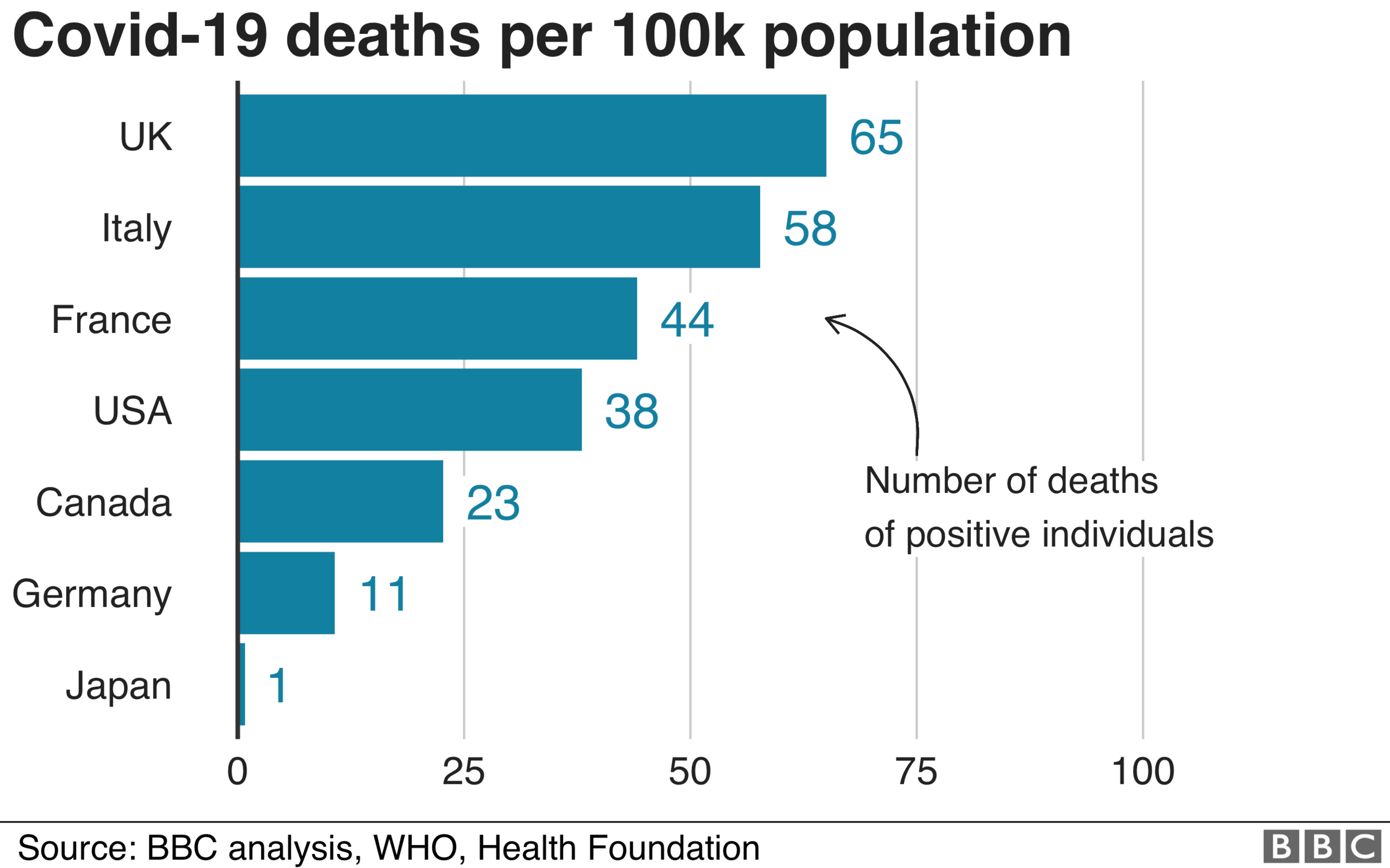
While it could have been worse, the level of deaths in the UK - adjusted for population and for the normal level of deaths - stands out compared with its G7 counterparts.
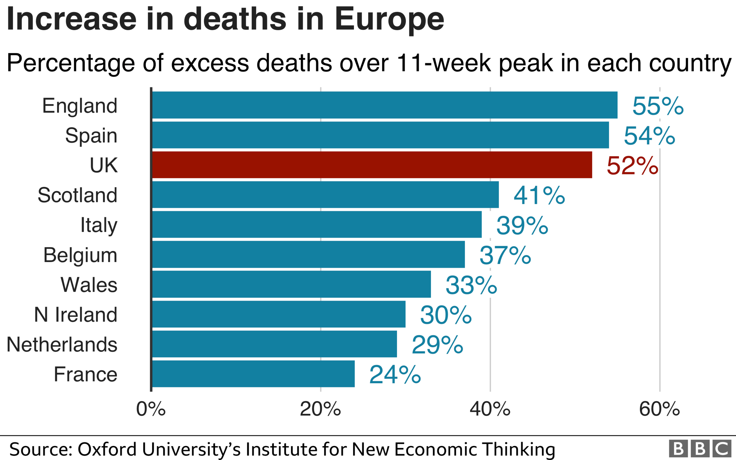
Within Europe, Spain - on these measures - has fared worse than the UK as a whole so far, but England and Spain have had similar hits, with England marginally worse on the more sophisticated measure. It is unarguable that the UK - and England in particular - is at the rough end of international comparisons of similar countries during the pandemic. The question is why?
Some of this might be down to population structure, and the general health of the population. A London effect, of having a densely populated global mega-city, is clearly important, but these comparisons factor some of that in. Even when you take into account the fact that both England and the UK have younger populations than Spain, our death figures still come out as bad or worse, according to the independent charity, the Health Foundation.
The speed and effectiveness of the initial government response can clearly be questioned, particularly as regards care homes. Another factor is the immediate geographical spread to all corners of the UK. The UK did not have the testing or tracing capacity to deal with a novel virus such as this. But if the virus was introduced to the UK en masse by the return of February half term holidaymakers from Italy and Spain, that simultaneous introduction of the virus in hundreds of towns, cities and villages, might have overwhelmed even the feted German system.
UK and Italy
A fundamental question is how the UK - and England in particular - has had a worse outbreak than Italy so far, despite having had two or three weeks extra notice of Covid-19 arriving from Italy.
For example, there have been 65 Covid-19 deaths per 100,000 population in the UK, compared with 58 in Italy.

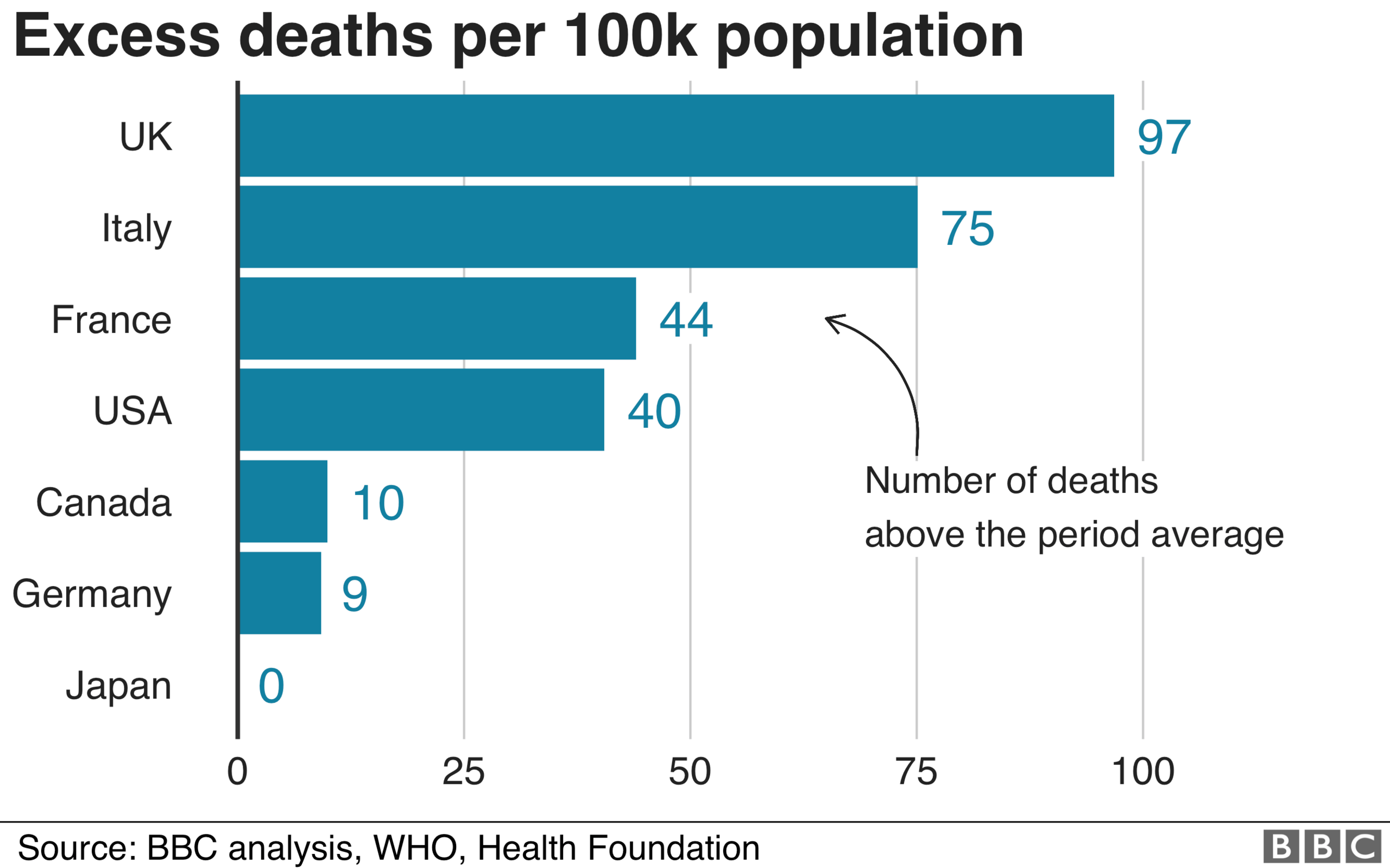
Furthermore, when it comes to excess deaths, the UK has recorded 97 per 100,000 population, while Italy has seen 75.
Excess deaths is a broader measure which compares the actual deaths with the average number of deaths in the same time period in previous years. It gives a sense of the overall deaths directly from the pandemic and deaths that occur indirectly as a result of the health system and economy locking down.
The same pattern is seen, yet more so, in the ratio of excess deaths to usual deaths over an 11-week peak at 52% for the UK and 35% for Italy. That last gap does take account of some underlying health realities, such as the fact that Italy has an older population than the UK.

Italy has so far prevented coronavirus spreading across the whole of the country
Some of the differences between the UK and Italy could be down to the size of London. It's three times bigger than comparable cities in Italy, and also one of the world's busiest hubs for international travel. Also, Italy had at least two different epidemics: a northern one centred around Milan and Bergamo which was severe, and a milder one in the south of Italy and elsewhere.
In early March, UK government sources were rather disparaging about the Italian coronavirus response, saying that - unlike the UK - Italy was taking a populist approach and not following the science.
Looking back on the first pandemic waves in the UK and Italy, while the health system in parts of northern Italy were overwhelmed, there were negative excess deaths in the Lazio region containing the capital Rome, 400 miles away. Despite Covid-19 hitting Italy with little notice weeks before the UK, Italy prevented that profound hit to Lombardy spreading to most of the rest of Italy. There have been significantly fewer registered Covid deaths in the entire Lazio region around the Italian capital - 841 in a population of 5.9 million - than in any region of England or nation of the UK.

Other data contains more parts of this specific puzzle.
The UK and England stand out for the geographical spread of the first wave, and also the persistence of the period of excess deaths afterwards, which only formally ended this week. One theory that could explain this pattern is that the post-February half-term return of families from Italy and Spain spread the virus to every city, town and more in the country. Every region of England and nation of the UK had thousands of registered Covid deaths, and notable excess deaths.
The decision in mid-March and early April to discharge thousands of patients from hospitals directly into care homes, even if they might have had the virus, inadvertently took this geographically widespread virus deep into the most vulnerable part of each of these communities.
The government stresses that decisions to discharge patients are made by medical professionals on a case-by-case basis. Although it was later changed, the 19 March guidance, external was clear: hospitals "must discharge" as soon as clinically safe, "normally within 2 hours".
A last question arising here is how the UK lost the advantage of time on Italy.
Italian health officials were briefing the European Health and Security Committee, including the top item on clusters in Italian ski resorts, as early as 24 February. The EU communicated the risk as "moderate to high" across the continent. The UK was not minuted as attending, external, even though it was entitled to in a limited capacity, after Brexit day a few weeks earlier.
UK and Germany
Germany was mass-testing as the pandemic threatened to grow exponentially.
Germany has done a better job of shielding its care homes, according to a recent study., external 0.4% of care home residents have died from Covid, as opposed to 5.3% in the UK. The way the outbreak spread might matter too. It was more concentrated there, and therefore capable of being controlled with the effective system of tracking and tracing.
The UK government would argue that these systems are now being put in place, with a huge investment in track and trace.

UK and France
Both the UK and France have broadly the same population. The French outbreak was geographically concentrated around Paris.
Could the government here argue that any test-and-trace system would have been overwhelmed by thousands of families returning at the same time from infected areas? Or should they have cracked down with a harder quarantine on those half-term returnees - or at least recognised the problem was out of control, and locked down more swiftly than the end of March?
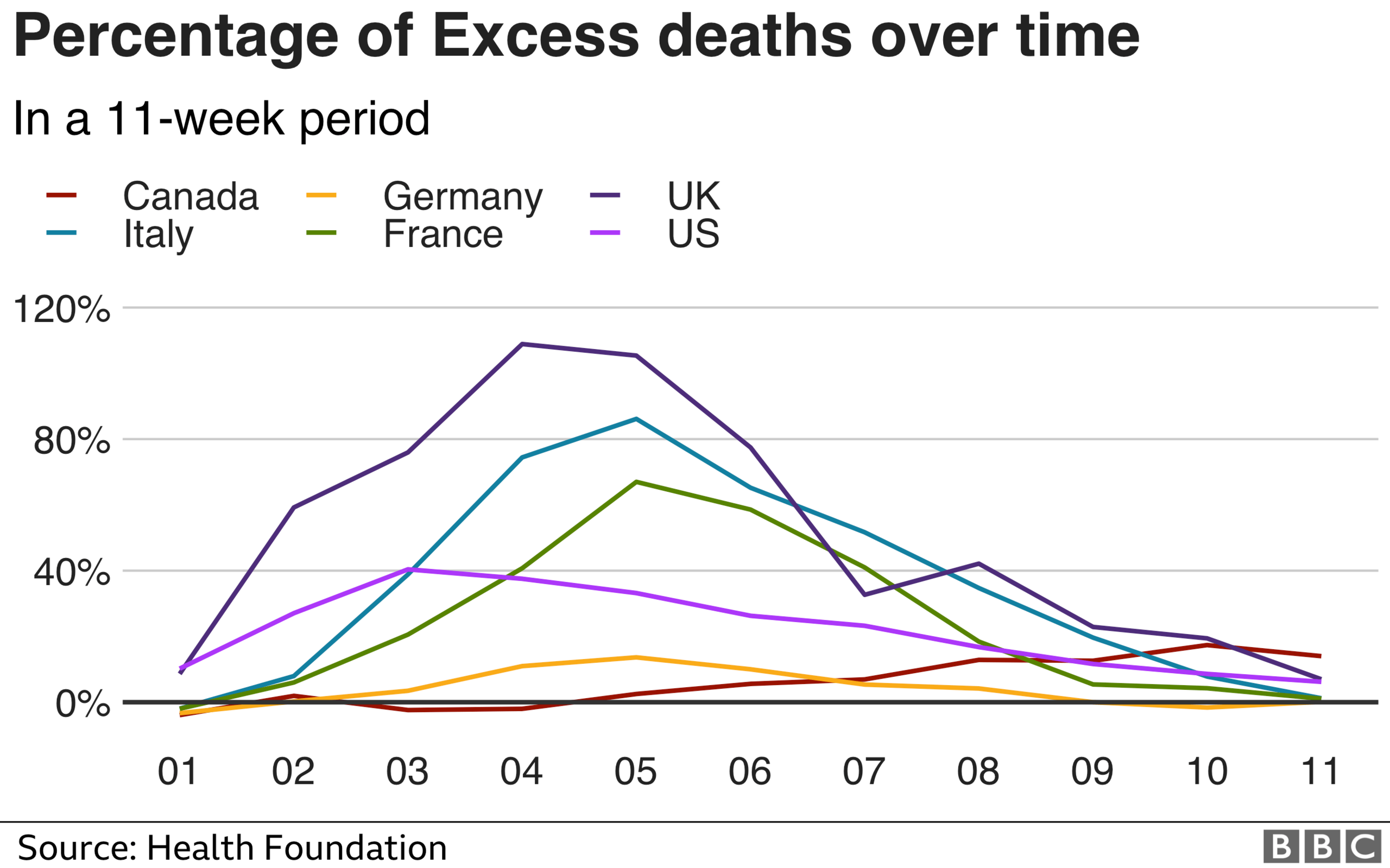
There are also reasonable questions about the strength of the lockdown in different countries. France was seen as more draconian. Its excess deaths percentage fell below 20% within three weeks of the peak.
The French obesity rate is 14% - which is notably lower than the UK on 21%, and is one of the risk factors identified by several studies. Some of that general difference in health should be taken into account in the percentage excess deaths measure.
UK and Japan
Despite its proximity to China, Japan has reported minimal deaths and excess deaths so far.
Like other east Asian nations, Japan was already attuned to the dangers of the coronavirus because of the 2003 Sars outbreak.
The fact that there has until now been no approved human vaccine for any form of coronavirus, means that "non-pharmaceutical interventions" - distancing, lockdowns and masks - were the only way of preventing and containing the initial spread.

The wearing of face masks had been a long-accepted social norm in Japan
The UK was well-prepared for an influenza pandemic. There were stockpiles of tens of millions of treatments already earmarked for distribution. Vaccines had been pre-bought from drugs companies. Neither would be of any use for Covid-19. There was a knock-on effect for the amount of PPE required by health and social care services too, from a virus more contagious and likely to last longer than anticipated in pandemic plans.
That is why Japan and other east Asian countries cracked down with quarantines and mass use of masks, which were already more of a social norm.
US and Canada
The US has returned to zero excess deaths on its official data, completing a first wave on its national statistics. But new states are now being hit significantly, and if in the coming months that were to lead to its excess deaths more than doubling across the country, the picture might change about how the first wave in the US would be defined.
Canada has now published excess deaths figures for most of its territories, and most of its population - but not for Ontario. That is unlikely to change the picture of an outbreak worse than Germany so far, but better contained than France, the US, and especially Italy and the UK.
Can you compare different nations?
It might be said that it is too early to do such comparisons.
Certainly, the longer we wait - a year or two perhaps - the more detailed and comparable the international data will become.
As early statistics have been released, a part of the UK's apparent underperformance arose from the fact that its figures were the most comprehensive and the most timely.

But that is no longer a significant factor.
The G7, a group of nations which are regularly used as a basis for statistical comparison, are measured on the basis of total registered Covid deaths, adjusted by population.
There is a chance that differences could be partly down to how Covid deaths are counted in different countries. So excess deaths, which measures total deaths over and above the usual level in previous years in that period, offers a broader way of comparing.
Importantly, this would measure not just direct deaths from Covid-19, but deaths arising from the shutdown of part of the health system and the economy too. But different nations have different population structures and existing public health characteristics, such as levels of obesity.
Comparing countries' excess deaths as a percentage of normal deaths is one way to capture some of that. But it is important to do that over the same length of time, to enable a like-for-like comparison. A standard method of calculation of usual deaths, used by the Office for National Statistics for example, is the average of deaths in the same weeks in previous years. There is a variety of ways of tweaking that, as data improves.
But, says Charles Tallack of the Health Foundation, we can make useful comparisons now: "Excess deaths measures the totality of a pandemics impact on the populations, the deaths from Covid. And deaths, which might not have been caused by Covid, but have been caused by people, for example, not using health services during the pandemic period."
Among the G7, the UK is currently the hardest-hit country. So that raises important questions. Understanding how countries are different is a really important part of learning the lessons for potentially a second wave or a future pandemic.
Conclusion
We do now have comparable figures for the world's biggest economies, and Europe's hardest-hit nations, for nearly three months of the peak of the pandemic.
As the first wave of the pandemic closes, and excess deaths return to normal levels, some initial informative comparisons can be made.
While it is possible the picture might change in the future, these results are stable over different methods and when many countries are through the first wave. And they raise important questions about the policies that have worked so far, and that would work in a second wave.
But we will update these analyses as new data emerges.
