Lessons to be learnt from the Gap logo debacle
- Published
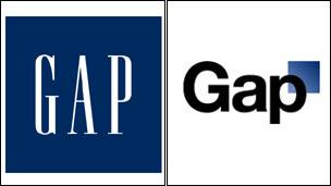
Gap says it learnt from its mistake, on the right
Gap clothing company has ditched its new logo after only one week, due to an online backlash. So what are the perils of changing a company emblem?
Cheapy, tacky, ordinary.
Some of the adjectives used by Gap customers to describe its now-axed logo. After less than one week, it has been consigned to the graveyard inhabited by rejected arrows, squiggles and inadvertently offensive corporate emblems.
The clean font, with a small blue square overlapping the "P", prompted such an outcry that the US clothing firm initially enlisted the help of the public in rethinking the design.
But within days it announced, early on Tuesday morning, it was returning to the solid blue box and "GAP" written in a capitalised serif font, a look introduced 20 years ago.
British customers won't have noticed because the change had yet to be implemented in the UK.
But Gap isn't the first company to learn that messing with one's visual identity is a risky business. So what did it do wrong, and what other logo makeovers have come under fire?
Gap, 2010
For a few days, it was goodbye to the 20-year-old solid blue square and the capital letters, hello to Helvetica and a small blue patch.
Last week, unveiling the new design, Marka Hansen, president of Gap North America, said it was more contemporary and current, honouring the "heritage through the blue box while still taking it forward".
But after a slew of criticism, much of it on Facebook, the company promised to take on board customers' own suggested logos as it reconsidered the emblem.
Days later, the purveyor of preppy fashions folded, admitting its mistakes in not consulting its customers first, and reverted to the original.
Gap is trying to change its stripes without changing the product offering, says marketing expert Craig Smith.
"Where marketers often go wrong is they think they have identified an opportunity for the brand to evolve and become something else, become more modern, and they think they can shortcut this by changing the visual identity, and carry the customers with them.
"It's a fundamental error because customers may not be ready to go with you. The product positioning has to change first, then the logo should be the last thing."
More Helvetica
My personal feelings are that the typeface is fine, says award-winning logo designer Jon Pink of J Pink Design.
"The letter forms in lowercase have an attractive quality to them and the simplicity is refreshing. I think if that was really a complaint, there would be similar complaints regarding other famous logos which utilise Helvetica in their logos, like American Apparel, [US homewares retailers] Crate&Barrel, Jeep, Panasonic, British Gas and 3M.
"However the addition of the blue square seems to be hated on a united front - it just looks cheap, tacky and very dull. So whilst including some connection of the original logo makes perfect sense in business terms, this illustrates perfectly that logic and reason can play second fiddle to gut instinct."
BP, 2000
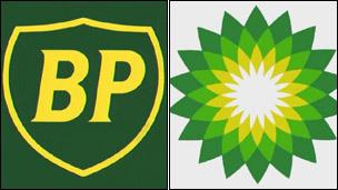
BP went from shield to flower in 2000...
In 2000, BP unveiled a new greener logo, replacing the shield with a green, white and yellow flower-shaped one. At the same time, it adopted the slogan Beyond Petroleum.
The move cost £4.5m ($7m) in brand research, with tens of millions more dollars to be spent supporting the change.
Environmentalists accused the firm of spending more on the logo than on renewable energy.
But it was 10 years later when the dangers of adopting a "green" emblem were clear, says Mr Smith.
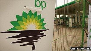
...but the logo was subverted during protests in 2010
"They've only learnt the error of their ways with the Deepwater Horizon crisis, because you can't pretend that a fossil fuel company is in any sense an eco-friendly brand.
"You immediately lay a trap for yourself. Since the crisis, lots of people online have been corrupting the logo."
The lesson there is that you can't pretend to be something that you're not, he adds.
Tropicana, 2009
Last year, fruit juice firm Tropicana dropped its famous orange and straw illustration from its cartons in the US, in favour of a glass of orange juice, a move that sparked countless complaints and criticism from customers. The brand's owner, PepsiCo, relented and went back to the orange.
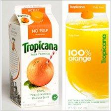
The glass of juice on Tropicana cartons was short-lived
"The 2009 redesign was meant to contemporise our graphics and, as a result of that, we learned just how passionate consumers are about our brand," says Tropicana's Gina Judge, in an upbeat assessment of the miscalculation.
"A group of very loyal Tropicana fans told us they loved our straw in orange imagery, so we brought that icon back to the packaging."
The new look made the brand look ordinary, says Mr Smith. "For a loved, long-standing household brand there is no such thing as a successful logo overhaul - the only triumph is subtlety.
"For each of the six decades that Tropicana has been a fridge and family staple, its visual identity should have been refreshed. If you unveil a revolutionary redesign, expect your customers to revolt."
In contrast, says Mr Smith, a brand like Heinz has managed to change its logo many times over the years but in such a subtle way that no-one really notices.
BT, 1991
British Telecom's piper was introduced in 1991 and lasted 12 years, but at the time he was widely ridiculed, both for the £50m price tag and the way he looked like he was knocking back a yard of ale. He was preceded by, and later followed by, more conceptual designs.
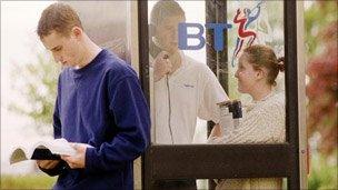
The piper soon became a fixture on British streets
"I think BT were trying to visually embody a human, almost personal element through the piper image," says Mr Pink.
"He is listening and communicating at the same time which would bode well with BT at the time. There is no doubt that depicting a human figure would also help the company achieve a more personal image, perhaps with more focus on customer service than it had before, but the style and pose were its failing points."
The colouring, replacing a purple and yellow "T", was trying to reinforce the British element, he says.
"Once a business has established its brand positioning amongst the general public, it is often the logo that is seen to embody that branding and therefore acts as the visual connection between consumer and business much like we connect a person's face with his personality.
"In fact that is a good analogy to logos and brands - if we think of a brand being someone's personality and the logo being someone's face it makes it easier to see why as humans we like familiarity and how breaking that connection can cause confusion and puzzlement."
Conservative party, 2006
When David Cameron ditched his party's hand-held blue torch for a scribbled tree, former party chairman Lord Tebbit described it as "a bunch of broccoli".
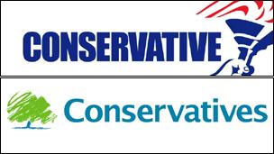
From torch to tree
Others said it looked like Mr Cameron's child had drawn it, says Mr Pink, and the softer colour palette was far removed from the very staunch red, white and blue of the old logo.
"I actually feel that criticism was unfair and that this is one of the more thought-out logo revamps of the last decade. Such a sharp change in direction helped David Cameron to distance himself from Lady Thatcher, but also helped the party appear more relaxed and environmentally conscious.
"The oak tree is also a symbol of strength and stability - both of which are great values to portray for a political party.
"Logos are like anything else that has been created- they are very subjective, so drastic changes will always split opinions, but this is one instance where I feel the naysayers have been proven wrong and the designers right."