Johnston Sans: The Tube typeface that changed everything
- Published
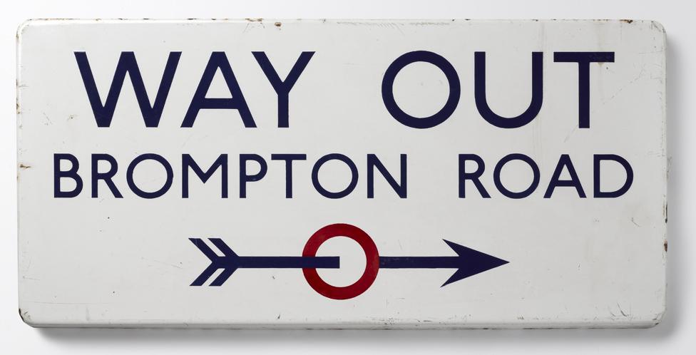
One of today's most popular typefaces owes its inspiration to radical work done for the signage on British transport a century ago. Johnston Sans changed everything.
In 1916, a small revolution in communication came about.
London's Underground railway ordered a new typeface for its posters and signage from the calligrapher Edward Johnston. He handed over details and examples of letter shapes that would set the tone for printed text until the present day.
"Johnston's remit was to unite the London Underground Group, the different companies all using the same rails and tunnels," says Donna Steel, curator of a new exhibition about Edward Johnston and his influence on printing at the Ditchling Museum of Arts and Crafts in East Sussex.

"All the advertising, all the signage was all completely different - there was this cacophony of letters. Johnston applied the proportions of Roman capital letters to his typeface, so it was rooted in history, rooted in traditional calligraphy. But it has an elegance and a simplicity that absolutely fitted the modern age."
The new typeface was called Johnston Sans - meaning "sans serifs".
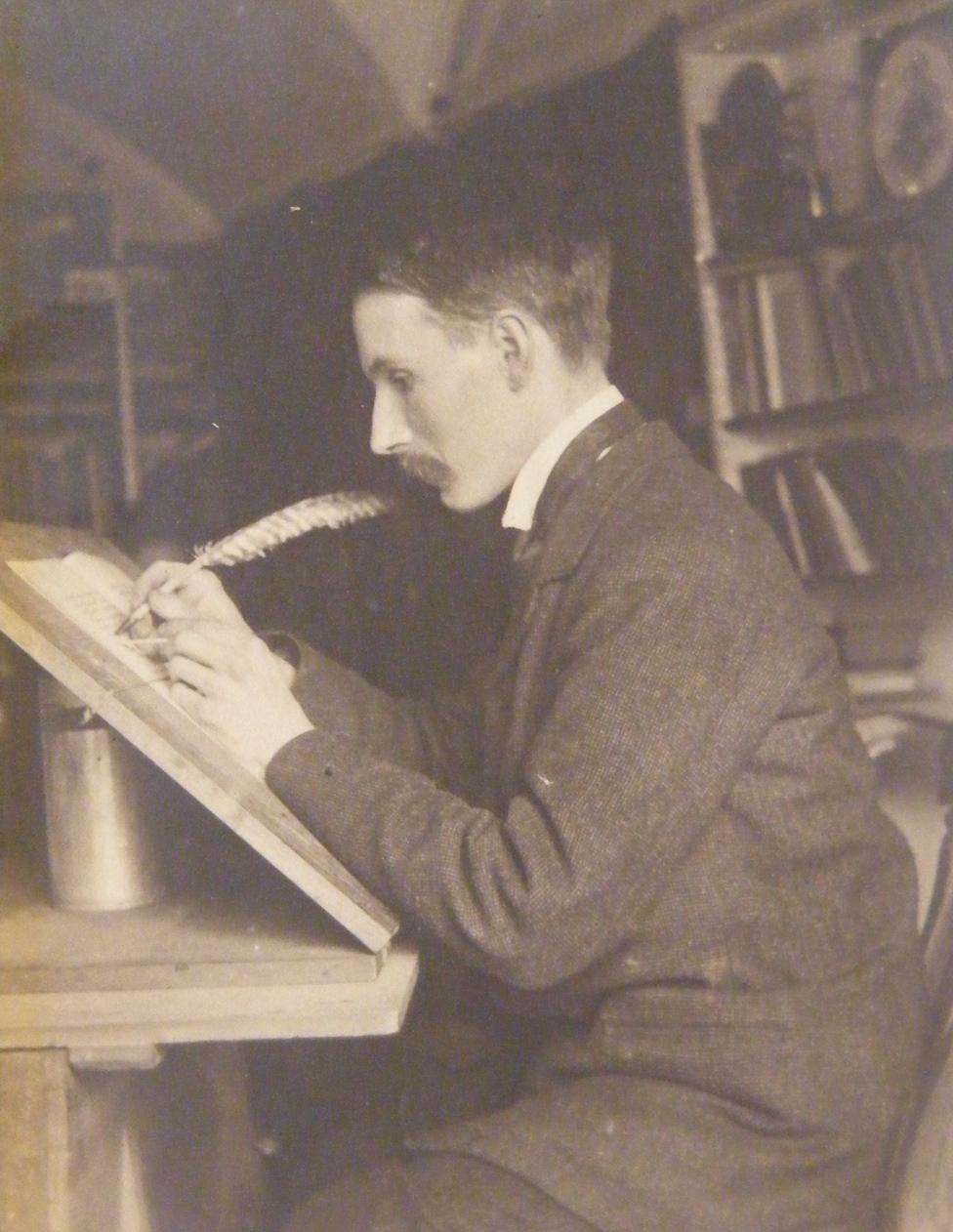
Edward Johnston at his desk
Until then, printed script tried to reproduce the calligraphic fancies of Victorian handwriting, with its decorative curls and flourishes, known as "serifs" in printer's jargon. The new letters deliberately left out the flourishes.
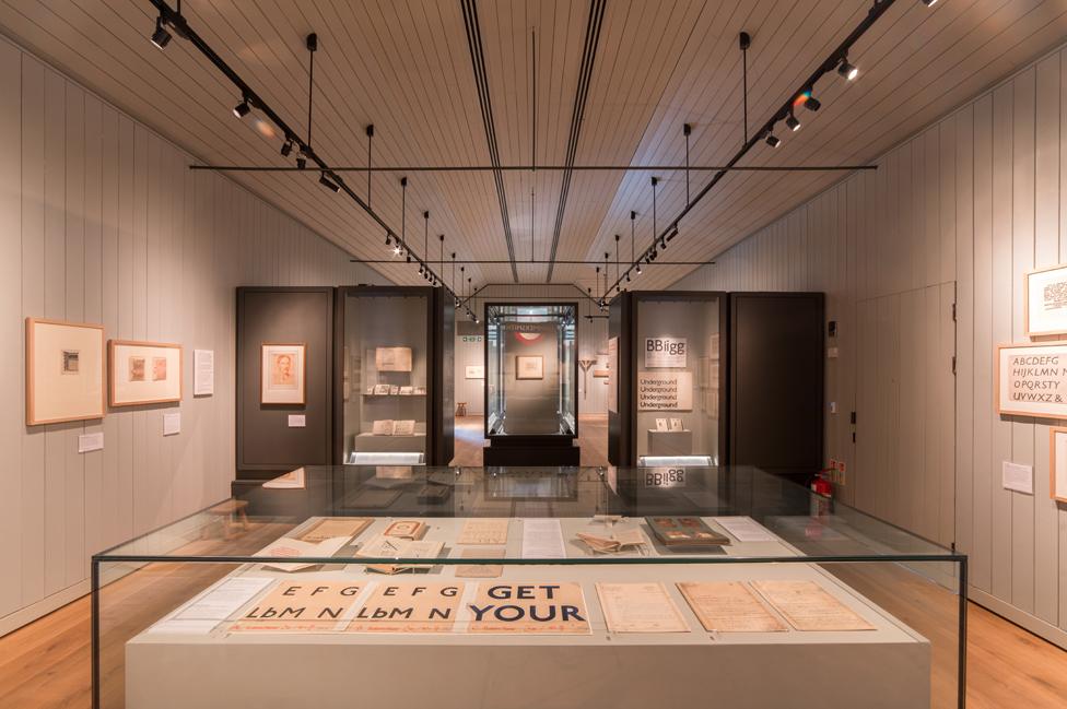
Johnston's signs on display at the Ditchling Museum of Art + Craft
"Having the serifs on makes things more difficult to read, there's more for the eye to take on," says Steel. "Johnston Sans combined readableness, beauty, simplicity. It's reassuring, which is so important when we're travelling, because when we're travelling we're vulnerable. With Johnston, the typeface is confident and it reassures us. We know when we've got the right place and his message is clear."
Typeface enthusiasts can be a bit fanatical in their attention to detail. Never refer to a typeface as "a font". The latter primarily refers to size.

Reading the detailed instructions sent by Johnston to London Transport's printers, you can understand the need for precision and care. Here's just a small part of how he told them to print a Capital E:
"In normal Block Letter Capitals (based on the approximately circular O) the limit of Weight is determined by one (or both) of two considerations. 1st by the effect on the transversely divided Caps ABEFPR & to a less extent on HGKXY. 2nd When a "lower case" (or "small letter") - "l.e." Is used, to match the Capitals. (Note: it is convenient to express the Weight of a letter by the stem-width of thickness compared with the Stem-Height…)"
1st in a transversely divided letter of a very heavy make there may be very little, or even insufficient, Background (especially above the transverse bar). Compare two heavy Es . It is seen that in E of W + H over 5 the upper & lower parts of Background xx are about the same width or thickness as the E's arms or stem.
Johnston had an unconventional start in life. He was born in Uruguay where his father was a soldier and brought up by aunts who had a phobia about fresh air and kept him indoors.
But he went on to lead a quiet, married life at the arts and crafts centre he established at Ditchling with his former pupil, Eric Gill.

Controversial craftsman - Eric Gill
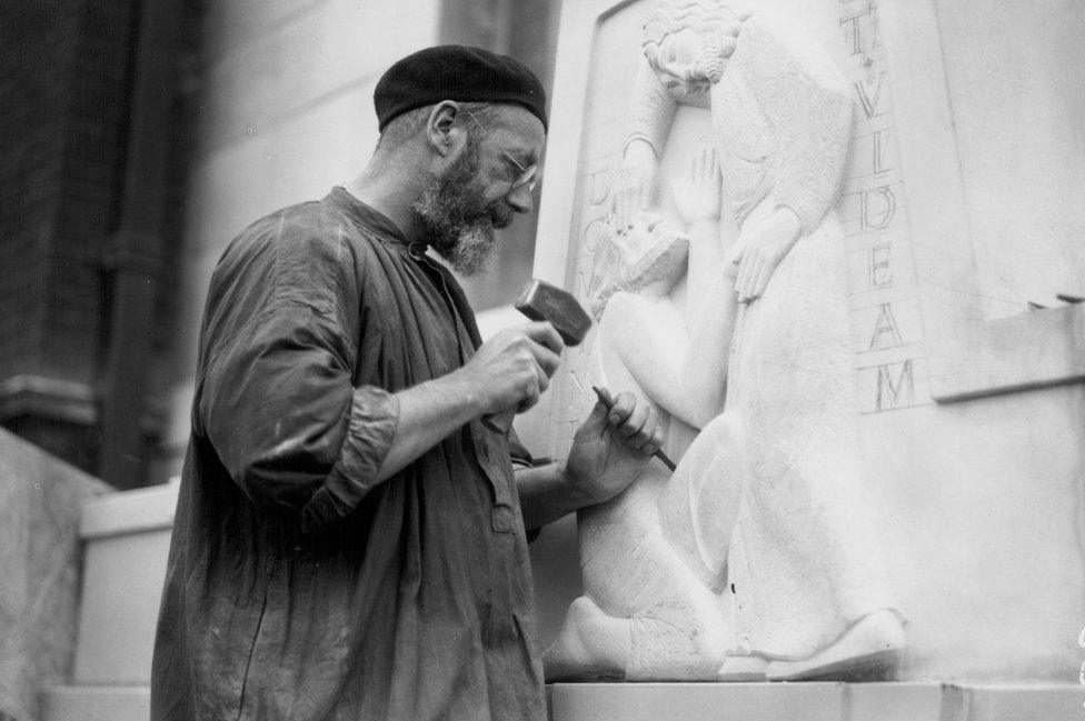
Gill working on a sculpture at Moorfields Eye Hospital in 1934
English sculptor, designer, printmaker and stonecutter Eric Gill was born in 1882 and died in 1940
Trained as an architect, he was inspired by Edward Johnston to move into calligraphy and letter cutting
His best known statues include "Ecstasy" (Tate Galleries), the stations of the cross at Westminster Cathedral, "Ariel Between Wisdom and Gaiety" outside BBC Broadcasting House and the seahorses of Morecambe's Midland Hotel
A biography by historian Fiona MacCarthy revealed that Gill had written accounts of sexual activity with two of his teenage daughters, his sisters and his dog.

Gill's sexual abuse of his teenage daughters, not to mention his dog, would certainly have landed him in jail today. He combined narcissism, religious obsession and sex addiction. Like some other artists - the murderer and painter Caravaggio or the viciously anti-Semitic composer Wagner, for example - the work of Gill challenges viewers to dissociate his appalling personality from the acknowledged beauty of his work.
Despite his notoriety, it was Gill's development of Edward Johnston's design, turning Johnston Sans into Gill Sans, that created the typeface for the modern age.
Gill experimented with an even simpler design - by hand - on the sign above a friend's bookshop in Bristol. That lettering caught the eye of an adviser to the company Monotype, which designed print for advertising and publishing and is still in business today. Monotype commissioned Gill to develop the typeface.
Its simple, bold style matched the modernising aspirations of the age. The London and North Eastern Railway used it for the nameplate of its new, express locomotive, The Flying Scotsman. Penguin Books adopted Gill Sans for the paperback series that began to fill bookshelves.
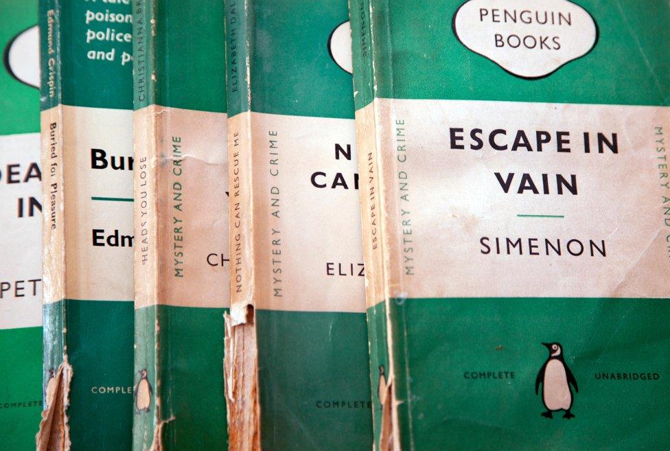
Today, Gill Sans still appeals to designers looking for a positive style - it makes up the BBC logo, for example.
To adapt Johnston Sans to new printing technology that emerged in the 1970s, London Transport engaged designer Eiichi Kono, who was born in Japan and trained in the UK.
He changed the dimensions very slightly - he turned full stops into diamonds, for example. But what you see on London's Underground today is essentially what Johnston drew by hand a hundred years ago.
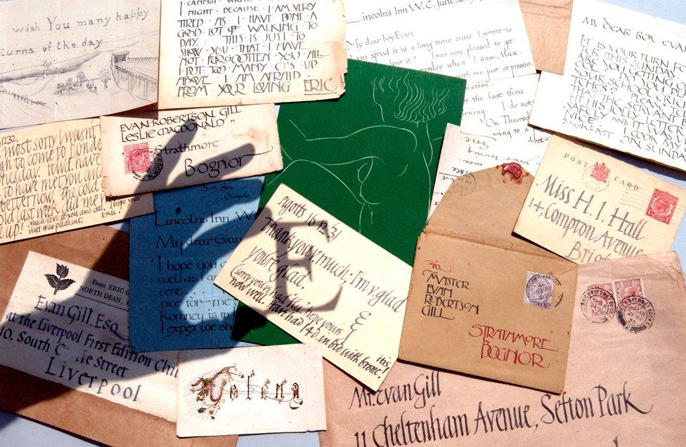
Examples of Eric Gill's designs
Nathaniel Hepburn, director of the Ditchling Museum of Arts and Crafts, has organised a summer of celebration of Johnston Sans. The museum has created a giant and unorthodox method of printing Johnston Sans - a 12.5 ton steamroller.
"We're going to make some huge, laser-cut Johnston wood types, ink them up with a really big roller, lay very large sheets of paper over the top, and then drive over it with a steamroller."
Typefaces are hugely important, says Hepburn. "The typeface is seen before any of the words are ever read."
Yet we can guess that Edward Johnston, a modest man who let Eric Gill take the praise for the typeface based on his work, and who now lies quietly in an unassuming grave in Ditchling churchyard, might not have enjoyed all the fuss.

More from the Magazine
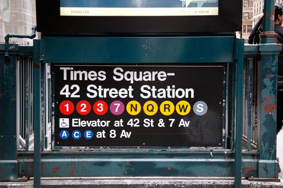
You won't find a graphic designer who isn't familiar with Helvetica. But why is this typeface so familiar to non-designers too?

Subscribe to the BBC News Magazine's email newsletter to get articles sent to your inbox.