Apple might be changing its iPhone font but will you notice?
- Published

Apple is rumoured to be ditching the type of text many of us see every day on its mobile, tablet and Mac screens.
For the last few years iPhone users have been tapping out messages and notes in Helvetica Neue.
But it's expected users will soon be seeing a new font called San Francisco, external, which the firm created for the Apple Watch.
It's thought the switch will be confirmed at Apple's developer conference in June.

Font off: Helvetica Neue versus San Francisco
The original Helvetica was designed back in the 1950s when computers looked more like church organs. Neue Helvetica was a reworking of that design, which arrived in 1983.
"It works great in print but doesn't transfer very well to being used at small sizes on digital screens," says Jon Hewitt, creative director at design firm Moving Brands.
He reckons the main aim of Apple's new look is to be readable on tiny screens or "when you're quickly glancing" at your device.
"We've noticed that it's been designed so it will also look good when it's used at larger sizes or in print, for example in Apple's shops," he added.

The truth is out, iPhone users: You have been writing your "to do" lists in Helvetica Neue
So why should you care about fonts?
To the untrained eye there isn't a huge difference between the two types of text. But did you know there are font "personalities"?
Jon Hewitt says we might not feel like fonts are having an impact on us but they "set the tone" even if that's at a subliminal level.
"Fonts serve a functional purpose in that they have to display information clearly and remain readable wherever that information is displayed," he explained.
"But their design sets the tone for that information.
"When we see a serif font like Times New Roman we will probably associate it with being formal, stiff and a bit old fashioned.
"The design of a font can make the words written in it appear more friendly, more formal or even more expensive."

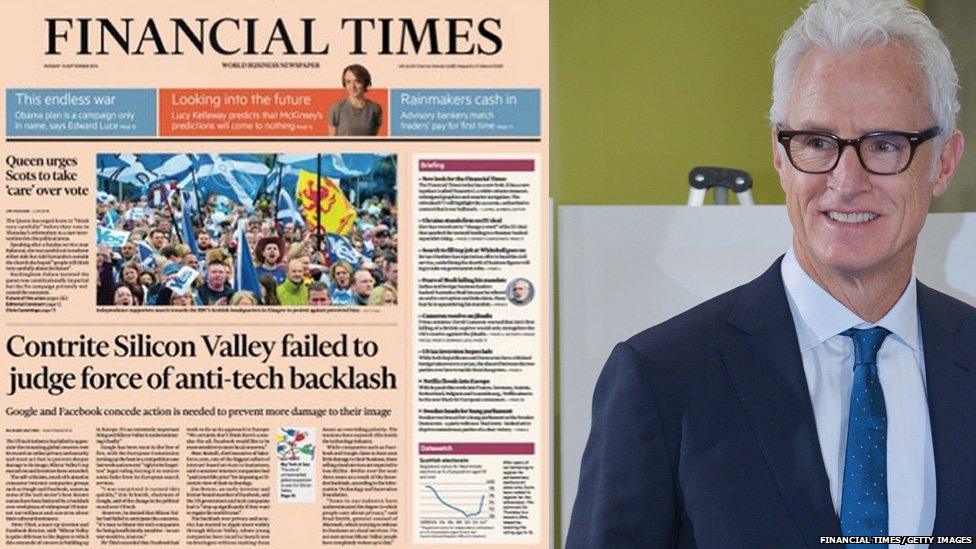
Does Mad Men's Roger Sterling (played by John Slattery) say FT to you?
Thomas Mould, a user experience designer at the BBC, explains: "Fonts give tone and personality. Fonts can change how we feel about a product.
"The Financial Times newspaper recently went through a redesign, external and when describing what they wanted from their new font they felt the persona of Roger Sterling [in Mad Men] best represented the type of person they wanted the font and the paper to feel like."
The concept of a "font" has been around for more than a thousand years.
The earliest printed book we know about is a Chinese scroll from 868 AD containing the Diamond Sutra, a Buddhist text.

But 1440 was the game-changing year that led to modern-day design.
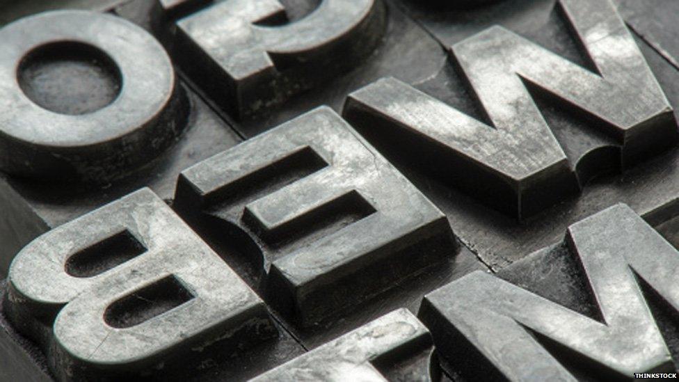
Henry VI was King of England, the world looked a lot more like Game of Thrones and books were all hand-lettered until German blacksmith Johann Gutenberg invented the movable type press.
He designed his font in the style of the "Gothic blackletter" so it looked hand-lettered.
But as more people learned to read rival printing shops opened up and other looks evolved, leading to the idea of typographic design.
A font is all the letters, numbers, punctuation and other symbols which compose a typeface.
Apple's new font change is expected to arrive when you upgrade to OS X 10.11 on desktop and iOS 9 on an iPhone.
Follow @BBCNewsbeat, external on Twitter, BBCNewsbeat, external on Instagram, Radio1Newsbeat, external on YouTube and you can now follow BBC_Newsbeat on Snapchat