How new bank notes will help the visually-impaired community
- Published

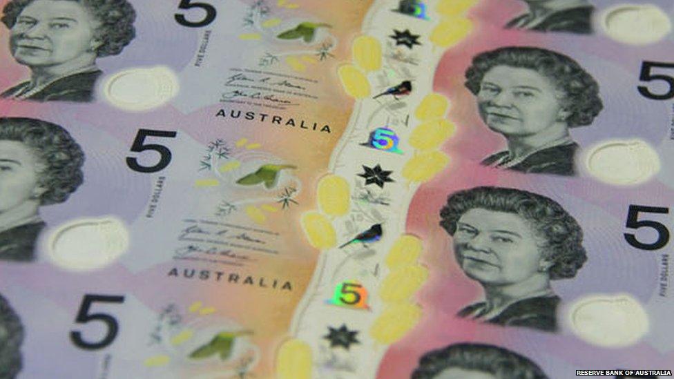
A new Australian banknote (below), which comes into circulation on Thursday, has a new design to help people with a visual impairment.
And it's thanks in part to a teenager.
Conor McLeod, 15, led a campaign to get "tactile features" on the notes, which means people who can't see well can feel the difference between the denominations.
The Reserve Bank of Australia has just unveiled the new $5 design, which will be available for use from 1 September.

Australian currency also features a portrait of Queen Elizabeth
"Connor's quest was sparked when he was given money for Christmas but could not tell how much he had received," charity Vision Australia said, external.
More than 55,000 people signed his online petition and he took his discrimination case to the Australian Human Rights Commission.
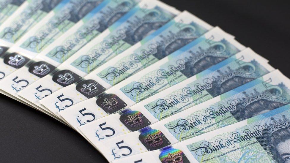
The Bank of England is making similar updates to its banknotes, when the new polymer bills are circulated in the coming months and years.
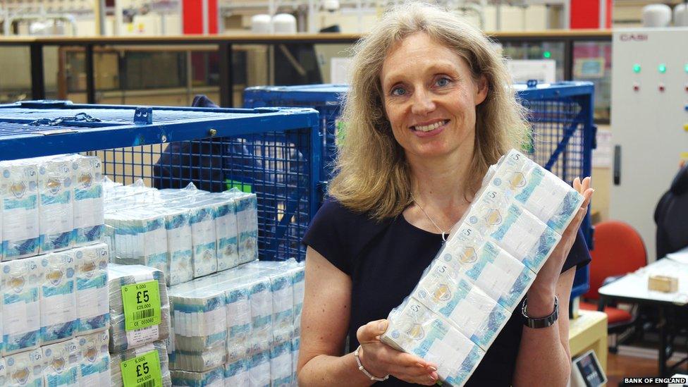
Chief Cashier Victoria Cleland is in charge of issuing the notes and it's her signature which appears on all new ones (if you've got a relatively new £10 or £20, you'll see it there now).

The first thing which helps people with a visual impairment tell banknotes apart is that as the value gets smaller, so does its height and width.
"A lot of people will know the size of the note and measure it against their fingers," she explains.
"Another thing we try to do is have some white space and then a big bold numeral."
The newer £20 and £50 show this design, as will the new fiver.
"That was something we did in consultation with the RNIB," says Ms Cleland.
She says having different colours for the notes is "really helpful" and not only for the visually impaired.
It makes it much easier for everyone to quickly distinguish between notes, unlike the US bills for example, which are much more uniform in colour and size.

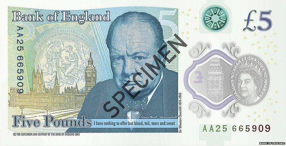
Winston Churchill features on one side of the new fiver
On 13 September the new £5 polymer note will begin circulation, with the £10 and £20 to follow.
These higher value notes will have similar tactile features to the new Australian $5 bill.
"We've especially gone for something that doesn't use Braille because very few people in the UK use it," says Ms Cleland.
"It's essentially a series of raised bumps. So for the £10 you'll be able to follow two sets of bumps and for the £20 you'll get three sets."
The £5 will be distinguishable because it won't have the bumps.
"We've been testing their robustness," says Ms Cleland.
"The work we've been doing with our producers and polymer means they will be more robust and durable [than previous notes].
"What you don't want to do is introduce a feature that'll only last a few weeks and confuse people even more."
Steve Tyler from RNIB said in a statement given to Newsbeat: "RNIB has worked with the Bank of England to offer guidance on what the new banknotes should look and feel like.
"A number of blind and partially sighted people tested different sized notes, textures and print types and offered their feedback.
"From a textural, contrast and size perspective, they [the new £5] are very distinctive which should help people with sight loss to identify them."
Find us on Instagram at BBCNewsbeat, external and follow us on Snapchat, search for bbc_newsbeat