'Hide the decline' revisited
- Published
- comments

Is global warming over? Some say so - but it's not backed by the data
Over the weekend, either the Mail on Sunday newspaper or its interviewee Judith Curry or possibly both, external described the recent new analysis of the Earth's temperature record as "hide-the-decline stuff".
They're absolutely right.
The phrase originated, you'll probably recall, in one of the emails liberated by hacker or hackers unknown from the University of East Anglia's Climatic Research Unit (CRU) in late 2009, which gave rise to the "ClimateGate" affair.
In that email, CRU's director, Phil Jones, the scientist mainly responsible for one of the three most important global temperature records, external, tells colleague Michael Mann that he discussed "using Mike's Nature trick" to "hide the decline".
The email was taken to be an admission that Prof Jones and others were deliberately hiding the fact that global temperatures had been falling during the most recent decade - hiding proof that global warming had stopped. (SEE UPDATE AT BOTTOM OF POST)
Now, the Mail, along with lobby group the Global Warming Policy Foundation (GWPF), external, has done its own analysis of what may in time become the fourth major global temperature record - the Berkeley Earth Project, external, which released its first scientific papers and a huge batch of data just over a week ago.

CRU's Phil Jones could not have been trying to hide a temperature decline unless he has a time machine
They conclude that it, too, shows the planet has not warmed in the last 10 years; and that the project's leader, Prof Richard Muller, chose to conceal the fact at the time of launch.
Hence the description "hide-the-decline stuff".
So why are the Mail - and Prof Curry, external, if she did utter the words - quite right in their description?
The original "hide the decline" claim is one of the most easily de-bunked in the entire pantheon of easily-debunkable "sceptic" claims.
Phil Jones wrote the email in 1999, immediately following what still ranks as one of the hottest years on record, and well before the idea of a "slowdown" or "hiatus" or even "decline" in warming gained currency.
So it can't have had anything to do with hiding a global temperature decline.
If it were a scientific idea, the notion that it did would be consigned to the garbage bin of history alongside perpetual motion machines, the steady-state theory of the cosmos and the idea of HIV/Aids as a gay-only disease.
It's that wrong.
De-bunking the Mail/GWPF claim that the Berkeley data shows warming has stopped, external takes marginally longer.
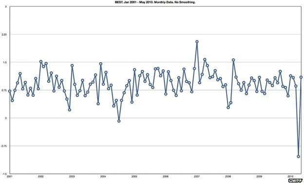
They produce a graph of monthly average temperatures from the Berkeley dataset that is, as far as I can see, accurate in the sense that it has put the dots in the right place.

GWPF's graph lacks error bars and a trend - and is skewed by a pretty obvious data "outlier"
It claims that the graph shows "a statistically perfect straight line of zero gradient". But there is no line given, and no error bars.
Worse, they produce no statistics. It's just a graph, and we're implicitly invited to use our eyes to validate the claim that it shows a flat trend.
A second issue is that weird penultimate data point, which even to the most casual observer would surely stand out as oddly low.
Did the world suddenly get 2C colder in April 2010, and then return to its previous balmy state in May?

There is little sign of cooling in the Arctic, where sea ice volume is decreasing year on year
Of course not. And when you go into the Berkeley dataset, external, you see that the last two readings it gives for 2010 - April and May - come with huge uncertainties attached, nearly 3C in fact, way bigger than anything else in their records.
I suspected - and when I spoke to Prof Muller on Monday, he confirmed it - that this was down to a dearth of readings.
Blogger Nick Stokes delved more deeply than I did, external, and found out that the only data for those two months came from 47 weather stations in Antarctica.
Simply put, at the time Berkeley did their analysis, they had not taken delivery of anywhere enough data to say anything meaningful about those two months.
GWPF and the Mail neither mention the huge uncertainties, nor put them on their graph.
Even visually, if you take these data points out, it begins to look as though there might be an upward trend.
Anyway, visual inspection is something best left for paintings and photos. For numbers, you need statistics.
Tamino, the enigmatic climate blogger who runs the Open Mind, external site and keeps his identity deeply under wraps, has run the numbers, external.
He calculates that if you omit those two Antarctic-only data points and end the run at March 2010, you see an upward warming trend of 0.14C/decade - smaller than the average that Berkeley found for the late 20th Century, but still positive.
Tamino also calculates that if you start just one year further back, the warming trend increases to 0.27C/decade.
For a quick comparison, we ran the Berkeley numbers through a standard spreadsheet package and came up with very similar numbers to Tamino. And if you start a year further back, in 1999, you see a bigger rate still - 0.30C/decade.
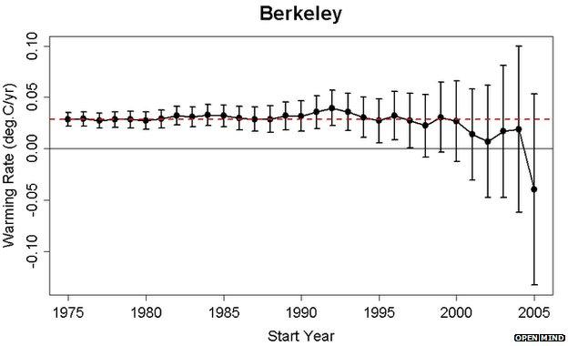
Tamino also includes a graph that should perhaps be mandatory viewing for anyone trying to make sense of all this - plotting the uncertainty in a trend estimate against the period over which the trend is calculated.

The shorter the analysis period between the start date and 2010, the less certain you can be of your trend. (The red line indicates the trend if you start in 1975)
Starkly, it shows that when you come down to a period as short as a decade - and GWPF/Mail used less than a decade - the uncertainties swiftly get too big to show anything reliably.
Andy Revkin of Dot.Earth, external tweeted a reminder this week that this issue was addressed formally two years ago, in a paper in Geophysical Research Letters, external by David Easterling and Michael Wehner.
Their top-line conclusion: "The climate over the 21st Century can and likely will produce periods of a decade or two where the globally averaged surface air temperature shows no trend or even slight cooling in the presence of longer-term warming".
Simply put, there are just too many short-term wiggles in the data because of the El Nino Southern Oscillation and other factors. You need more time.
Richard Muller made the same point in our brief phone conversation.
"You could equally well take a period between about 1980 and 1995, and it would be equally 'flat'," he said.
"It simply shows that if you allow yourself to use the non-scientific process of picking your starting point in order to get the result you want, you can do that."
This week, he is at a climate conference in Santa Fe alongside Prof Judith Curry, the Georgia State University climatologist who's credited as an author on the Berkeley papers despite apparently having had little to do with the analysis, external.
The Mail article used her as the project's chief critic; and she gives her account of the conversations she had and the quotes she gave on her own blog., external.

You may not "believe" in it - but science works on data, not belief
Having had a long chat at the Santa Fe meeting, all is now apparently sweetness and light, external between Profs Curry and Muller.
In time, the Berkeley dataset might show the global temperature rise stopping - so might the records from Nasa, Noaa and CRU. Without a fully functioning crystal ball, who can say for sure?
But it hasn't happened yet.
So why might journalists and lobby groups claim that it has?
"It's politics, not science," Richard Muller told me by phone. "Politicians have been doing this kind of stuff for a long time - look at what Al Gore did with all his disinformation.
"Some start with their conclusion and they pick the data to find what they want. People should listen to scientists, not politicians or journalists."
To come full circle, this is why the Mail on Sunday was quite right to draw parallels between its Berkeley analysis and the first "hide-the-decline" episode.
This time, as last, it's an object lesson in how to spin a colourful cloak from meagre thread.
Now, as then, you pull on the thread, and the cloak swiftly unravels.
UPDATE 3 November 1036: A number of comments have quite rightly pointed out that the "hide the decline" email was also critiqued at the time of "ClimateGate" in its proper context - ie, reconciling a tree-ring dataset with an instrumental dataset.
This wasn't the sense in which I dealt with it in this post, obviously - I was focussing on the mis-use of the email in claims that it "hid a decline", or slowdown, in temperatures from 1998 onwards.
With hindsight I should have made that clear in the text, and I could also usefully have pointed out that some "sceptical" blogs took pains to clarify the issue at the time, such as the wattsupwiththat post, external reading "contrary to what you've likely read elsewhere in the blogosphere or heard from the few policymakers and pundits actually addressing the issue, it was not the temperature decline the planet has been experiencing since 1998 that Jones and friends conspired to hide".
Apologies for any confusion.