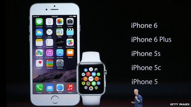
Apple Watch: The net reacts to Apple's first wearable
- Published
- comments
Rory Cellan-Jones asks if Apple Watch can convert a sceptical public to wearable technology
It's not often that details of a major tech product can be kept under wraps until it appears on stage, but the Apple Watch managed to dodge the rumour sites and stay a secret right to the end.
It helped that Apple isn't ready to release the wearable until next year - missing the busy Christmas shopping season - though it may squeak in in time for the Chinese New Year in February.
Tim Cook and Co managed to tantalise their audience with the promise of elegantly designed miniature apps - some, such as Maps and the exercise-focused Workout sounding genuinely useful, others, such as the ability to transmit your heartbeat to a loved one, perhaps less so.
And while the Digital Crown control and pressure-sensitive screen hold the promise of a clever user interface tailored for the Watch's size, there was surprise from some that the fashion-conscious firm had opted for a rectangular watch face rather than a circular one, bearing in mind Motorola and LG have been praised for doing the opposite.
But if one thing is clear from previous Apple launches - until you get time to play around with their products at length it's easy to miss many of their fine points and flaws.
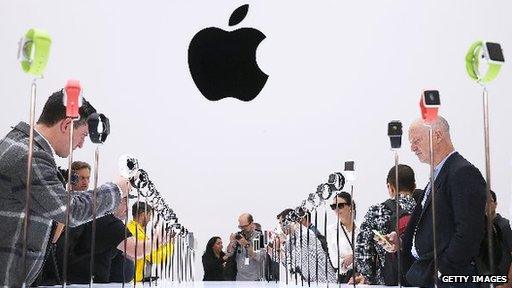
Selected tech bloggers, other journalists and celebrities were invited to Apple's launch
Of course, that didn't prevent a flood of instant feedback before U2 had a chance to round off the press conference. Below is a selection of what appeared online in the hours after the announcement.
From a fashion point of view, the external aesthetic seemed neutral: neither super-stylish nor repellent. I would imagine that geeks would love it more than aesthetes. Yet smartphones have already transformed the fashion world in a way we never imagined.
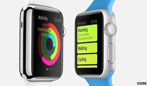
Apple spent much of the launch highlighting the Watch's fitness-tracking facilities
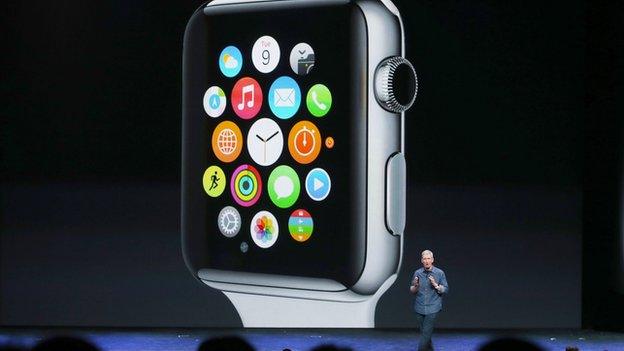
Maybe the cleverest part of the Apple Watch's design is how you control it. Instead of relying on multi-touch gestures designed for bigger screens, the Apple Watch leans on the use of the "digital crown," aka "the spinny knob" aka that thing you typically use to adjust the time... Think clickwheel 2.0.
An intriguing feature is the Maps app, which in addition to offering directions also takes advantage of the haptic vibration system inside the device. In practice, this allows Apple's Maps app to not only plot a journey from your current location, but guide you using different types of vibrations on the wrist.
Apple left out some key details about the product, such as screen resolution, processing capabilities, and most importantly, expected battery life.... It also doesn't bode well that the display is not always on and only lights up when you move your wrist or interact with the watch
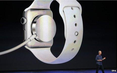
The design of the watch means that it cannot be worn while recharging
What's the psychology behind showing your audience a rapid-fire demo of your most important new product for years, then blasting them senseless with a deafening rock band? Maybe it's to bludgeon us all into submission.
Wall Street Journal:, external
OK, someone tell me why I need to share my heart rate with another Apple Watch owner. Honest question. I guess if I am very close to my caregiver.
It seems spectacular, worlds better than other solutions. No doubt there are countless other consumer companies gearing up to announce their Android Wear devices. And now, instead of simply competing with the round-faced Moto 360, they have to announce their device in the face of the Apple Watch.
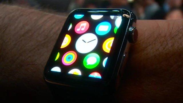
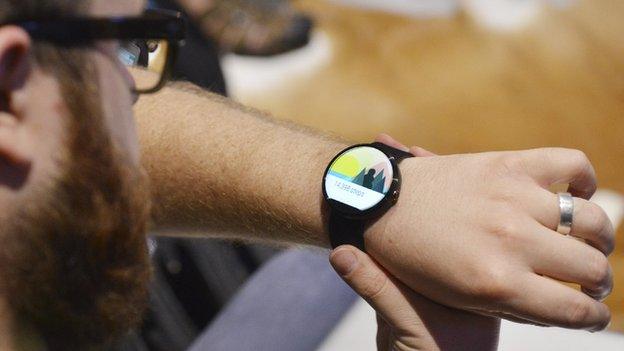
WATCH: Richard Taylor tries out the Apple Watch
Look, do we really need this? Besides, if you want to know what time it is, there's always your phone.
Twitter:
A lot of kitchen-sinking in the Apple watch. Much like the iPad launch. It's a piece of glass that could be anything, but what in particular? @BenedictEvans, external
Apple to left-handed people wondering about the lack of left hand controls on the watch: "You're wearing it wrong." @rort, external
[Apple later confirmed that the watch could be worn the other way round to suit left-handed users. However, this will mean that the Digital Crown will be located at the bottom of the device rather than at the top, as depicted in promotional images]
Apple Watch design ... #uninspiring. Thick, square, still looks like a tech geek's toy. @jasonhiner, external
I was just watching a video on the Apple Watch, and no exaggeration drooled on myself. I wish I was joking. I'm at work. @elizabiitchanna, external
Apple Watch is the antithesis of what we've come to expect from Apple. Software looks absolutely amazing, hardware design is dated and ugly. @zacharye, external
Complete standing ovation for the Apple Watch - looks utterly stunning. Am worse than drooling @stephenfry, external
Hands on: Moto 360 and Android Wear
The Apple Watch allows us to share our heartbeats. Next year: colon x-rays. Stop over-sharing, America @bobcesca_go, external
The differences between Google Glass and Apple Watch tell you a lot about the two companies... @nxthompson, external
For Apple Watch as it was for the iPad and the iPhone before that: it is all about the apps! @caro_milanesi, external
With Apple Watch, Apple Pay, is Apple changing it's naming convention from iEverything? @jaspmeshultz, external
Facebook:
I've a Breitling on my wrist. What will I do with Apple watch? Jochen Winkler, external
No mention of waterproof... in the announcement or on the Apple pages. Very disappointing. Guess no swimming apps then? Stephen DeVito, external
I would gladly pay $250 but $350 is ridiculous. Dave Hunter, external
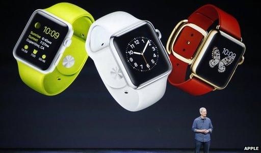
Apple has yet to detail how much it will cost to pick one of the more expensive designs
Wish it was coming out before Christmas! Debbie Argyle Treiber, external
Did you make one for left-handers? Kimberly Huebner, external
I think that the requirement for the Watch to require the iPhone should be re-thought on the next one. Cathy J Cross, external
Reddit:
The only appealing part of it in my opinion is the user interface. I can't believe I'm saying this, but a Motorola product looks infinitely more elegant and well designed than an Apple product. OsamaBeenModdin, external
I really like it... but the more I think about it there is one critical piece that keeps nagging at me. When I think of an iPhone/iPad, I am purchasing it for a limited cycle (I don't expect to keep the device for more than three years). When I buy a watch, I'm wanting to buy something that will last 10+ years. lastmessiah, external
No sleep tracking, since you're probably gonna have to charge the thing at night, removes 50% of what I want my wearable to do. arcalumis, external
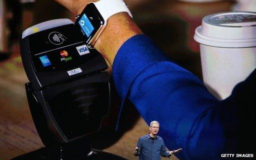
Tim Cook said Apple Watch owners would be able to use it to make contactless payments
It looked thick in the pictures alone, but when they showed it on peoples' wrists it looked a lot better. I like it. gallionator, external
I saw how the iPhone was revolutionary and how the iPad is one of the most amazing entertainment devices around, but I don't know what the watch is fulfilling. am0x , external
The battery will be make-or-break on this one. abbotleather, external
There's going to be an explosion of third-party bands and accessories, which may also serve to drive sales over the competition in the same way the accessories market for iPhone does. stultus_respectant, external

Apple has previously waited for others to pioneer new tech before leapfrogging the competition as the graphic below illustrates:
-
1973
×The Xerox Alto personal workstation
The Alto was one of the first computers to use a mouse, and an early pioneer of the “desktop” concept.
-
1984
×Macintosh 128K
Apple’s first almost-affordable, mass-market computer was launched with a futuristic ad by Ridley Scott.
-
1998
×Audible / MPMan / Rio
The Rio had just 32MB of memory – enough to store roughly an hour of music.
-
2001
×iPod
Apple launched the original iPod with the slogan '1,000 songs in your pocket'.
-
1994
×Weighing half a kilogram and featuring a rather crude touchscreen, the Simon was able to send and receive emails, as well as take notes.
-
2007
×iPhone
At the iPhone’s launch, Steve Jobs told the audience the device was 'five years ahead of any other mobile phone'.
-
2003
×Fujitsu Stylistic
Based upon what used to be known as the 'slate form factor', Fujitsu’s tablet PC could be operated with a pen or connected to a keyboard for use at a desk.
-
2010
×iPad
One million iPads were sold in 28 days after its launch in the US.
-
2003
×Fossil Wrist PDA
Developed in partnership with Microsoft and Palm, the Fossil could deliver traffic and weather reports, among other things.
-
2015
×Apple Watch
The Apple Watch comes in three ranges, each built out of different materials. All provide access to apps, notifications and activity-tracking data.

- Published9 September 2014
- Published9 September 2014
- Published9 September 2014
- Published9 September 2014
