BBC News switches PC users to responsive site
- Published
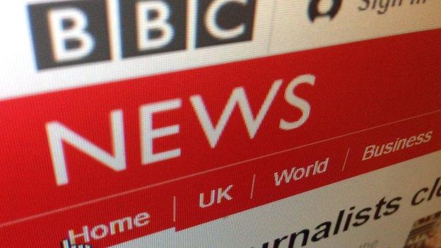
Users are now being taken automatically to the new website
The desktop version of the BBC News website has been switched off, and all visitors are now being directed to a newer, responsive design.
The new site adapts its layout depending on what type of device it is being used on, be it a desktop PC, tablet or mobile.
The BBC said the move reflected the change in how the majority of visitors were consuming their news.
However, some users said the design felt "empty" and "too bright".
Desktop visitors to the BBC News site have been prompted to try out the new responsive design for the past few weeks - but now the desktop-only site has been switched off for good.
Users are being automatically taken to the new-look site.
"We now see 65% of our visitors to the website are on mobile or tablet devices," said Robin Pembrooke, the BBC's head of product for the News and Weather sites.
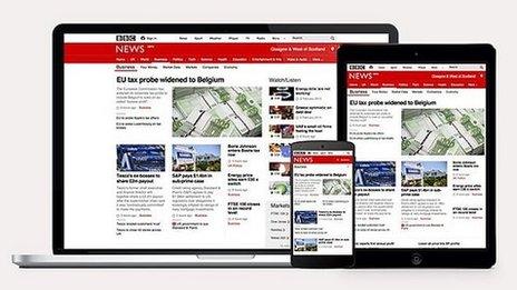
The new design adapts to different types of devices
"The old site that we had, which is now four-plus years old, was really designed with PCs in mind. Moving to a fully responsive solution which works across mobile, tablets and desktops is the way to go. It means that we can have one solution that is a web solution for all of our users."
The new layout gives higher priority to video content as well as analytical articles by BBC reporters.
Mr Pembrooke said that while the like-for-like running costs of the BBC News website will be lower, the amount the corporation spends on online will not be reduced.
"We can now start to introduce new features such as personalisation with the same size of development team," he said.
Starting point
A post on the BBC Internet Blog gives more detail on the changes and invites feedback from the public.
Initial reactions to the new design were mixed.
User almamatters on the BBC Internet Blog described the new design as "an unmitigated disaster" while another, Josh Tumath, said, "It's great to use and so quick to load."
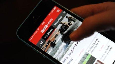
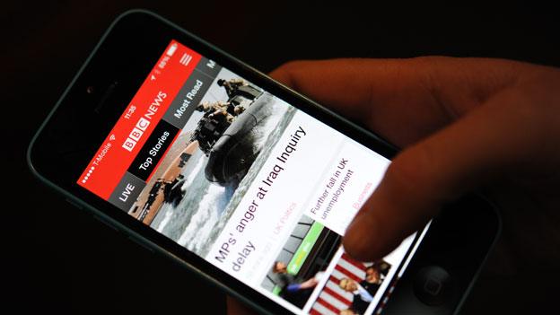
The move to responsive follows the launch of the new app earlier this year
User JoJo wrote: "Please don't do this."
Common among the complaints was that the site is too bright. Mr Pembrooke said Monday's launch was a starting point.
"I think we'll see that evolve over time. What this opens up is the possibility to start experimenting with different types of colour palettes as well - for different types of content.
"This first release we feel we've got it to the point where we've got parity with the existing site, but what it opens up is now the ability to start adding in a whole range of new features such as being able to introduce topic pages and the ability for us to start introducing more personalised features on the website."
'Big bang'
Online news veteran Martin Belam, external, currently editor of new formats at the Daily Mirror, told the BBC that redesigns of major websites are often met with shock and anger among some regular users.
"Having gone through several big redesigns at the BBC, Guardian and the Mirror over the years I have a mental checklist of the feedback I'm expecting to get each time: "If it ain't broke don't fix it", "It looks like something Fisher-Price built", "Did you let the work experience kid design this".
"Very vocal criticism online often reflects a real hardcore minority view though.
"A site will judge whether a redesign has been a success on metrics like speed, availability, cost of maintaining code, ease of making changes and of course audience growth. Those things won't always be apparent to the general user."
BBC News website editor Steve Herrmann said lessons have been learnt since previous relaunches of the BBC News site.
"The last relaunch was very much a big bang, all in one go.
"At the time we didn't give people a way of previewing or getting a sense of what it was going to be like. With this, first of all, the new site itself is actually the mobile site that we've had for some time.
"We created a promotional banner to bring it to people's attention on desktop to say have a look - with the aim of inviting people to see what we were working on.
"For me that's a critical difference."

"If it ain't broke": BBC News website through the ages
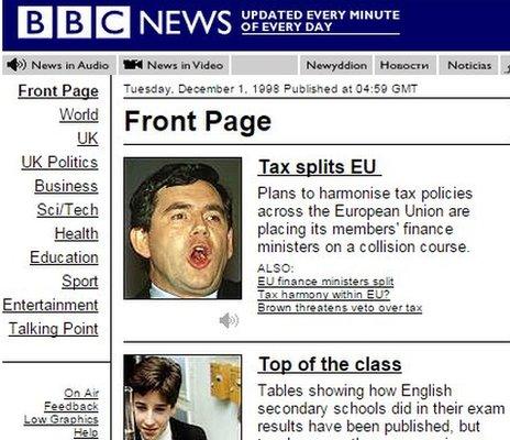
1998
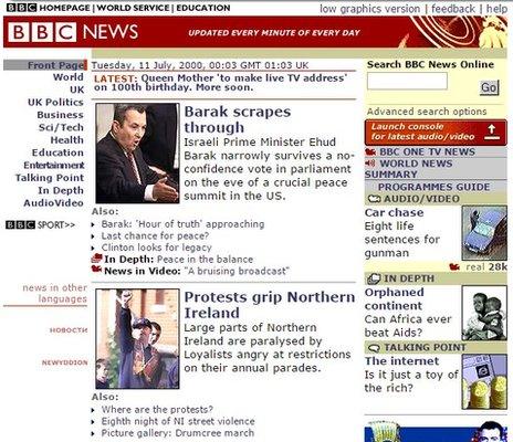
2000
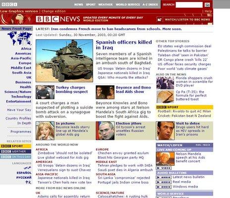
2003
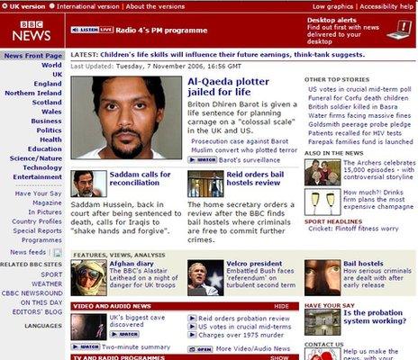
2006
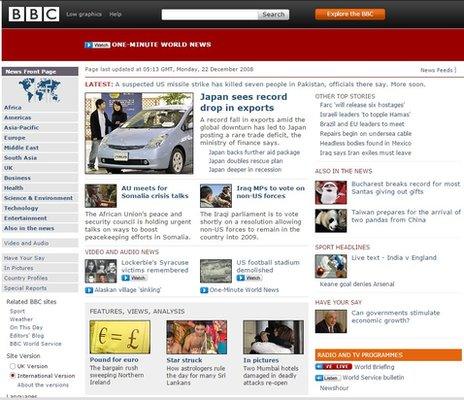
2008
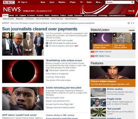
The current design, in place since 2010
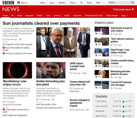
The new responsive design
- Published21 January 2015
- Published24 February 2015
