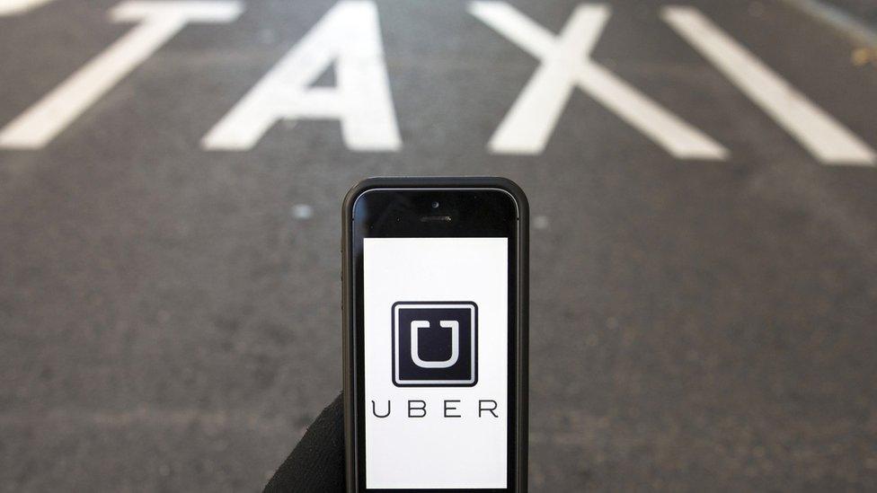
Uber drops its U. Why?
- Published
- comments

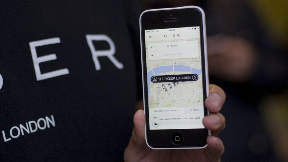
Uber's new app logos. On the left, the app as it appears to riders, with the drivers' app on the right
Before someone shouts "is Uber changing its logo really news?", let me answer that for you: no, it probably isn't.
Yet, much like my Dad's sensational perm in the 70s, a striking new look can turn heads and get everyone talking.
But, much like my Dad's sensational moustache in the 90s, not always in a good way.
On Tuesday, the controversial but extremely popular ride-sharing service unveiled its sweeping new look., external
Gone is surely the world's most recognisable "U", and in its place, an image that looks like - according to my followers on Twitter - something in between a broken polo mint and an ancient Chinese coin.
For a subdued, soft-spoken view on the company's thinking, I approached Ed Zitron.

How the Uber logo used to look
He runs EZPR, a media relations and branding agency based in San Francisco.
"It's hilarious!" he said.
"It's just quite incredible, a company that is so desperate to appear at least remotely reliable and cuddly has chosen the most robotic, Big Brother logo they could have gone for - short of just using the cover of 1984."
Well, that's one review, I suppose.
Here's how the company itself described it.
"The old Uber was black and white, somewhat distant and cold," wrote Travis Kalanick, Uber's founder and chief executive.
"This belied what Uber actually is - a transportation network, woven into the fabric of cities and how they move. To bring out this human side - the atoms - we've added color and patterns.
"The team has spent months researching architecture, textiles, scenery, art, fashion, people and more to come up with authentic identities for the countries where Uber operates."
The "authentic identity" aspect relates to colours. If you're in Ireland, your Uber app (if you can find it anymore) will be made up of different colours than if you were in, say, China.
"In Mexico," Mr Kalanick writes, "we were inspired by Mexican pink and the patterns in the local tiles; in Ireland, from the Georgian architecture and the lush greens; and in Nigeria, from the ankara, which came up again and again because of its bright colours and beautiful geometric patterns."

The colours of Ireland - as decided by Uber
The rest of the company's announcement is, of course, good old-fashioned brand-friendly mumbo-jumbo. The sort we're all used to, whether it's the new Pepsi logo, or the storm-in-a-teacup around the logo for London 2012.
For a more revealing look at the thought process, we can turn to Wired magazine, which was given the "inside view" of the rebranding.
It tells how Mr Kalanick played an extremely hands-on role in the design - "usually a bad sign," says Ed Zitron - and that he was very nervous revealing it to his employees.
To quote Wired's ominous words: "Kalanick is not a designer. He's an engineer by training and an entrepreneur by nature. Yet he refused to entrust the rebranding to anyone else."
The article goes on to talk about subdued smirks among Mr Kalanick's staff as they discussed working on his "unique" approach.
If you're one of the many millions of Uber users around the world, the app's logo has probably already changed. Familiarise yourself with it now as, in the haze of a post-pub search for a cab, you may forget such a change has been made.
Big changes to a brand's image are almost always laughed at. The more daring, the more laughs and claims a six-year-old could have done better.
Most daring for Uber is getting rid of the U. When an Uber pulls up, it's the U that reassures you in the window. And few Silicon Valley companies dare stray from having some aspect of their name in the logo. Think Google, with its new G, or Facebook's F.
Let's hold too much judgment on whether this is a good call by Mr Kalanick. In most cases, people slowly get used to a new look and forget it was ever even a subject for debate.
And let's face it: Uber, with its enormous marketing budget, could make its logo a picture of a soggy tea-bag and still make a success of it.
Follow Dave Lee on Twitter @DaveLeeBBC, external and on Facebook, external
- Published2 February 2016
- Published19 January 2016