The mystery of the 'golden cohort'
- Published
- comments

The life experience of British people born between the years 1925 and 1934 has long had demographers and insurance companies scratching their heads.
For reasons which remain unclear, individuals within this slice of the UK population have been living longer and healthier lives than groups both older and younger.
Today the Office for National Statistics returns to the mystery of the so-called "golden cohort", external, trying to understand better why the members of the generation born in the midst of the Great Depression have been enjoying higher rates of mortality improvement throughout their adult lives.
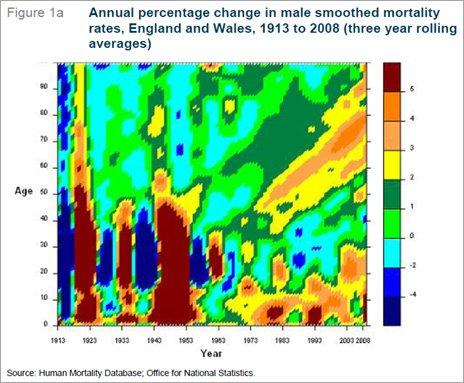
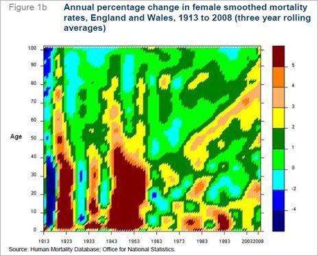
One tool used to track the golden cohort is a heat chart which, in this case, looks at annual mortality improvements for men and women. It takes a bit of explaining, but the diagrams reflect the social history of Britain over the last century or so.
Starting with men (Figure 1a), the most obvious feature of the heat chart are the vertical bands of blue and brown in the bottom left corner. Blue represents worsening mortality and brown improving, so the blue slice closest furthest to the left is the cohort decimated by World War I and the influenza pandemic.

The next blue column is thought to represent the consequences of the Great Depression and the third coincides with World War II. The fourth, incidentally, is believed to reflect the fatal fashion for smoking earlier in the century. The pattern is repeated but less marked for women (Figure 1b) during the first half of the 20th Century.

What has been baffling academics, though, is the yellow and orange pattern which runs diagonally upwards from around age 40 on the right-hand side of the both charts. Follow the line down to the x-axis and you will see that the people within that blessed blob were born between 1925 and 1934. It is the home of the golden cohort.
Today's analysis suggests that members of the golden cohort got off to a good start in life. Britain was experiencing rapid improvements in infant and child mortality at around the time of their birth. Deaths from diphtheria and tetanus began to fall rapidly with the introduction of immunisation and there were improvements in hygiene and nutrition.
During World War II, those aged between 16 and 40 saw mortality worsen significantly of course, but the golden generation were generally too young to serve and were often evacuated from danger.
The post-war period saw the golden cohort begin to experience a sustained period of mortality improvement until cigarettes caught up with it. The slight break in the diagonal line between the mid-fifties and the mid-seventies probably reflects a tobacco cull but, for those who survived the impact of smoking, the encouraging story resumed.

Did wartime rationing improve life expectancy?
Dodging two world wars and the odd epidemic might explain why the golden cohort survived more successfully than previous generations. Improving health and safety accelerated the progress. But the real mystery is why subsequent generations did not benefit to the same extent.
Going back to the heat charts, one can see another golden cohort developing in the bottom right-hand corner - people born in the mid-60s and later are also enjoying significantly improving levels of mortality. But why is there a valley of green and pale blue between the two warm zones? Why did the golden generation do better in terms of improving mortality than the generation born between 1955 and 1965?
One theory is that the golden cohort benefited from rationing. The wartime diet was richer in fruit and vegetables and with much less saturated fat than later in the 20th Century. Today's ONS analysis suggests that such a diet during adolescence and early adulthood "may have improved general health during childhood and later".
I suppose if one was weaned on healthy food, it may have instilled habits which would have been beneficial throughout life. But couldn't the reverse be true - that being deprived of less healthy foodstuffs during the war years might have inspired even greater consumption when they returned?
As someone who finds himself firmly within the green and blue valley of disappointingly flat mortality improvement, I am interested in any theories on why my generation - blessed by a period of phenomenal economic growth and medical advance - didn't perform better in the life expectancy department.
I have a theory. We know that contented, happy people tend to be healthier and to live longer. We also know that the golden cohort coincides with a generation that appear to be the happiest of any.
They grew up during decades when the privations of war and austerity inspired a strong sense of community. The baby-boomers, by contrast, were indulgent - too much food, drink and individualism. Could that be a factor?
The conclusion of today's ONS paper says that their analysis "does not suggest any clear explanation for the golden cohort experiencing greater mortality improvements than the cohorts born on either side". Oh well. The mystery continues.