BCP council logos 'appalling' and 'terrible' say critics
- Published

The four new logos have been drawn up by council staff and a local design agency
A council's new logo designs costing £4,000 look like they have been "knocked up by a five-year-old", according to one critic.
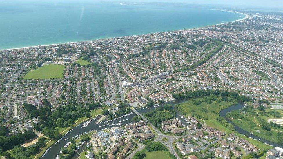
The logos have been drawn up for Poole, Bournemouth and Christchurch (BCP) councils, which are due to merge in April.
They have been described as "appalling" and "terrible" by some councillors.
The council said a recognisable logo was needed to show "the planned change has taken place".
However, Councillor Mark Howell, of Poole People & Independent Group, criticised the designs.
He said abbreviating the name to BCP made the authority seem like "a well-known parking company".
Poole councillor Phillip Eades said: "These options are pitiful. They bear no resemblance to the local area and could have been knocked up by a five-year-old.
"We are told we must have a new logo and 'brand' because otherwise residents won't pay their council tax bill or parking tickets - it is laughable."

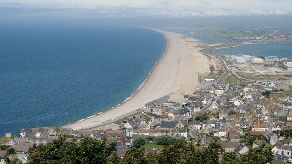
Weymouth & Portland, Dorset County, East Dorset, North Dorset, Purbeck and West Dorset are set to form one of two unitary councils in the county next year
Bournemouth councillor Nick Rose said: "I have never seen such appalling and pitiful attempts at branding."
He said it was "a waste of taxpayers' money".
The Bournemouth, Poole and Christchurch (BCP) shadow executive committee said its own staff and a local design agency had worked on the logos.
In a joint statement it said: "The four designs are only at concept stage at the moment and will be developed further following feedback from residents, as well as councillors and BCP staff."
Dorset's nine authorities are due to become two unitary councils in April.
- Published31 October 2018

- Published20 July 2012
- Published9 October 2018
- Published23 August 2018