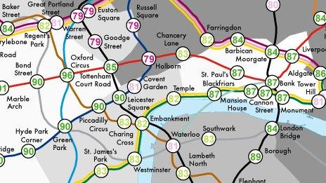
Tube map used to plot Londoners' life expectancy
- Published

The map shows life how life expectancy varies between different Tube stations
A version of the Tube map has been produced to show how life expectancy varies from station to station.
The contrast it depicts between Tube stops is stark, with the variation in life expectancies of children born near stations only minutes apart being years different.
The map - called <link> <caption>Lives on the Line</caption> <url href="http://life.mappinglondon.co.uk/" platform="highweb"/> </link> - was created by University College London (UCL) researcher Dr James Cheshire and shows some startling results.
For example, it shows there is a 20-year difference in life expectancy between those born near Oxford Circus and others born close to some stations on the Docklands Light Railway (DLR).
Newborns around Star Lane are predicted to live, on average, for 75.3 years in contrast to 96.4 years for those near Oxford Circus.
'Different patterns'
Elsewhere, there is a six-year difference between Pimlico and Vauxhall - consecutive stations on the Victoria line, but on opposite sides of the River Thames.
In 2008, the London Health Observatory showed that if travelling east on the Tube from Westminster, every two Tube stops represented more than a year of life expectancy lost.
This work inspired Dr Cheshire's latest research, which uses data based on government statistics showing life expectancy at birth for those living around the stations.
"I wondered if different patterns emerged across the Tube network," he said.
He said he chose to use the Tube map as "it's famous the world over and something most Londoners can relate to".
Dr Cheshire said the map showed that "if you're impoverished as a child, your diet may be poor and sadly it can follow you for the rest of your life".
Other disparities depicted on the map are no less striking.
For example, if you travel eastbound between Lancaster Gate and Mile End - 20 minutes on the Central line - life expectancy decreases by 12 years.
But not all the Tube lines show a trend depending on which direction you travel.
"London is a city that's very diverse and one of its great characteristics is that rich and poor people live side by side," Dr Cheshire said.
'Two cities'
Stations serving east London's Olympic Park fair badly and contrast with the Olympic volleyball venue at Earl's Court, in west London, whose spectators will be passing through areas with far higher life expectancies and lower child poverty.
Shadow Health Minister Diane Abbott, who is MP for Hackney North and Stoke Newington, an area where life expectancy is plotted as being relatively low, said the map showed "a tale of two cities".
"You need to send more money to where it is needed, and that's the poorer boroughs," she said.

Dr Cheshire analysed patterns across the network
She suggested the government "needs to look at children's diets, fizzy drinks machines in schools, school meals and stopping the advertising of junk food".
Public Health Minister Anne Milton said: "The link between life expectancy and deprivation is well established.
"That is why from next April, for the first time we are introducing a ring-fenced public health budget for local communities to better target the causes of poor health in their area."
Michael Marmot, a UCL professor who has advised the government on public health, said the map "captures how stark the health equalities are in a very small geographical area".
"If you want to see a difference in life expectancy between countries of 11 years, you can fly from London to Guatemala," he said.
"But if you are worried about your carbon footprint, you could just catch the Tube east.
"The difference between Hackney and the West End is the same as the difference between England and Guatemala in terms of life expectancy."
Sir Michael said life expectancy was affected by "early child development, education, employment and working conditions, having the minimum income to live a healthy life, the environment and the issues of smoking, obesity, drinking and diet".
- Published17 February 2012
- Published31 December 2011
- Published31 July 2011