Tube 150th anniversary: Brand 'worth its weight in gold'
- Published

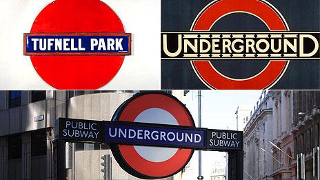
The Underground's roundel has evolved since it was first introduced in 1908
It may be the oldest subterranean railway in the world but it is not the largest or even the busiest.
Yet the words the Tube have come to represent a part of London that is known the world over.
London's Underground, 150 years old this week, has become an "instantly recognisable brand" which stands out from similar services in other cities and has become a lucrative part of the city's tourist industry.
Its red, white and blue signs, famous map design and even warnings to passengers to "mind the gap" have become internationally recognised.
Mark Heavey, director of marketing and advertising for the Metropolitan Transportation Authority which operates New York's subway, said: "The roundel - the disk and the bar graphic, really in all of its forms, I find to be instantly recognisable as the embodiment of London Underground brand.
"It exudes so much history, British tradition, and really screams London as much as Big Ben, red phone boxes or double-decker buses."
When the Underground was launched in 1863 its aim was to keep the congested city moving.
By 1900 the network was expanding under different companies and names, therefore rail bosses felt the need to integrate it.
The roundel as a logo was born in 1908 as a unifying symbol and the network came to be known as the Underground, or simply the Tube.
'Underground bullseye'
Mike Ashworth, London Underground's brand and heritage manager, said: "I don't think there was ever a real eureka moment in terms of development of our brand.
"It was really a practical requirement.
"What they needed was a way of very clearly showing a name on platforms, very crowded with posters and other signs, so the reutilisation of the blue bar merely by putting a red ring around it which draws the eye's attention to it."
The roundel started out as a solid red disc and it was not until 1925 that it became the hollow ring with a blue bar that is used today.
"There are lots of urban myths about how the roundel started," Mr Ashworth said.

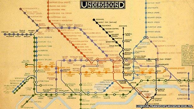
Henry C Beck's map visualised the Underground network as an electrical circuit
"For example, it was reckoned in 1908 that the chairman of the company was a very good rifle shot and it was based on a target at Bisley shooting ranges."
Frank Pick, who joined in 1906 and later became the chief executive, is credited with making the logo a brand by incorporating it in posters and extending it to buses.
He also commissioned Edward Johnston to create a unique typeface in 1916.
Johnston incorporated the font in the 'Underground bullseye' in 1925 and gave the logo its current form.
And this is what New York, the world's largest subway network which began in 1904, lacks, Mr Heavey says.
"In New York City we don't have the same unifying element that people look for.
"We have some subway entrances that have a globe, there's others that do not and it is certainly not as consistent as it has been in London for over a century.
"That's really the hallmark of branding, it's consistency."
The next defining moment in the Tube brand came in 1931 when Henry C Beck, an engineering draughtsman who was laid off during the depression, submitted a design for a map based on an electrical circuit.
In 1933 the Underground agreed to trial print 750,000 copies of the geographically inaccurate but simple map for public use. It quickly became popular in London and abroad.
"Very famously in 1938-39 Sydney actually copied the Tube map to such an extent that we did write and ask them to think again," Mr Ashworth said.
The roundel and the map made the Underground a brand which has "spawned its iconic status", said Nikki Crumpton, chief strategy officer for advertising agency McCann-Erickson London.
She said: "Together they make sense of what London is on the surface as well as below the ground.
"As a Londoner, born and bred, it is how I see London in my mind's eye.
"It is more than infrastructure. It has, like a brand, a physical product but also a design system and a logo, I would suggest as well known as Coke or VW or IBM.
"It has stature and permanence, and a sense of timelessness... maybe what we should compare it to is Westminster or the V&A, the Louvre."
Unlike gushing foreign visitors, Londoners seem to pass by the familiar symbols, but Mr Ashworth believes they have more regard for it than perhaps they realise.
He cites the example of LU removing the River Thames from the Tube map in 2009 "because we felt that the diagram was getting too cluttered".
"We had numerous people getting in touch with us," he said.

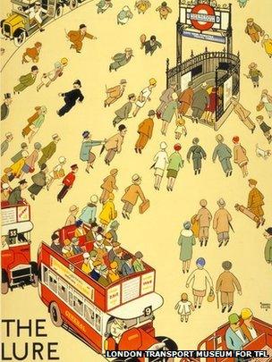
'The lure of the Underground' poster from 1927 was very popular
"It was probably one of the most lively debates we have ever had about anything we have done as a company and those calls came in from London and national and international."
"It shows not only how important it is to us as a company but also to those who use it," he added.
As the Tube became popular people came looking for souvenirs.
"London Transport and its predecessor Underground Group of companies sold posters and large maps to the public from some time in the 1920s," Mike Walton, head of trading at the London Transport Museum, said.
"The first tentative forays into merchandising with souvenirs began in the 1960s and stepped up in volume in the mid 1970s when it was realised that many private companies were using the organisation's properties to sell cheap merchandise without any of the benefit of the sale passing back."
The museum earns about £2.5m annually from its official outlets and foreign visitors account for 35% of the revenue.
The "most enthusiastic" buyers are French, Italian, Spanish, Brazilians, Mexicans and Chinese.
And this figure does not include items, such as Mind the Gap T-shirts and Tube map tea towels, sold in many shops and stalls across London.
So as the Underground turns 150 will we see its brand icons change much?
"We are of the opinion that if it ain't broke you don't need to fix it. (It is) worth its weight in gold to the company," Mr Ashworth said.
"I think we will hang on to the bare bones of look and feel as we move forward for the next 100 years of service."