Covid-19: An end to two years of statistics and BBC whiteboards
- Published

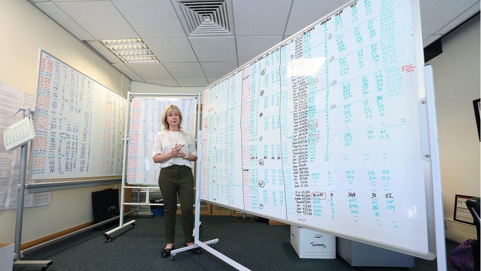
The health team stuck to whiteboards instead of spreadsheets because "seeing and writing those numbers everyday was more tangible"
What has been a daily Covid marker for more than two years has come to an end.
Am I sad? Absolutely not. However, it is a significant moment in Northern Ireland's Covid-19 story.
For more than two years, the Department of Health published the Covid-19 daily dashboard statistics online.
That ended on Friday when the final post said there were "262 positive cases reported in the past 24 hours and no deaths have been reported in that period".
But while publishing the data has ceased, Covid has not.
Over the past two years, my colleagues and I in the BBC NI health hub transferred the daily data on to huge whiteboards that consumed our office.
In March 2020, we thought one board would suffice.
By May 2022, we had used up four large boards all filled with numbers both back and front.
Allow X content?
This article contains content provided by X. We ask for your permission before anything is loaded, as they may be using cookies and other technologies. You may want to read X’s cookie policy, external and privacy policy, external before accepting. To view this content choose ‘accept and continue’.
Every single number represented a person, a man or a woman who each had a story.
At the beginning, families told us that they did not want their loved ones remembered as just a statistic.
My colleague, Catherine Smyth, and I took turns filling in the board - at first the writing was neat and orderly - but our patience dwindled.
I recall one of us saying: "This will probably last around three months."
In those early days, we often knew the person behind the number, but then the numbers exploded and we just couldn't keep up.
As days unfolded into weeks and months, it became impossible to put a name and face to every statistic.
Among those who spoke to us was Brenda Doherty, whose mum Ruth was one of the earliest deaths to be reported in March 2020.

Brenda Doherty's mother Ruth was one of the first people to die with Covid-19 in NI
From a WhatsApp conversation in her living room, and just hours after receiving the call from the hospital that her mum had died, Brenda told me her mum would not be hidden behind a number and instead she asked us to publish photographs.
Many others did the same.
The daily bulletin gave the number of deaths, inpatients, cases, care home outbreaks, hospital bed occupancy and other general notes.
For some, it became the Covid bible; for others the statistics just added to the Covid myths and misconceptions.
Back in March 2020, when our world changed, the figures were tweeted by the Department of Health each day at 14:00 BST.
The peak was early March, after the school half-term and a popular holiday time for families.
As we learned over the two years, travel meant the virus spread and the numbers increased.
Over time, a pattern emerged - holiday periods triggered a rise in numbers and our boards would look busier.
Our white-board markers were replaced three times.
By May 2020, like the virus, IT systems had advanced and the Covid-daily dashboard went online.
For journalists, the 14:00 Covid alert provided vital information which would determine how our lives would roll for the following weeks and months.
We were advised by several number nerds on Twitter and while we stuck to our white boards, they studied spread sheets.
I recall one particular night in February 2021.
The executive was preparing a pathway to recovery road map, we reported the rolling seven day average for deaths in Northern Ireland stood at six expected deaths per day.
While that wasn't the worst, the enormity of the past year finally hit me.
Surrounded by the whiteboards, I realised this Covid emergency was far from over.

I have been asked why whiteboards and not spread sheets?
Seeing and physically writing those numbers in red, green and black each day was more tangible, less technical.
By writing the numbers, often with others looking on, it triggered conversations - it was almost therapeutic.
Programme producers and presenters gathered in front of the boards and discussed the numbers before programmes.
They are a physical chart of a time most of us would choose to forget, but know for various reasons they cannot be erased.
I cannot wipe them
The whiteboards preserve a real-time image of the pandemic as it unfolded over two years.
As someone tweeted: "They are a work of art... remembering the people behind the stats."
Could they be part of a Northern Ireland pandemic memorial? I hope so.
I cannot wipe them - that would be like erasing time.
Related topics
- Published26 April 2022

- Published20 May 2022
