Key election numbers
- Published
There will be more economic statistics before the Westminster election. One of them might even tip inflation into negative territory.
And although that terrifies some economists, because that way lies a vicious spiral, most people for now are enjoying cheaper fuel, food and all those retail discounts.
So the numbers we got this week are quite likely to be the important ones that shape the election campaign.
And if the economy matters as much as usual, they are also the numbers that stand a reasonable chance of shaping the election result.
At week's end, we learned - to no surprise - that the government deficit remains huge.
With a big lump of inflowing January tax receipts from the many who are now self-employed (it's reassuring that they're making some money on which to pay tax), there was a bumper one-month surplus.
So the UK government is now back on target to spend in excess of £91bn more than it takes in during this financial year. Some target.
And it's a rather different target from the one it had when the coalition took office. It planned to eradicate the deficit by this looming Westminster election.
The fact the Conservatives and Lib Dems have failed to do so, and by such a wide margin, is one of their opponents' main complaints about the government's claims of economic competence.
But equally, the continuing need to get the deficit down is a big issue for all the parties to address. Even the SNP is now doing so. And that's where Conservatives think they're on the strongest ground.
The economic figures that get a lot of attention through a recession are Gross Domestic Product (GDP). That's because it is these very numbers by which a recession is defined.
There were fears at one point of not only a double dip recession (two periods of at least two quarters of declining output from the entire economy), but perhaps a triple dip.
It wasn't that bad. There was only one big dip of recession, in 2008-9. But it has been a bumpy ride since then:
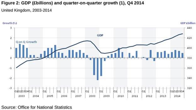
The dark line shows steady growth until the financial crisis hit, with a sharp downturn and a slower growth trajectory since the start of 2009. Only recently has the economy returned to its pre-recession level of output.
The Scottish economy behaved in a similar way to the UK one. The downturn was a bit less severe, and there has been a bumpier recovery from it. This is how the Scottish government's statisticians portray it:
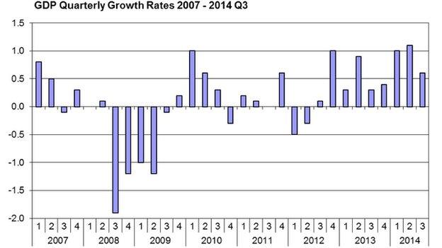
GDP is important, and the slow nature of the recovery will weigh on the economic debate over the coming weeks. But GDP growth, or lack of it, is no-one's personal experience. Jobs and pay are more likely to have a bearing on individual voters' thinking.
This week, we learned how they have been performing up to the end of last year, with helpful illustrations by the Office for National Statistics.
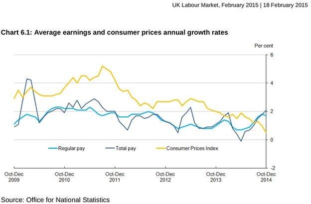
This shows what has happened to earnings over the past five years. Increases have been very weak, partly because workers have not been in a strong position to push for higher pay rises, and because their productivity growth has been unusually flat.
The gap between the yellow line, showing what's happened to prices, and the light blue line, showing pay plus bonuses, represents the erosion of spending power.
In other words, wages have been rising very slightly, and not as fast as inflation. Only in the past three months has (blue) pay pulled ahead of (yellow) inflation. But only just, and far from making up for the lost spending power. The most recent inflation figure was 0.3%, heading downwards, while pay in January was up 2.1%.
Remember that this shows averages. Some people have faced a higher effective inflation rate - if, for instance, they have to spend a big share of their income on heating.
And average earnings don't tell the full story of those who have failed to keep up with them, who have not been working as many hours as they wanted or needed to, and those families that have faced a cut in tax credits and benefits.
So that chart tells you only a bit about the "cost of living crisis" the Labour leadership is keen to emphasise - an argument that gets more difficult to make now that there are rising average real earnings.
What about jobs?
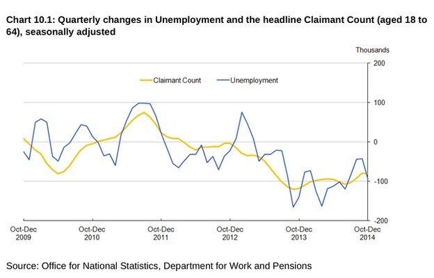
The claimant count of those on Jobseekers Allowance (the yellow line) has been falling for several reasons, including benefits reform.
It is the blue line that has received most attention, since the 1990s, as a measure of unemployment: those saying they were seeking work at some time during the three-month period covered in each set of statistics.
The unemployment story looks spiky, but the trend has been downward. That's not what the history of recessions tell us ought to happen Unemployment has previously picked up as the post-recession recovery takes hold.
But there is now flexibility in the British labour market which appears to have been helpful in limiting the extent of unemployment, including the rise of the self-employed.
And that flexibility also helps explain why private sector employers have been hiring in very big numbers.
While public sector employment has fallen, total UK employment was up 609,000 last year to 30.9m. The UK now has the highest number of employed women ever, as their retirement age has risen.
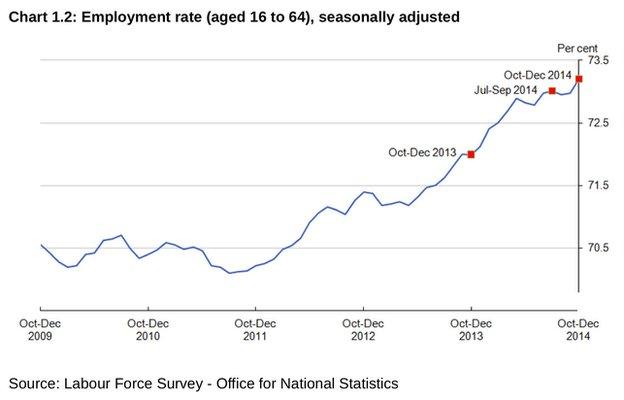
What this does not tell you is the quality of the jobs, or their pay and attractiveness, or about people doing jobs which don't match their skills, or which don't offer the hours they want or need. And all those issues will feed into people's feelings about the strength of the labour market.
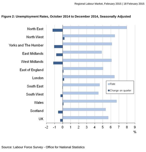
Nor does it tell you about variations around Britain, because unemployment looks rather different in the south-west and the north-east of England:
Even within a region or a country such as Scotland, there can be a lot of variation, though the data only shows that for the claimant count:
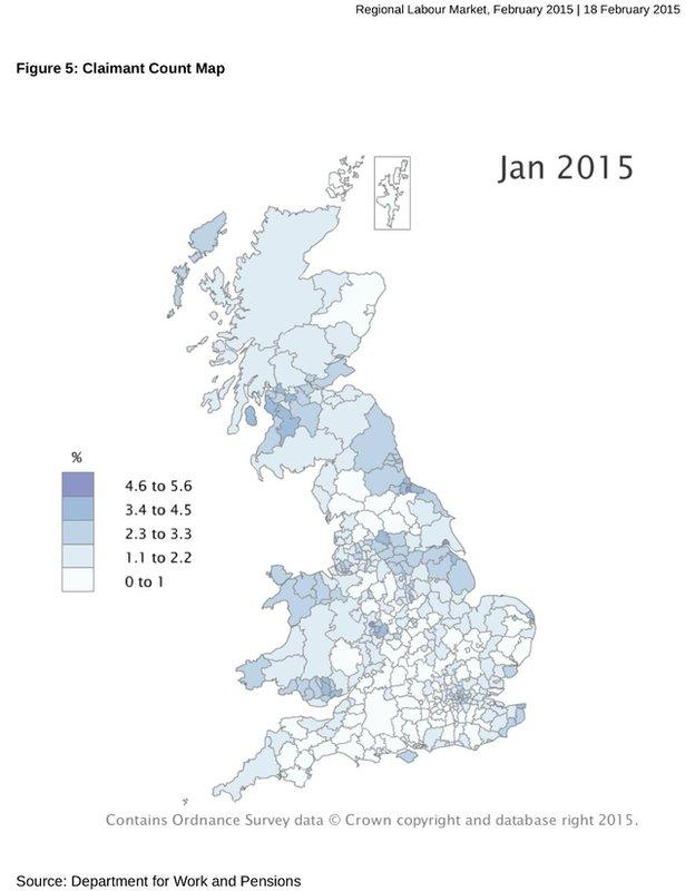
The difference between north-east Scotland and east and north Ayrshire is as wide as anywhere in the UK.
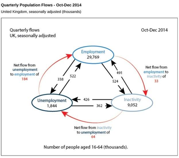
Nor does the topline figures tell you about churn through the labour market over the course of three months of labour market surveying. People move in and out of jobs, and in and out of being available for work.
The Office for National Statistics has been experimenting with its data. It's not that reliable yet, but - if you like your economics graphically - the number crunchers have come up with these estimates:
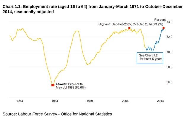
In any case, the jobs picture looks rather happier than in the big recession of the 1980s which brought such a shake-out of old industries:
According to Oxford Economics, assessing these statistics, we ought to feel like we're enjoying something called 'joyflation'. The thinking goes like this; the fall in inflation with a likely dip into a falling price index is added to gradually accelerating wage growth, and then allied to an extra £600 of earnings free of income tax starting from this April's pay slips.
The consultancy's spending power index is at its highest for six years, and it is estimated that 2015 will see it rise to its highest for 13 years.
Now, one issue which pollsters tell us is a big concern for a lot of voters is immigration. "They're taking our jobs" is the complaint. Is that true? Well, the ONS offers us this:
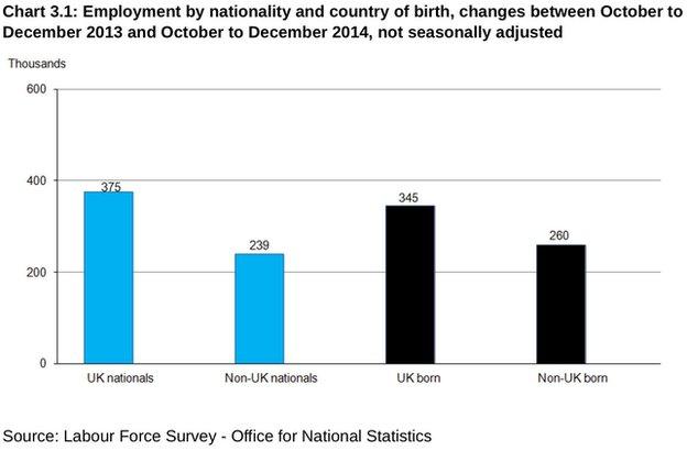
This gives us a breakdown of the growth of 609,000 people in UK employment during last year. What this doesn't tell you is how many 'non-UK born' people are UK citizens whose mothers happened to be abroad when they gave birth. Nor does it tell you how many UK nationals are benefiting from the opportunity to work elsewhere.
But it does suggest that, proportionate to their numbers, non-UK nationals and people who were not born in the UK are relatively good at getting jobs.
Why? Ask the employers. You'll often get answers about scarce skills and positive attitudes to work.
And if Britain pulls out of the EU - another big issue for this election - you can see why employers might be unhappy about the consequences for their recruitment pool.
- Published19 February 2015
- Published19 February 2015