Could pylons ever be pretty?
- Published
- comments

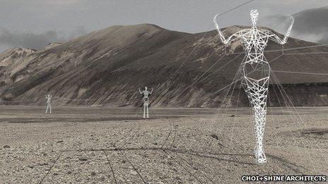
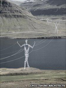
Humanoid pylons, highly commended in an Icelandic contest
Electricity pylons, little changed since the 1920s, may get a makeover with a new international design competition. Are transmission towers icons or eyesores?
Where is your nearest pylon?
Except for those living almost directly under one, many will be hard pressed to say. These giant man-made structures are now part of the landscape.
But can a pylon be a thing of beauty? On Monday, the UK became the latest country to run a pylon design competition, open to entries from around the world.
This is for practical as well as aesthetic purposes. More will need to be built to link new generating schemes - be it wind, hydro or nuclear - to our electricity sockets. The alternative, laying cables underground, costs more and requires wide swathes of land to be dug up.
Since more are to be built, what should they look like?
For some, the transmission tower is already a thing of stark beauty. Photographers and pylon-spotters appreciate the geometry of the lattice structure.
Poets, too, have found inspiration in the march of grey steel across the landscape. So popular was pylon imagery in the 1930s that it lent its name to a school of poetry.
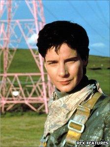
And they have been immortalised in film - a pink one in particular in Among Giants, in which pylon painters Rachel Griffiths and the late Pete Postlethwaite found love among the high-voltage wires.
Steady march

The humanoid towers use the same modular structure as standard pylons
Iceland's Landsnet power company ran a similar design competition in 2008. Highly commended among the entries was one for humanoid pylons from Massachusetts-based architects Choi + Shine. It also won the 2010 Boston Society of Architects Unbuilt Architecture Award.
Landsnet has now joined forces with Norway's TSO Statnett to assess the feasibility of building the best designs, says CEO Thordur Gudmundsson.
"Lower visual impact was of special interest here. We were also looking for masts that would be erected as standalone towers at special places of interest, such as the man and woman towers of Choi and Shine."
Other companies around the world have also expressed interest in their design.
It draws on both art and industry, says Jin Choi, citing the twin inspirations of Giacometti's spindly, elongated sculptures, and massed pylons marching away from a hydro-electric scheme in Quebec.
While the materials and construction methods are similar to standard pylons, one point of departure is the colour - white instead of gun-metal grey.
"These are not trying to disappear into the landscape, but to make a contrast against it. And with proper lighting, it could become a tourist attraction," says Choi.
"It has the potential to be quite beautiful, especially against the dark lava rocks and grey Icelandic sky."
Co-designer Thomas Shine says public opinion on pylons is split. "There are people who would rather see nothing - they think all power generation and power lines are a bad thing and spoil the environment.
"Then there's the view that if you have to have power lines, wind turbines and power masts, at least if they are pretty and attractive, that helps. So we took something that was an eyesore and made it into something beautiful."
Delicate design
Even the original designers tried to make a virtue of the huge steel transmission towers.

The pink pylon in Among Giants was pulled down in 2003
The British design chosen in 1927 by leading architect Sir Reginald Blomfield sought to be more delicate than the brutalist structures used in Europe and the United States, and closer to the true sense of a pylon - an Egyptian gateway to the sun.
The first went up in July 1928 near Edinburgh, and the last of of 26,000 went up in the New Forest in September 1933 - ahead of schedule and on budget.
But only after a vociferous anti-pylon campaign, says urban historian Bill Luckin, of the University of Bolton.
"Did the Central Electricity board feel genuinely threatened? The archives suggest they felt very threatened. So many of the people involved in the protest movements were so eminent - what the electrical press called 'impractical aesthetes'."
These "impractical aesthetes" included the economist John Maynard Keynes and the author Rudyard Kipling, co-signatories of a letter to The Times in 1929 decrying plans to erect pylons in the rolling green of the Sussex Downs.
Some concessions were made to the anti-pylon brigade. But nothing could stop the grid.

Wind turbines, too, split opinions
"They are largely transparent to a large extent. You look through them, rather than at them," says Ross Hayman, spokesman for the National Grid. "That was part of the original intention, as well as improving their wind resistance.
As well as the see-through design, planners try to lay pylons below the skyline to be less intrusive.
But second only to motorway networks, pylons are the biggest manmade addition to the landscape.
"The German attitude tends to be that new features, if properly planned, can enhance the landscape," says urban planner Sir Peter Hall. "In Britain, since the dawn of the rail age, it's been the opposite, that they take away from the quality of landscape."

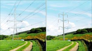
Pylon v mono-pole - an alternative offered already by the National Grid
The National Grid offers alternative mono-pole designs in public consultations, but the results have been inconclusive, says Hayman. "People tend to prefer the old lattice design."
At a public meeting in Shropshire recently, village residents demanded to know how a proposed wind farm would connect to the national grid. When told the new power line, whether underground or overhead, would connect to existing pylons nearby, the response was "what pylons?"
"I took them to the window of the village hall and pointed out the pylons about a mile away. They'd become so used to them, they'd stopped noticing them."