Just Jeb! Five things Bush's logo tells us about him
- Published
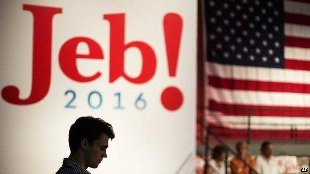
What's in a logo? Given that presidential hopefuls are packaged and presented more and more like corporate advertising campaigns with million-dollar marketing budgets, candidate iconography has become the subject of close inspection and, quite often, open derision.
It was only two months ago, after all, that the Hillary Clinton arrowed-H design generated a raft of instant analysis and puzzled headshaking.
Now Jeb Bush has unveiled his campaign logo in all its simple, retro-styled glory, and the whole process repeats itself.
But does the logo shed any light on the candidate? Here are five possible things Mr Bush's presidential campaign logo could be revealing.

1. He's worried conservatives don't love him
Nothing says you're excited about the prospect of being president like ending your logo with an exclamation mark. It's an excitement that can be a challenge for Mr Bush, who often presents a quieter demeanour in public appearances and is an admitted introvert, external.
Unfortunately for Mr Bush, if there is excitement on his part, it hasn't always been reciprocated by the masses. While the candidate continues to sit near the top of the polls, enthusiasm for his candidacy among his party's rank-and-file is muted, at best. Many grass-roots Republicans view him as insufficiently dedicated to the kind of confrontational conservatism that has become de rigueur in today's politics.
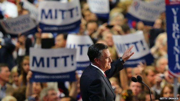
Exclamation marks haven't had much success for presidential hopefuls
Milton Glaser, a veteran graphic designer responsible for the iconic "I heart NY" design of the late 1970s, says the exclamation mark is meant to "generate a sense of enthusiasm and excitement. Jeb doesn't seem to be a personality who achieves that goal, so you kind of have to invent it for him and indicate that you're enthusiastic."
From a design standpoint, he says it is "not outrageously ugly". The exclamation mark balances out the heavy "J" in Jeb, he adds, giving it "some modest visual distinction".
Mr Bush isn't the only candidate who has tried the positive punctuation on his campaign material. Mitt Romney, Lamar Alexander and Michael Dukakis employed some version. Of course, none of them went on to become president.

2. He sticks to his principles
Mr Bush during his pre-campaign period has emphasised his consistency over the years. He doesn't change positions - on immigration, on education - based on the mood of the Republican electorate.
"I'm not going to change who I am," he said, external last week. "I respect people who may not agree with me, but I'm not going to change my views because today someone has a view that's different."
He also doesn't change logos.
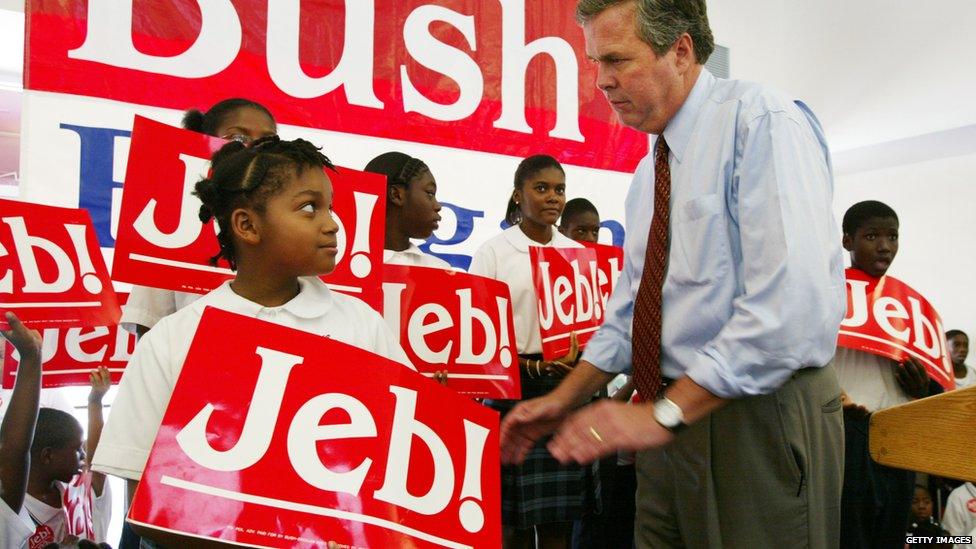
Bush has used the exclamation mark before - including his 2002 gubernatorial run
Mr Bush first used "Jeb!" as far back as 1994, during an unsuccessful campaign for governor of Florida, and he has stuck with it ever since.
Mike Murphy, a campaign operative advising Mr Bush who is rumoured to be behind the logo design, noted this, external in a recent tweet: "Why Jeb! logo works well: clean, easy to see from far away, upbeat and, most of all, consistent."

3. His surname brings baggage
He's Jeb. Just Jeb. Although few people will forget that the former Florida governor has a presidential pedigree, the Bush surname is conspicuously absent on his logo.
"The important thing about the Jeb logo isn't the exclamation point that is there," tweets, external the Atlantic's David Frum, a former George W Bush speechwriter. "It's the last name that isn't there."
Speculation abounds that the logo is a deliberate attempt to distance the candidate from his family name - a move that Mr Bush himself has acknowledged in the past.
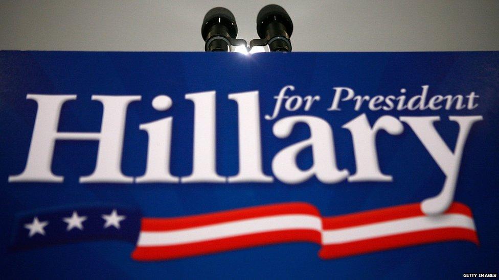
Hillary Clinton also dropped her famous last name in her 2008 presidential signage
"I love my father and my brother," Jeb Bush said in February. "But I am my own man."
Then again, as journalist Mark Silva points out, external, back in 1994 when Mr Bush first unveiled his logo, his father had just carried the state of Florida in the 1992 presidential election. "Why would he run from that in '94? " he tweets. "Pure nonsense."
One could argue that the logo distances Mr Bush from his entire name, since "Jeb" appears nowhere on the candidate's birth certificate. It's a nickname drawn from his initials, John Ellis Bush.

4. He doesn't want to appear TOO serious
If the Republican Party were a font, it would probably be Times New Roman. Conservative, traditional, formal.
The logo, on the other hand, practically oozes a casual informality, with its rounded lettering and pointed serifs on the J and B.
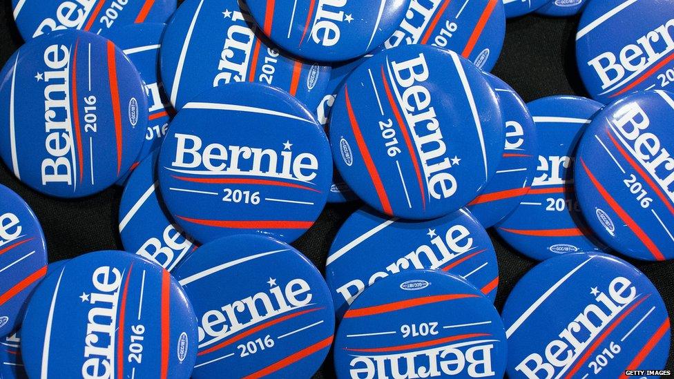
Less traditional fonts are usually the province of less traditional candidates
Mr Bush has said, external that his campaign "is going to be fun" - and the logo could be a way of showing it.
The font, says Glaser, "is the only modest distinction. Instead of using a familiar gothic or something, it shows something that's a little bit eccentric - but not too eccentric."
But what, exactly, is the name of the font Mr Bush uses? Stephen Coles, of the website Fonts in Use, suggests, external that it's a "very heavy, late Twentieth Century version of Baskerville" - a font that a 2013 study, external found to be most trustworthy.

5. He's not as bombastic as his rivals
And what about the colours, red on a white background? Red has become the unofficial symbol of the Republican Party. The states they win are almost always coloured red on the electoral maps by major media.
There's blue, as well, in the logo's "2016". But while the design has the colour of the American flag, it doesn't feature the same patriotic flourishes of Ted Cruz's flag flame, Marco Rubio's US map dotting his "i" or Rick Santorum's red-and-white bald eagle.
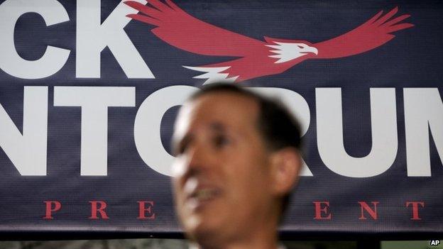
Rick Santorum goes all-in on US patriotic imagery
While many other candidates have been heavily pushing an assertive foreign policy, including calls for more active military efforts against the Islamic State, Mr Bush - perhaps because of his brother's mixed history of overseas entanglements - has employed restrained rhetoric. His logo, it seems, reflects that.
Restraint, bordering on emptiness, is the bottom-line observation on the logo, as far as Glaser is concerned.
"All in all it's a modest, maybe accurate attempt to position the candidate to being not openly committed to anything," he says. "It's a mark with no symbolism except the word and the exclamation point, which means nothing."
But, he adds, "it could have been a lot worse".