What does a fashion designer make of Scottish clubs' face masks?
- Published
With face masks mandatory in shops in Scotland, various football clubs have launched their own branded versions. But which one look like pair of speedos? And which resembles a tea towel?
BBC Scotland asked fashion designer Siobhan MacKenzie for her opinion some of the designs...
Celtic
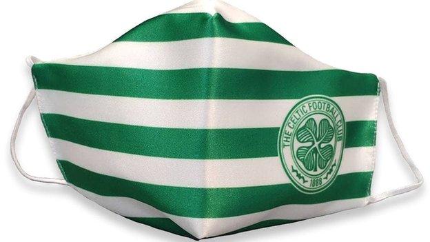
From a branding perspective, it's good. If you were going to wear it to a game with your Celtic jersey - it's perfect, but it's maybe not something to wear out and about. Masks are going to become the new accessory so you want them to go with different outfits as well.
I'd have liked a more refined option. Perhaps something more subtle - a plain green, white or a black mask with a logo incorporated somewhere so it could be styled with what you're wearing and not quite so in your face.
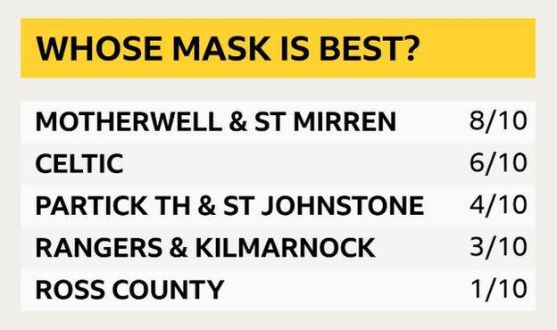
Mark: 6/10

Kilmarnock
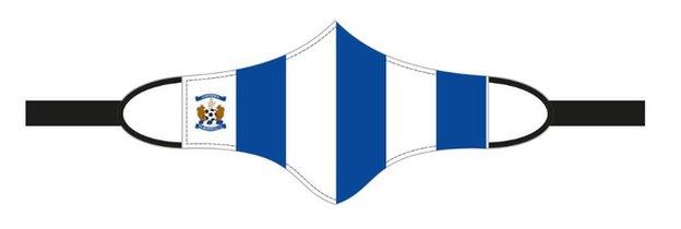
It looks a bit like a tea towel. There's quite a lot going on. It's practical but I don't love the design.
I don't know if the logo is just getting lost in all the stripes. It could have been a bit more simplified. It's an intricate logo so that could've maybe been emphasised.
It's a practical option but I don't know if its very stylish. If you're using the ear loops, those Velcro straps would just be flapping about.
Mark: 3/10

Motherwell
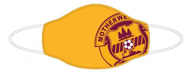
I like this one. You can tell there has been a bit of thought gone in to the design. It's a simple but effective. It's not over the top.
The club crest is incorporated in there without it just being plastered on. It is sort of teased and the colours of it match up nicely to the strip, so branding wise it works really well.
Mark: 8/10

Partick Thistle
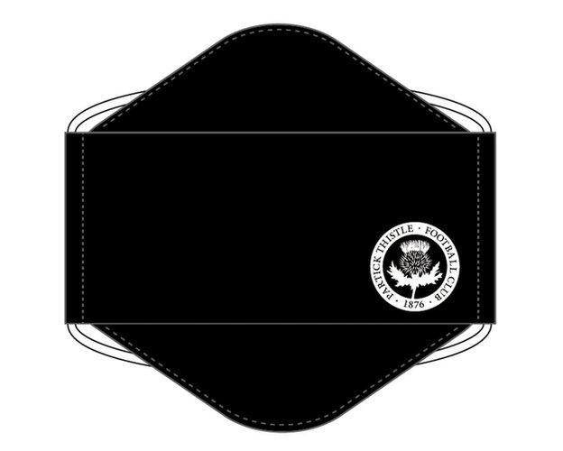
It's a bit too simple. I would've liked to have seen a small bit of red and yellow injected in there to portray the team colours without it being overbearing. A little hint of colour would've been a really nice touch. It's going to get lost in quite a saturated market of black face masks.
Maybe they wanted it more professional looking to wear out and about, but a pop of colour would tie it more in to the club. It could work but I'm sure the fans would've maybe wanted something to reflect the team better.
Mark: 4/10

Rangers
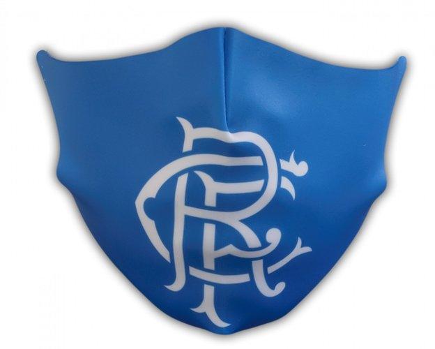
My dad's going to kill me for this because he's a fan, but I think it looks like a pair of Speedos. I would've expected something a bit better from a club like Rangers.
This mask doesn't look very functional and the material looks quite poor from the picture - hopefully it might be a little better in the finished product.
If Rangers want a new one designed, they can give me a shout - I'm sure my dad would be happy.
Mark: 3/10

Ross County
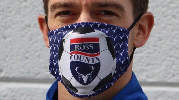
They're my local team so I would've loved to have liked this but, oh gosh, it's a lot. There is so much going on - the printed materials and then a football and a team logo on top of that. Its far too garish.
This is a good example of when people cut corners from having things properly designed. It kind of looks like a child has done it - is that a bit brutal?
It could've been a nice, plain mask, a stag and the crest incorporated in somewhere.
Mark: 1/10

St Johnstone
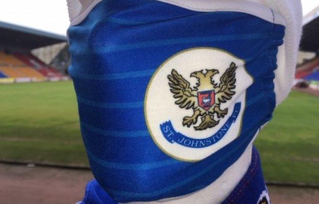
The material looks like its really hard to breathe out of; like its made out of the strip material.
The design concept is good - the blue with the fine stripe and the crest - but the execution of it is perhaps what's gone wrong. Maybe the crest could've been embroidered to make it a bit richer looking.
Mark: 4/10

St Mirren
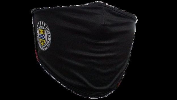
Its a nice mask. They've stuck with the team colours, the crest is a really good size and isn't just plastered on, but its recognisable and you can tell it is St Mirren. The material looks like its good quality.
It's subtle but has the right sort of design elements. You could put this on with any outfit and it would go.
Mark: 8/10
