Australia's beloved weather website got a makeover - and infuriated users

Farmers are angry - they argue the information they need is now hard to find
- Published
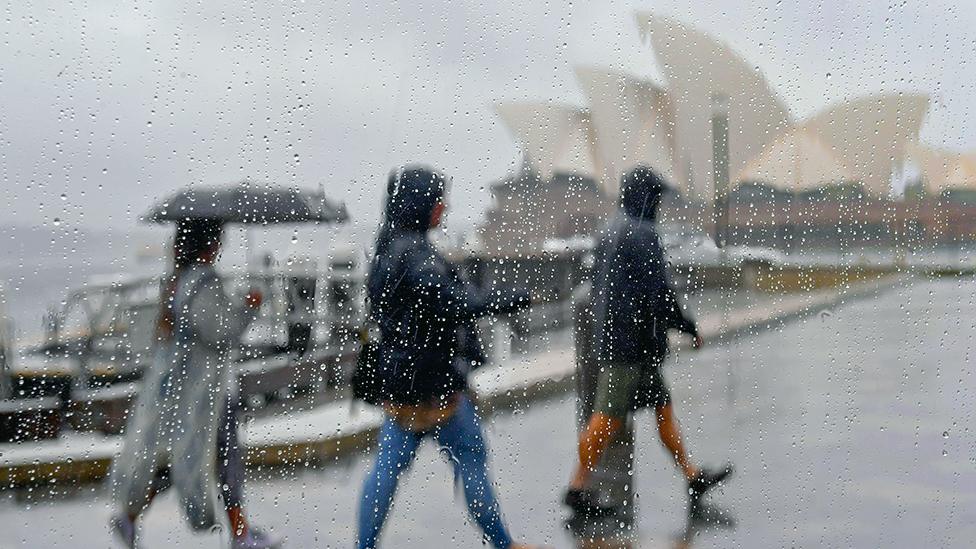
It was an unseasonably warm spring day in Sydney on 22 October, with a forecast of 39C (99F) - a real scorcher.
The day before, the state of New South Wales had reported its hottest day in over a century, a high of 44.8C in the outback town of Bourke.
But little did the team at the national Bureau of Meteorology foresee that they, in particular, would soon be feeling the heat.
Affectionately known by Australians as the Bom, the agency's long-awaited website redesign went live that morning, more than a decade after the last update.
Within hours, the Bom was flooded with a deluge of complaints. The hashtag #changeitback went viral.
Gripes ranged from the new colour scheme for the rain radar, to furious farmers and fishermen who could no longer put in GPS coordinates to find forecasts for a specific location.
And then, this week it was revealed that the site's redesign had cost about A$96.5m ($62.3m; £48m), 20 times more than the previously stated A$4.1m.
"First you violate expectations by making something worse, then you compound the injury by revealing the violation was both expensive and avoidable," psychologist and neuroscientist Joel Pearson told the BBC, explaining the public outrage.
"It's the government IT project equivalent of ordering a renovation, discovering the contractor has made your house less functional, and then learning they charged you for a mansion."
'Game of hide and seek'
A consensus was quickly clear: "Please bring back the previous format," one person surmised on social media.
"It's awful, the most useful features are gone and it's not user-friendly. A waste of taxpayer money," another added.
Others said the timing was poor: "Why change it on a day of severe weather?"
There were some fans, including one who posted: "I like the new site. The front page is much cleaner". But they were few and far between.
Less than 48 hours after the launch, the Bom released a list of tips, external on how to use the new site, but this was further mocked by disgruntled users.
"Terrible! You shouldn't need step-by-step instructions to navigate the site," one post read.

Social media has been flooded with complaints about the new site
With more than 2.6 billion views a year, Bom tried to explain that the site's refresh - prompted by a major cybersecurity breach in 2015 - was aimed at improving stability, security and accessibility. It did little to satisfy the public.
Some frustrated users turned to humour: "As much as I love a good game of hide and seek, can you tell us where you're hiding synoptic charts or drop some clues?"
Malcolm Taylor, an agronomist in Victoria, told the Australian Broadcasting Corporation (ABC) that the redesign was a complete disaster.
"I'm the person who needs it and it's not giving me the information I need," the plant and soil scientist said.
Others appeared to accept their fate: "I am sure we will get used to it but it is not intuitive at all."

Many users say they found the old version easier to navigate
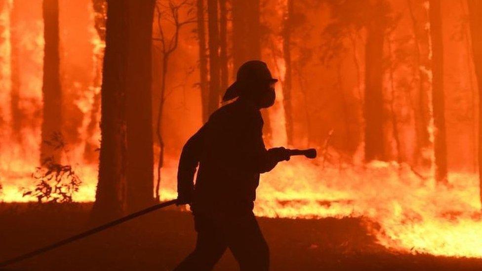
Exactly a week after the debacle, the acting head of the agency was forced to apologise. There were concerns that people had been underprepared for storms in Queensland because of the site's poor usability.
The outpouring prompted the federal government to issue a scathing rebuke of the Bom and order immediate changes to the site.
"The bureau clearly has work to do, in that it has lost community confidence in the new website," Energy Minister Chris Bowen said at the time.
In a bid to calm the storm, parts of the previous site were brought back to life, giving people the option to use the old features.
A month after the relaunch, the new head of the Bom - who started his role during the saga - admitted the changes had been "challenging for some" and again apologised for the confusion.
"Inherently, we don't, and won't, always get it perfectly right. But, we are constantly striving to get better," Dr Stuart Minchin said.
But he kicked off another round of criticism by revealing the revamp actually cost $96m, a figure which covered a full website rebuild and testing of the "systems and technology that underpin" it.
Immediately, the government demanded Bom explain how taxpayers' money had been spent "efficiently and appropriately," according to the Sydney Morning Herald.
Barnaby Joyce, a member of the Nationals, which mainly represents regional communities, said: "We spent $96m to put a B at the end of the Bom site. It's now bomb, it's hopeless."
New site 'scrambling' people's brains
On the day of the launch, the Bom assured Australians that the community had been consulted on the changes. A test site in the months leading up to the relaunch found customer satisfaction rates were consistently above 70%, they told the BBC.
"The tsunami of complaints suggests that consultation was either perfunctory or they listened to the wrong people," Mr Pearson said.
For years, farmers and emergency workers had developed what neuroscientists call "procedural memory" for reading weather patterns using the site, he explained. It's muscle memory like touch-typing or driving a familiar route home.
"Your fingers know where the keys are, your hands know when to turn."
But when the new site changed the radar's colour scale, long-time users were left scratching their heads as their "hard-won intuition for reading storm intensity became unreliable overnight".

The old colour scheme included black which users said was a useful indicator
The new site, Mr Pearson said, "was scrambling the neurological shortcuts that people had spent a decade building".
"It's like rearranging all the furniture in your house and then expecting you to navigate it in the dark without stubbing your toe. Except the 'furniture' in this case determines whether you move your livestock before the flood arrives."
For sociologist Ash Watson, the collective reaction to the site reflected its special status in Australia.
"Australia has always been a large country of weather extremes, and Bom's cultural importance has really been cemented in recent years as we've experienced more severe weather and the rising impacts of climate change."
As a regular user of Bom's site, Ms Watson acknowledged the good intentions behind the changes, but said her research - on the social impact of tech - showed that people are getting fatigued by change.
"It can be hard for people to get excited by new updates and see their immediate benefits when they don't want to have to learn how to use yet another new platform, app or website."

The Bom website performs an essential role in times of disaster
This is not the first time the Bom has weathered a publicity storm.
In 2022, it spent hundreds of thousands of dollars on a rebrand, asking to be called either its full name or "the bureau", not the "weather bureau" or "the Bom", given the negative connotations.
But the campaign was short-lived. They eventually released a statement saying the public was welcome to use whatever name they wished.
The incident reflected a fundamental misunderstanding of how the culture of naming works, Mr Pearson said.
Australians had organically adopted "Bom" as a term of affection, like a nickname for a friend, he said.
"When the institution tried to correct this, it felt like being told you're pronouncing your mate's name wrong."
He said the site's redesign revealed a similar "cultural blindness but with higher stakes".
In a statement, Bom's spokesperson told the BBC it had received about 400,000 items of feedback on the new site, which accounted for less than 1% of the 55 million visits in the past month.
The responses were "both positive and negative", they said, with fans saying they liked the new design and presentation, the accuracy and reliability of the forecasts, and greater ease in using the site on different types of mobile devices.
But it was clear that people had "formed strong habits", the spokesperson said, and further changes may be made based on the feedback.
Related topics
- Published19 September 2023
- Published8 November 2022