Climate Stripes projected on to landmarks

The graphic shows the change in average annual global temperatures since 1850, represented as colours
- Published
The iconic Climate Stripes graphic has been updated to show the figures for 2023, the warmest year on record.
To mark Show Your Stripes Day, the graphic from the University of Reading has been projected on to landmarks across the world including the BT Tower in London and Story Bridge in Brisbane, Australia.
A new colour had to be added to the graphic in order to depict the average temperature in 2023.
Prof Ed Hawkins, the climate scientist who created the image, said he hopes it will inspire "conversations" and action to reduce warming.
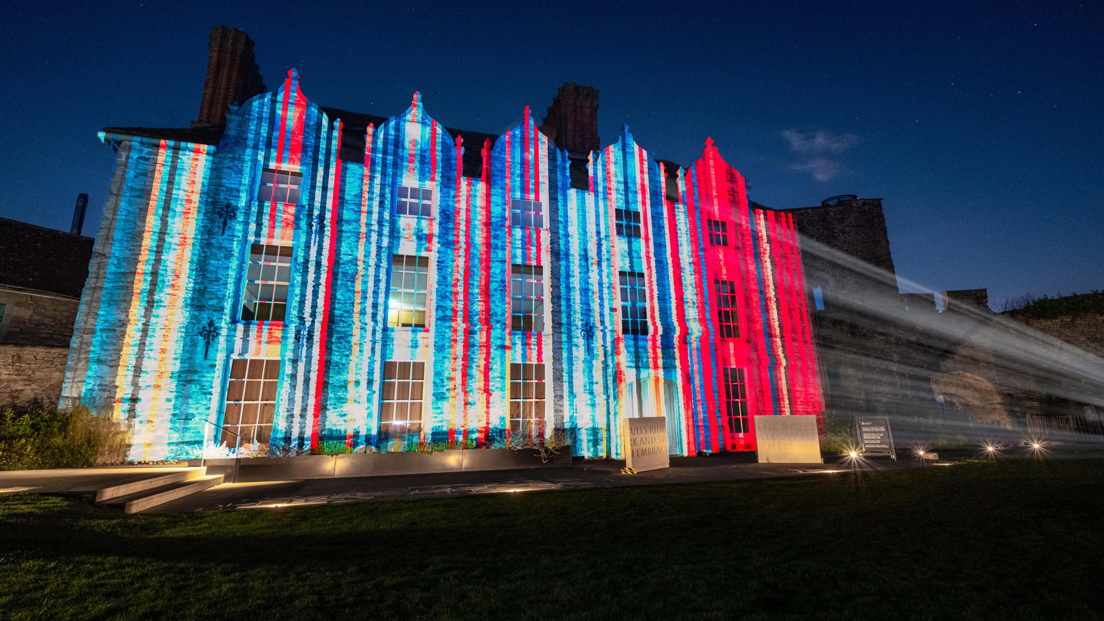
The stripes were projected on to Hay Castle in Hay-on-Wye
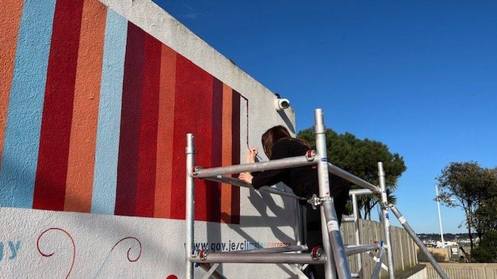
The climate stripes show the change in average annual global temperatures since 1850.
Red stripes indicate hotter years and blue stripes indicate cooler years, against the average of the period 1961-2010.
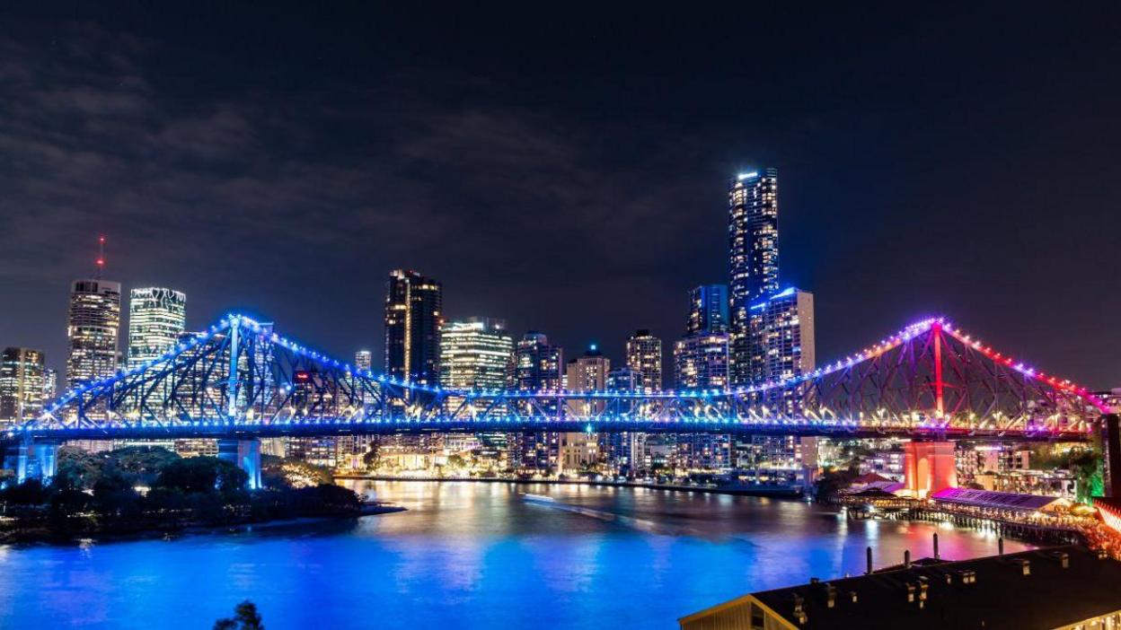
Queensland’s climate stripes were projected on to bridges in Brisbane
Prof Hawkins said 2024 has also so far "broken all of last year's records every month".
He said the data made him feel "pretty uncomfortable", adding: "It highlights what's happening to our planet."
"We are continuing to burn fossil fuels and add carbon dioxide to the atmosphere at an extremely fast rate and that is causing global temperatures to rise.
"That's leading to more intense heatwaves, more heavy rainfall events which is causing suffering all over the world."
He said the idea of the graphic is to "enable anyone to understand the problem that we're facing with a single glance".
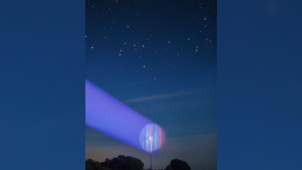
The stripes were projected on to a wind turbine in Stroud
On Friday night, the graphic will be projected onto the Tower of London, and displayed in Times Square in New York City.
It will also be visible outside the Red Bull Arena Leipzig, Germany, before the Euro 2024 match between France and the Netherlands.
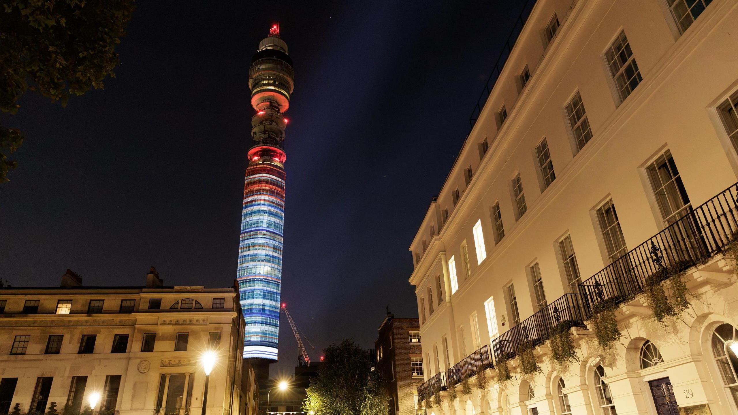
BT tower in London also sported the stripes on Thursday night
"Start conversations about our warming world, and take climate action," said Prof Hawkins.
"The faster we act, the less bad the climate consequences will be."
Follow BBC South on Facebook, external, X (Twitter), external, or Instagram, external. Send your story ideas to south.newsonline@bbc.co.uk, external or via WhatsApp on 0808 100 2240, external.
- Published7 March 2024
- Published5 January 2024
