Climate stripes need new colour as world warms

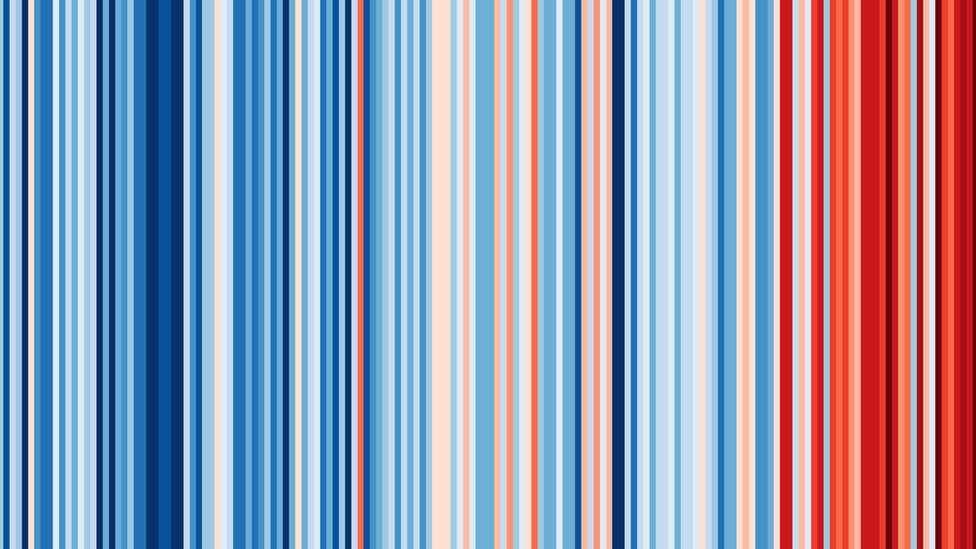
The iconic stripes show the change in average global temperatures since 1850
- Published
Global temperatures were so hot in 2023 that the latest climate stripes image needs a new colour to show it, its creator has said.
The stripes show the change in average annual global temperatures since 1850, with red indicating hotter years and blue cooler ones against the average of the period 1971-2000.
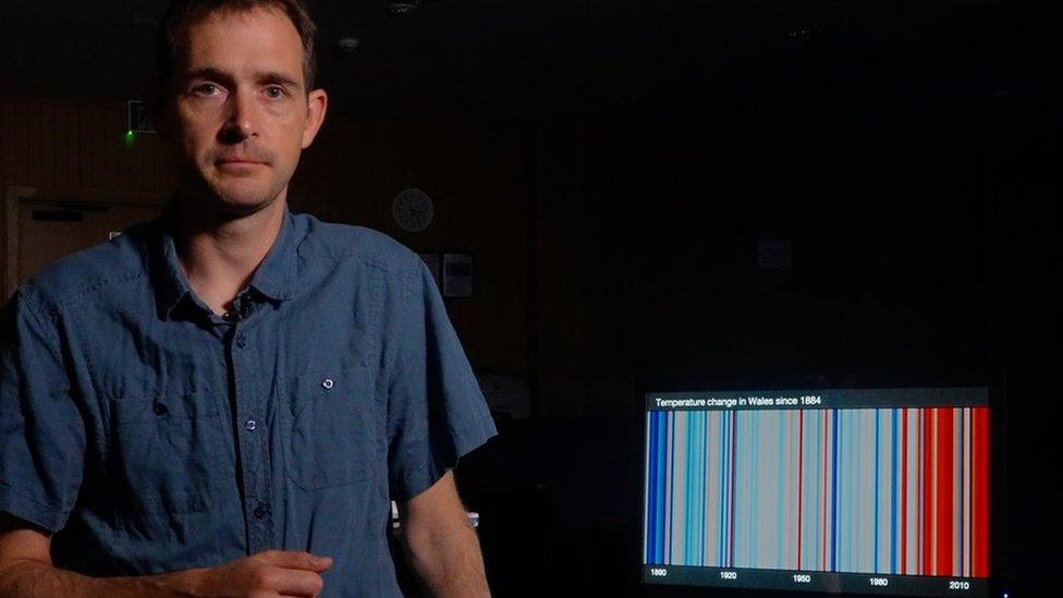
Prof Ed Hawkins, from the University of Reading, has published the first updated image for the globe using the latest interim data for 2023 and said the darkest red from the current scale will not tell the full story.
"2023 was off the end of the scale," he said.
On Tuesday, the Met Office confirmed 2023 as the hottest year on record for Wales and Northern Ireland and the second warmest on record for the UK as a whole, just behind 2022.
Prof Hawkins said the need for a new colour "was always going to happen at some point".
"But the margin of record breaking in 2023 has still been a surprise," he said.

The Met Office announced 2023 was the second hottest year on record for the UK
The stripes represent billions of pieces of scientific data, collected over more than a century, in a single image.
Over the past year, the stripes have been seen on Envision Racing’s new Formula E racecar, on the White Cliffs of Dover and on Toronto’s CN Tower.
In 2022, the stripes were displayed on a local bus and incorporated into Reading FC's new home kit.

The stripes were beamed on to the White Cliffs of Dover in June last year
Prof Hawkins said "we already have many of the solutions we need" to tackle climate change.
"We now need bold, transformative change across all parts of society to make our planet’s climate safer for current and future generations," he said.
“The climate stripes are all about starting conversations about climate change, and 2024 has to be the year we turn conversations into faster action."
Follow BBC South on Facebook, external, X, external, or Instagram, external. Send your story ideas to south.newsonline@bbc.co.uk, external.
Related topics
- Published2 November 2021

- Published22 June 2021
