COP26: Climate change graph 'needs more colours' as world gets hotter
- Published
From the catwalk to the side of a Tesla, the lines graphic has become a symbol of our warming planet
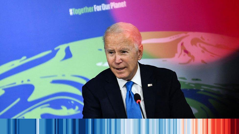
The man behind a global warming stripe graphic said he's going to need more colours to represent future years in a warmer world.
From London Fashion Week to BBC News branding, Prof Ed Hawkins' visualisation has become an international symbol of climate change.
Each line represents the average temperature for a year - blue for colder years and red for warmer.
Colours will just get darker, he said.
Prof Hawkins said choices made at COP26, the climate summit in Glasgow, will determine how dark the colours get.
The graphic was first used by the Reading University academic at the Hay Festival in 2018.
He said: "I was looking for a way of very simply communicating the fact that our planet is warming and so I made a set of stripes for Hay.
"I could instantly see that members of the audience realised that something was happening and they could instantly visualise the fact that the planet was warming and that was affecting Hay itself."

Wales' warming stripe graphic shows a gradual change to it's hottest days in the least 30 years
The colourful representation of temperature changes is now available for every country around the world, external.
Using the sequence for Wales from 1884 to present day, the colours gradually change from blues, to oranges, to dark reds.
The hottest years were in the past 30 years.
"This is a signal of our warming world," said Prof Hawkins.
"This data is critical for policy-makers making decisions. It tells us that Wales has warmed about one-and-a-half times faster than the global average.
"So for every two degrees [Celsius] that the global temperature increases, Wales will increase by about three degrees in temperature."
The stripes' climate history plays a key role in working out what's next for global warming.
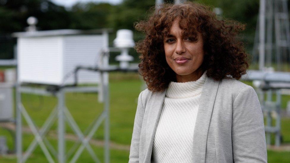
Prof of paleoclimatology Joy Singarayer said it's humans causing the changes
Professor of paleoclimatology, Joy Singarayer, said studying the past is important to understanding the future.
So, as temperatures and CO2 levels have been higher historically, why are there concerns this time around?
She said: "It's not due to natural variations in our orbits, in solar cycles or in volcanic eruptions and so on."


Prof Singarayer said it's humans causing the changes.
"In Wales for example we can see evidence of that, from glacial valleys that have been scoured out by ice sheets to other evidence on the landscape of as warm, or warmer than present temperatures," she said.
Fall Bay, on the Gower, near Swansea, shows evidence higher temperatures in the past.
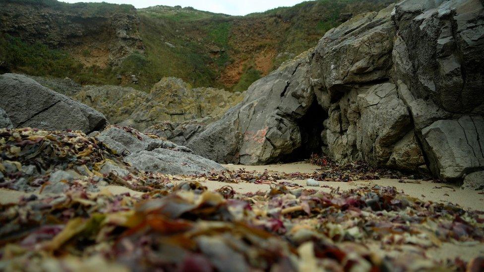
Raised rocks on the beach on Gower is evidence of where sea levels would have been
The shells of sea creatures and pebbles shows the sea level from 125,000 years ago - up to nine metres higher than it currently is.
Prof Singarayer says an extreme series of circumstances could result in water raising to similar levels in the future.
"We think we might see half a metre or a metre sea level rise by the end of the century, depending on our carbon emissions and most of that currently is due to ocean thermal expansion so as the world is getting warmer, the oceans are also getting warmer and so the volume of those is increasing," she said.
"But there's potential for ice melts in the future, from Greenland and Antarctica in particular and that will contribute to rising sea levels.
"We think that happened in the past. So that is part of the reason why we see those raised beaches there.
"In a kind of drastic climate change scenario where we don't reduce our carbon emissions, something like that may well be possible in several 100 years' time. And the difference from that past scenario is that climate change is undeniably being caused by us now."
There is a limited time to act if the world is to stave off the worst effects of global warming, she said.
Interpreting the past plays a crucial role as we live through what could be a turning point in the future of the climate change.

BLACK AND WELSH: Celebrate our multicultural nation; humour, pride and lived experience
HAYLEY PEARCE PODCAST : Tackling the issues that make your group chats go off

Related topics
- Published25 October 2021
- Published15 November 2021
