Tube map redesigned by Essex lecturer goes viral

Maxwell Roberts said he had not expected his version of the TfL map to be such a hit
- Published
A new version of the London Underground map designed by a University of Essex lecturer has gone viral.
Harry Beck's 1933 Tube map is the one people usually use, but Maxwell Roberts, from Walton-on-the-Naze, created his own version in 2013.
Mr Roberts has now updated his creation, and it has had a million engagements within 24 hours.
"I wasn't expecting it to go that crazy. That is the most crazy map I have ever released on social media," he said.

Maxwell Roberts was first captivated by the London Underground map when he was five
Mr Roberts's map uses circles to show colour-coded routes for all 11 lines.
He said he was inspired to update it after Transport for London (TfL) released an advertising map for mobile phones which also had a circles-and-spokes design.
"Lots of people said to me, 'TfL have borrowed your circles idea'," Mr Roberts said.
"And I thought, 'Let's not complain, let's go back to my original circles map and let's make it better this time'."
A TfL spokesperson said the original Tube map was "an iconic piece of world-renowned design" and there were no plans to change it.

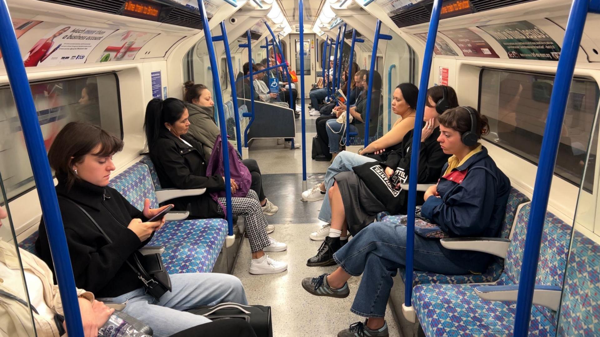
The London Underground map is one of the most recognisable in the world
"While there have been some previous 'circular' designs of a London Tube map created by fans and other designers over the decades, [the new] design was specifically created in-house by our design team for this campaign and only shows the London Underground lines, external," the spokesperson said.
Mr Roberts said he had initially created his map in 2013 as a bit of a "joke".
Referring to the new update, he said he thought: "Let's apply the design rules properly this time."
He added: "I also thought, 'Let's get the geography as well because, with maps, shapes and geography are important. Let's try to make my map better than TfL in every way'."

Mr Roberts's map uses circles to show colour-coded routes for all 11 lines.
Since releasing his update a few days ago, Mr Roberts said: "I think it is quite fun comparing it with the TfL circle map.
"When you compare it with the number of likes and the number of engagements, TfL have lost the battle of the circles maps."
Walton man designs his own Tube map
- Attribution
Follow Essex news on Facebook, external, Instagram, external and X, external. Got a story? Email eastofenglandnews@bbc.co.uk, external or WhatsApp us on 0800 169 1830
- Published12 September 2012
- Published12 August 2024
- Published5 August 2024