London Underground map gets curves in lecturer's design
- Published

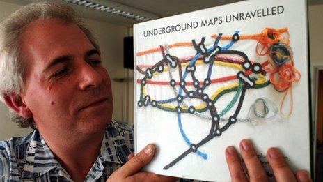
Psychologist Dr Maxwell Roberts has spent the last 10 years studying global underground maps
Harry Beck's 1933 London Underground map is a design classic.
In prioritising clarity over geography, the electrical engineer's map of the underground triggered a revolution in the way transit routes were represented.
Its colour coded lines and network of vertical, horizontal and 45 degree diagonal lines remain to this day.
Almost 80 years on, and some experts have started to question whether the central design tenets of the map need a rethink.
One of them is Dr Maxwell Roberts, a psychology lecturer at the University of Essex.
He has spent the past decade studying underground maps from around the world.

Dr Maxwell Roberts has spent the past decade studying underground maps from around the world.
And he believes the current London tube map can be improved.
"Harry Beck did a really nice job with the map," said Dr Roberts. "It was ahead of its time and is a very good design for all sorts of reasons."
He said that before Beck's design, the underground maps showed "all the twists and turns of the lines and showed the chaos of reality".
"It doesn't distort geography too much and it seems to have been accepted by people very quickly," said Dr Roberts.
"But there are now 100 or so extra stations," he said, "and the map really can't cope well with it. Everything is bunched up.
"The current official map is good enough to use," he said, "but we can improve on it."
One of the aims of his research was to "untangle" what a map was actually for and how they can help us.
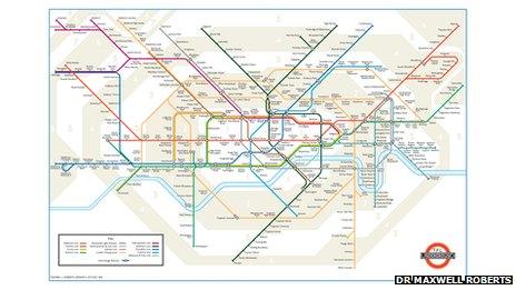
In response, Dr Roberts has come up with his own version of the tube map.
'Straighten out the suburbs'
He explored different angles - including 60 and 22.5 degrees - and introducing curves to some lines rather than zig zags.
The main issue facing designers, he said, was the fact the tube map had to be usable in pocket size. "You can only squash so much into a little shape like that," he said. "The pocket map dictates the design.
"I've been trying to find which angles get you the smallest possible design and 45 degrees doesn't necessarily do that," said Dr Roberts.

Dr Roberts has been testing his version of the tube map at the University of Essex.
"I've managed to get the corners right down and we've tried to straighten out the suburbs," he said.
His design has been shown to senior figures at Transport for London in a presentation - though a spokeswoman for the organisation said it had "no plans" to change the tube map.
Experiments at the University of Essex, he said, showed subjects using his map for route planning up to 25% faster than those using the official version.
Yet Dr Roberts, whose academic work Underground Maps Unravelled has just been published, doubts his design will ever be used.
He said his design, with its use of curves and new angles, might be too radical a change for those responsible for the London Underground Map.
One of the discoveries he has made through his map research was that people often "loved" maps which were "difficult to use" and hated those maps which were easy to use.
"There's an absolutely clear difference between ease of use and people's engagement with a map," he said. "A nice map in front of you says 'you can go anywhere and do anything and here's how to do it'."
He said the biggest challenge on the horizon for the London Underground map would be the forthcoming Crossrail line linking Maidenhead and Heathrow in the west and Shenfield and Abbey Wood in the east.
The £16bn joint Transport for London and Department for Transport venture will carry up to 78,000 passengers an hour through 37 stations during peak times when it opens in 2018.