Is it time for a new wheelchair access icon?
- Published
- comments
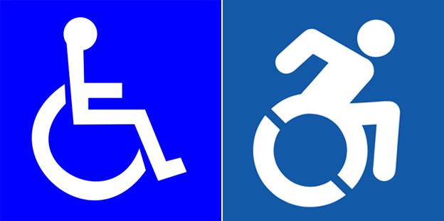
The stick figure in a wheelchair has become one of the most widely-used and instantly recognised symbols in the world - but a group of American designers want to change this famous icon of disability.
Seen on toilet doors, parking bays and practically every public building in the developed world, the International Symbol of Access has been in circulation since 1969. But now a group calling itself the Accessible Icon Project, external want to give the design a more 21st Century, even paralympic, feel.
The new icon is based on the old one but shows the figure leaning forward, actively pushing the wheelchair - more David Weir than Ironside. The group's website is critical of the old icon: "Its arms and legs are drawn like mechanical parts, its posture is unnaturally erect, and its entire look is one that makes the chair, not the person, important and visible."
Artist Sara Hendron, a lecturer at Rhode Island School Of Design, USA, is one of those behind the project. She says the new icon started as a piece of "guerrilla art" on the campus of Gordon College near Boston, where she and collaborator Brian Glenney adapted existing access signs by overlaying a transparent sticker of a new active wheelchair user so old and new could both be seen.
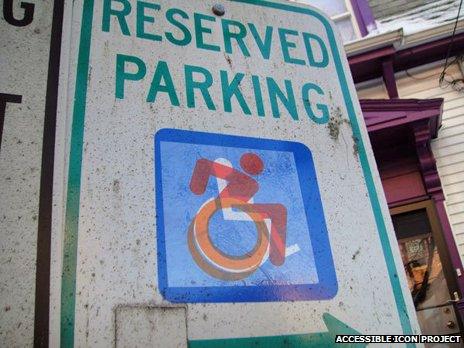
An early example of the new icon in action
The designers wanted to get people thinking. Hendron says the new symbol is "a metaphor for self-direction and self determination," and believes the old one has become politically invisible. She thinks that other similar public information symbols are more dynamic than the classic wheelchair sign and are pictured actively engaging with the world.
"If you go to a national park which says you can have a swim, a picnic or fish there, you'll see all these 2D icons that are indicating with very animated gestures all that stuff you can do with your body."
There's been interest in the new icon from around the world, from in Italy to India and South America.
"We're eagerly watching New York City who have said they're going to implement it but are presently at the red tape stage," says Hendron. "And in the meantime we've heard from other towns as well and scores of individual organisations and institutions."
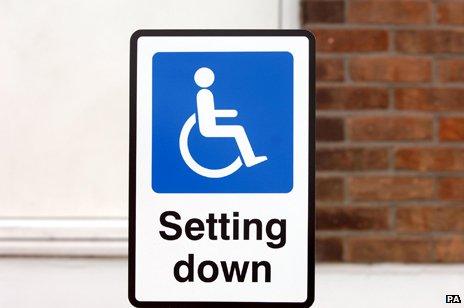
Does the old wheelchair icon present too passive an image of disabled people?
How widely the symbol is adopted, depends on a number of factors, however. Barry Gray is from the graphical symbols committee of the International Standards Organisation (ISO). He likes Hendron's symbol, but says its meaning is not clear-cut.
"The new design idea is related to the style of a speedy wheelchair but it's not a racing wheelchair sign we're trying to create," he says. "We're trying to create the idea that this is the way you go into the building… not to speed down a road."
There's another issue with the classic symbol, which is not necessarily addressed by the new version - it depicts a wheelchair user, but is also supposed to symbolise access for blindness, autism and many other non-wheelchair related impairments. In fact, although there's an estimated 750,000 wheelchair users in the UK, that's still less than 10% of the disability community.
Visual artist Caroline Cardus doesn't want the symbol to contain a wheelchair at all.
"If no other impairments are included in the sign then there's a subliminal message that if it's all right for wheelchair users then everyone else can just struggle along - and that's massively unhelpful."
In 2004, Cardus created The Way Ahead, external, a travelling exhibition of thought-provoking disability road signs which was very popular and has only recently ended.
"I've thought for a very long time I would love to have a sign with something like a big 'A' or whatever letter access starts with in your language, because then you could potentially have some visual shorthand which maybe has different levels."
She suggests a new symbol should provide extra information, like the London Underground map, which uses colour-coded wheelchair icons. A white wheelchair on a blue background means the station is step-free from street to train. Blue-on-white means the station is step-free from street to platform only.
"The A could perhaps have one dot for physical access and two dots for cognitive awareness," she says. "Something that basically says things are completely accessible or things are slightly accessible."
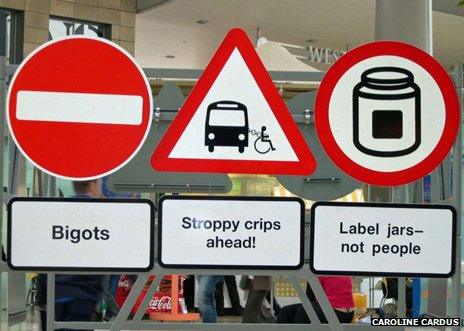
Some of artist Caroline Cardus's "signs"
Gray says that impairments like autism and mental health have been talked about but are difficult to depict visually.
An ear symbol, for example, indicates the presence of a hearing loop system and very specific access symbols are now becoming international standards.
"We recently introduced a symbol which indicates that assistance is available, to be used at a reception desk or similar. It's meant for people who need guidance, so perhaps people with sight or cognitive difficulties. It's a picture of one person holding the hand of another, external."
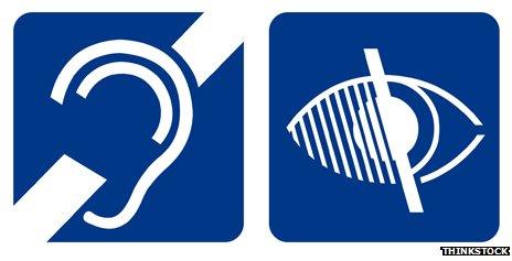
Access symbols for deaf and visually-impaired people
Hendron says that she accepts that there are limits to what can be achieved with graphic symbols:
"I don't wear skirts a lot, but I go to the women's rest room and the skirt on the woman in the icon means it's not the men's room. Is there a problem with that? Probably, but it's a shorthand that I make peace with so that I can travel and get places fast with my five-year-old daughter who might need to suddenly bolt there."
You can follow Ouch on Twitter, external and on Facebook, external, and listen to our monthly talk show