In graphics: Eurozone crisis

The interactive content on this page requires JavaScript

Infographic showing GDP figures for Eurozone countries
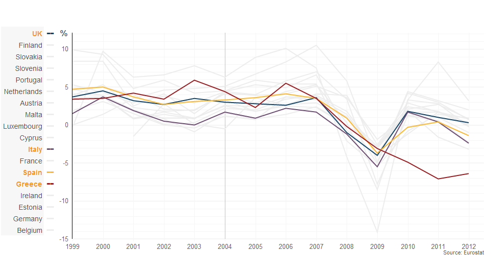
Annual GDP growth - percentage change from previous year

Gross domestic product (GDP) is the value of all the goods and services produced by a country in a single year. This chart shows how much GDP has grown, or contracted, every year since the launch of the euro.

It shows very clearly the damage caused to the whole of the eurozone by the 2008 global financial crisis, and the failure of peripheral economies - unlike Germany - to return to sustained growth since then.

Click and drag in the chart to zoom in

Select country to highlight data

Reset
  • --
  • --
  • --
  • --
  • --
  • --
  • --
  • --
  • --
  • --
  • --
  • --
  • --
  • --
  • --
  • --
  • --
  • --

EUROZONE GDP: FULL DATA

DownloadAnnual change in GDP for the eurozone and the UK[25kb]

Spain and Ireland, which enjoyed property booms and rapid debt-fuelled growth before 2008, have failed to recover. Latest data shows them back in recession this year.

Notice that while Portugal and Italy did not experience huge dips in 2009, their GDP growth was very weak for much of the previous decade.

For Portugal, this made the big infrastructure projects it was pursuing difficult to afford, while for Italy it made the government's enormous debtload harder to bear.

Lastly, look at Greece, whose economy seems to have been driven into freefall by the government's austerity measures and the collapse in confidence in the country's future.

Send us your feedback

More on This Story

The BBC is not responsible for the content of external Internet sites

More Business stories

RSS

Features