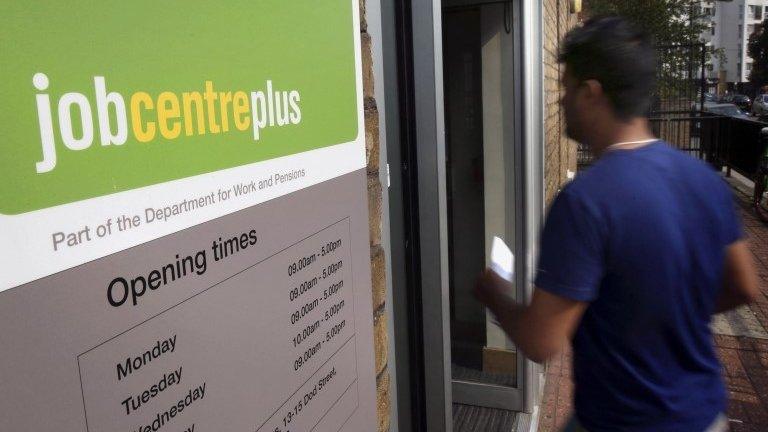
Why do we report unemployment every month?
- Published

Beware of headlines that tell you unemployment has risen or fallen.
On Wednesday, official figures from the Office for National Statistics (ONS) showed a 79,000 fall in unemployment, which was dutifully reported across news outlets.
But is it really telling us what we think it is?
The ONS is very good at telling us what the margin of error is with its figures. With the change in the number of people unemployed, this month it was that they are 95% sure that the figure is right within plus or minus 81,000.
The figure for the three months to August was close to the threshold, but essentially, if unemployment has fallen by fewer than about 80,000, you cannot say with confidence that it has fallen at all.
As the chart above shows, in the past year there have only been three occasions when unemployment has fallen by more than the margin of error - the figures reported in November 2014, and February and March of this year. Meanwhile, there have been no increases of more than 80,000.
Comparing quarters
But we shouldn't be putting all these figures on the same chart anyway. Why not?
October's figure will compare the three months from June to August with the previous quarter, from March to May.

The ONS gets its data from talking to 100,000 people every three months
The figure we reported last month compared May to July with February to April.
This means that this month's figure is not really comparable with last month's figure.
But also, it means that about two thirds of the information in this month's release will already have been in last month's.
Huge survey
To understand why that is the case you need to know about how the figures are collated.
The unemployment figures are based on the Labour Force Survey (LFS), which is a huge survey in which the ONS talks to about 40,000 households or 100,000 individuals every three months.

How many people of working age in the UK really don't currently have one?
The people who ask the questions in the LFS are allocated areas in which to conduct the survey and have the households they are surveying divided equally over the 13 weeks of the quarter.
So when a month's figures come out, they will be based on one third of the respondents having been asked since the last figures were released and two thirds of respondents for whom they are still using the answers they gave in the previous two months.
"The monthly figures provide a leading edge indicator to help highlight the latest changes in the labour market," says Nick Sofroniou from University of Warwick's Institute for Employment Research.
"But because they are based on a rolling estimate containing the previous two months' data, I would only use them if they exceed the margin of error, because who wants to make a headline that turns out to just be sampling noise?"
He stresses that you only get a properly robust comparison when you compare a quarter with the previous quarter.
Overlapping quarters lead to bizarre anomalies such as happened in February last year, when the ONS reported that the unemployment rate for October to December was 7.2%.
Some news outlets reported that as an unexpected rise, because they were comparing it with the previous month's figure of 7.1%.
But actually, the figures were comparable not with the previous month's figure but the one for the previous quarter, July to September, which was 7.6%.
So despite the unemployment rate being higher than it had been the previous month, the rate had in fact fallen, which some might feel was unreasonably confusing.
Misinterpreting figures
Would it be more sensible to report it once a quarter instead of every month?
Up until the late 1990s, unemployment was indeed reported once a quarter. But then it was realised that the figures could be released monthly without having to collect any extra data.

Should unemployment data be released every quarter instead of every month?
But doesn't that mean that people misinterpret the figures?
"Some people do and some people don't," says David Freeman, head of the labour markets division at the ONS.
"We try to push people in the right direction."
He points out that the statistics were reviewed only last year, external and the way they were produced was cleared.
Eye-wateringly expensive
The review acknowledged that there was demand for a proper monthly series, rather than a rolling quarterly one, but in effect concluded that the money to do so was not available. In order to get a proper monthly figure you would have to triple the number of households surveyed, which would be eye-wateringly expensive.
If the ONS only published figures once a quarter they would be no more accurate than the monthly ones, it would just stop people comparing the wrong figures. So maybe the challenge is to the interpretation of the figures, not their production.
"Perhaps the issue is whether appropriate cautions can genuinely be exercised over the interpreting of month-to-month changes," says statistics guru Prof David Spiegelhalter, from Cambridge University.
"My optimistic self feels that this could be done with some clever journalism. My pessimistic self thinks it is hopeless, and maybe it would be better to wait for three month figures that have more chance of standing on their own merits."
Also eye-wateringly expensive would be trying to reduce significantly the margin of error on the unemployment figures. Doubling the number of households surveyed would make the change in unemployment correct to plus or minus about 55,000 instead of 80,000.
So without a vast injection of fresh cash into the collection of statistics it looks as if we'll just have to try harder to explain the limitations in the figures and be a bit more careful with the headlines.
- Published11 September 2015

- Published20 June 2015
- Published5 February 2015

- Published21 January 2015
- Published15 January 2015