The Guardian redesign: A review
- Published
For newspaper readers, all redesigns are guilty until proven innocent.
The millions of people who buy a daily newspaper in Britain are creatures of habit. They adore the thud on the doormat, the rustle and crinkle of the paper, their own idiosyncratic routine of turning to Sport or Comment or Business (delete as appropriate) first, and look forward to particular items and writers on particular days.
So anybody who undertakes a redesign of a newspaper is mad, brave, desperate - or some combination of all three.
And yet the task is exhilarating. It does, as Kath Viner said in an impressive interview on Today this morning, force you to think hard about the role of print in a digital world. Moreover, there is sheer commercial necessity: this move will save millions of pounds and is integral to the Guardian's turnaround plan. On Radio 4's The Media Show, Viner told me before Christmas that all the mooted savings are in production costs, rather than editorial.

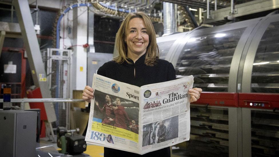
First day of the tabloid Guardian with Katharine Viner, editor-in-chief
Before offering some brief thoughts on just a few key aspects of the redesign, let me add a few caveats. The first is that this redesign isn't aimed at me. It's aimed at the people who take the Guardian, and generally only the Guardian, each morning. Keeping them sweet is the imperative here.
Second, I'm a little surprised at the emphasis put on the word tabloid, rather than the commonly used "compact". Yes, this is semantics; but semantics matter. Tabloid connotes something beyond size - namely, a looser affiliation with the truth. Some Guardian readers may take against it, though obviously Viner is an infinitely better judge of this than I could be. "Compact" would, I think, have made the change clear while freeing the paper of the messier associations with tabloid values.
Finally, there is one major reason for doing redesigns which Viner didn't mention, and probably won't publicly - and that is they allow an Editor to stamp their authority on a publication, and remake them in their own image.
George Osborne has been looking at redesigns of the Evening Standard, partly for the same reason. They're his way, just as this tabloid format is Viner's way, of saying: "I'm the daddy now".
Overall, my own view is that this redesign is agreeable, attractive, and likely to be effective - except in one crucial regard.
Page one
Curiously, given how much thought would have gone into it, I think the front page is the weakest aspect of this otherwise commendable switch.
When you change from broadsheet - or indeed Berliner - to compact size, you obviously lose a lot of height. That means that the journalism gets squashed, or pushed downwards. There's a danger it can be cramped, and doesn't have room to breathe.

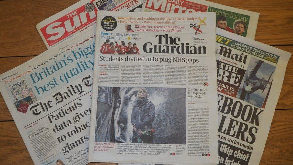
Tabloid or compact: The Guardian enters a new era
With this redesign, that effect is radically accentuated because they've changed the masthead. It's a big departure. Gone is the signature blue branding. And now the masthead is over two decks - that is, the "The" is on the line above the "Guardian". This pushes the stories on the front page even lower: the top third is taken up with masthead and promotional puffs. As a result, the splash headline is somewhat lost.
When the Independent was redesigned, external by the remarkable Matt Willey, now at The New York Times magazine, he addressed this loss of height by flipping the masthead and putting it along the side. This had two additional benefits: first, it accorded with the more magazine-like feel the paper was trying to create; second, it was true to one of the paper's founding mottos, "Classic with a twist".
Its main advantage was it created more height on the front page. I don't for a minute suggest The Guardian should do the same. But I hope the comparison is instructive: over time, as the redesign beds in, I'm sure the designers will find a way of creating more height on Page One, so that the lead story and picture can stand out more.
The other thing missing from Page One is more puffs, or information, as to what it's inside. If you look at the bottom of this Times front page, external, you will see six news stories given in brief. That's a valuable service to the reader, and I suspect that, over time, these will pop up on the new-look Guardian.
Fonts
There is a whole world of joy to be had online if you're interested in typography, with vast communities of design geniuses comparing varieties of curl on an "s" and a "p". I think the criteria for a newspaper font are simple. Is it clear? And does it convey the character or spirit of the publication?
On both these fronts, the fonts in this morning's edition score highly. They are clear, with plenty of leading between words. Many redesigns make fonts too small. This one doesn't. I see in Viner's letter on page three that there is a new font, called "Guardian headline" - but the fonts all look very similar to the old ones, which means the desired effect - evolution without big disruption - has been achieved.
Goodness knows if I'm in a minority of one on this, but I think the font manages to convey both seriousness and wit.
Light and shade
Each morning, newspaper executives get a flatplan: a layout of the following day's paper, telling them where the various advertisements are. One exciting task is to plan tomorrow's paper around those ads. This is quite tricky. You have to bunch stories thematically - so you can't have an education story on page seven, then go to a set of crime stories, and come back to education on page 17.
And you must have light and shade. This is one of the things the Daily Mail does exceptionally well. It is a personal obsession of Paul Dacre's. He has been known to flick through an edition saying "light, shade, light, shade, light, shade" with each page - the alternations meeting with approval.
Today's edition of the Guardian, external has a pleasing combination of light and shade. It's good to see no advert on page three: prime real estate saved for a big picture and lighter story (let's see how long they can resist putting an ad there).
The spread on Michael Wolff (pages 16-17) is beautifully laid out, and offers a pleasing counter-point and change of pace to what's around it. And it's terrific to see the centre-fold "Eyewitness" feature, of a big photograph, retain its place. It's always fun choosing that picture, and while the paper of this new compact edition strikes me as a little more yellow, which the picture editor won't like, "Eyewitness" offers a moment to pause for thought.
Sections
The most impressive thing about this new edition is the sections. I think the new Journal section, with Comment, Obituaries and so on, is superb.
First of all, it feels very connected to the paper, but as an independent section allows the family to read different parts of the same edition. This isn't to be under-estimated. A huge number of couples read newspapers at the same time. In the crude and outdated stereotype, men read the News, and women the Features section. This generalisation was never valid, let alone in 2018; but the principle that a couple should be able to divide a paper between them is a fine one.
The Journal section leads with a beautiful, evocative illustration by Nathalie Lees, and there is clear sign-posting at the top of it. The editorials work well on its second page. But best of all is "The Briefing" on pages 10 and 11. What a service: beautiful, jam-packed with data, and a real wonkish paradise.

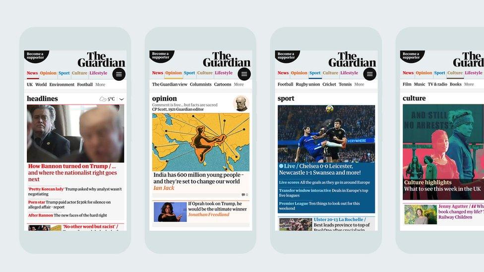
The Guardian app and online versions have also been redesigned
I think the Independent received more complaints from readers for moving the crossword than anything else in its history (apart, perhaps, from ceasing to print). For my money, the crosswords and puzzles look perfectly fine on the back of the Journal.
As for G2, the best that can be said is that it seems to me to read and feel very much like... G2. This is clearly subjective, and some readers may hate it. But to switch to tabloid and have a second section that feels very much the same is a considerable achievement.
And given Sport is all about drama, and pictures can convey drama uniquely well, I'm glad to see a lead picture given plenty of space on the back page.
Securing a legacy
There is so much in a daily newspaper that, if I spouted forth about every aspect of the edition, this blog would never end, and I'm sure you don't want that.
So let's just recall the basic objectives. This redesign had three aims: first, to save money; second, to assert the authority of the editor; third, to revive the idea of print in a digital world.
On the third, print publications are all about creating among their readers a sense of being in a club. They are instruments of membership. This is what - albeit with a fortnightly satirical magazine - Ian Hislop has done so well at Private Eye. Journalists at the Guardian will have an infinitely better sense than I will as to whether this redesign will strengthen that feeling of membership. My view is, it won't undermine it.
As for the other two aims, they will take time to materialise, but the savings will indeed come and this is now even more Viner's paper than before. She inherited something akin to a financial basket case, with losses in the tens of millions for year after year after year after year.
If she and Dave Pemsel, the CEO, manage to hit profitability next year - the first time the Guardian will have done so since the 1980s, and that too despite Facebook and Google gobbling up ever more advertising pounds - they will go down in history as much more than the leadership team that took the paper tabloid.
A final thought. Tabloid or compact size is simply more convenient to read, especially in transit, than broadsheet. When Simon Kelner, the former editor of the Independent, made that argument in the early 2000s, he was initially met in some quarters with derision. Imitation is a high form of flattery; and on seeing the Guardian go compact 15 years after he championed the idea, Kelner could be forgiven a wry smile this morning.