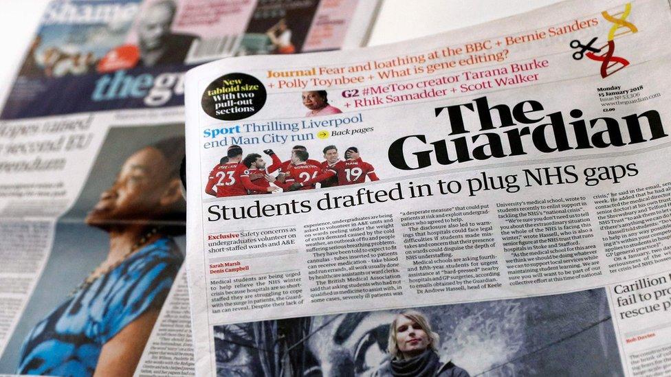
The Guardian newspaper adopts tabloid format
- Published
- comments

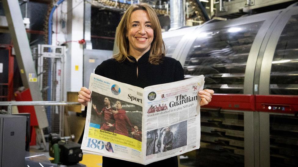
The first edition of The Guardian's tabloid format was published on Monday
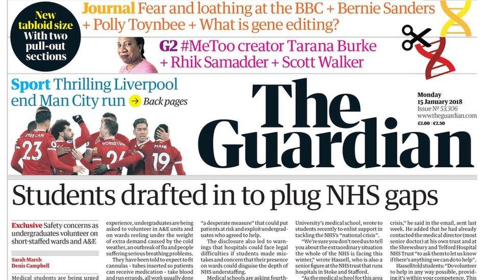
The Guardian has launched its new look as a slimline tabloid newspaper.
The reformatting is part of a drive to cut costs at the paper, which last year made a loss of £38m.
Previously, the paper was a hybrid between a broadsheet and a tabloid, called a Berliner - a unique format in the UK.
The new design means The Guardian, external can be printed by more printing presses around the UK, which is expected to save the title millions of pounds.
The change in format has also brought about the redesign of the newspaper.

Editor Katherine Viner said The Guardian would remain "thoughtful, independent and challenging"
The paper no longer carries the distinctive blue masthead, opting for a simpler design. It's also created a new font called "Guardian headline", which the paper claims is "easier to read".
The overhaul also features a new daily pullout section of opinion and ideas, called Journal.
The shake-up includes a digital reversioning of the brand, with the website showing a similar aesthetic as the new-look paper.
The Observer will follow suit - launching in tabloid format on Sunday 21 January.

View from Amol Rajan - the BBC's Media Editor
For newspaper readers, all redesigns are guilty until proven innocent.
The millions of people who buy a daily newspaper in Britain are creatures of habit. They adore the thud on the doormat, the rustle and crinkle of the paper, their own idiosyncratic routing of turning to Sport or Comment or Business (delete as appropriate) first, and look forward to particular items and writers on particular days.
So anybody who undertakes a redesign of a newspaper is mad, brave, desperate - or some combination of all three...

Editor Katharine Viner told Radio 4's Today programme on Monday: "The main reason we did it is because it saves millions of pounds to print a tabloid like this.
"We're on track to lose less than £25m this year and we intend to break even next year which would be the first time since the 1980s that the paper has broken even."

Katharine Viner: "Clarity and imagination have been our guiding principles"
Viner said: "Clarity and imagination have been our guiding principles as the Guardian's new design has taken shape.
"The Guardian's journalism itself will remain what it always has been: thoughtful, independent and challenging."
On Twitter, there were mixed responses to the paper's new look with actor and presenter Tony Robinson saying he was a fan:
Allow X content?
This article contains content provided by X. We ask for your permission before anything is loaded, as they may be using cookies and other technologies. You may want to read X’s cookie policy, external and privacy policy, external before accepting. To view this content choose ‘accept and continue’.
This Twitter user, external said she thought the paper looked "slick", however tweeter Ellie took some time to adjust to the changes:
Allow X content?
This article contains content provided by X. We ask for your permission before anything is loaded, as they may be using cookies and other technologies. You may want to read X’s cookie policy, external and privacy policy, external before accepting. To view this content choose ‘accept and continue’.
Some Twitter users commented that the new design made the paper look like the Independent:
Allow X content?
This article contains content provided by X. We ask for your permission before anything is loaded, as they may be using cookies and other technologies. You may want to read X’s cookie policy, external and privacy policy, external before accepting. To view this content choose ‘accept and continue’.
Some saw pros and cons in the overhaul:
Allow X content?
This article contains content provided by X. We ask for your permission before anything is loaded, as they may be using cookies and other technologies. You may want to read X’s cookie policy, external and privacy policy, external before accepting. To view this content choose ‘accept and continue’.
Whereas some were not convinced at all by the new look:
Allow X content?
This article contains content provided by X. We ask for your permission before anything is loaded, as they may be using cookies and other technologies. You may want to read X’s cookie policy, external and privacy policy, external before accepting. To view this content choose ‘accept and continue’.
And some thought the left-leaning paper had not stuck to its moral compass:
Allow X content?
This article contains content provided by X. We ask for your permission before anything is loaded, as they may be using cookies and other technologies. You may want to read X’s cookie policy, external and privacy policy, external before accepting. To view this content choose ‘accept and continue’.
Society of Editors executive director, Ian Murray, called the redesign "fresh and very professional".
Murray said: "I think it's inevitable that newspapers will evolve," adding: "It proves even papers with such a strong brand as the Guardian - with such a loyal readership - still need to have a newspaper with a look and feel of the times.
"With any redesign you're going to get some people who will object, but most will get over the look and come back. Content is still king."

Follow us on Facebook, external, on Twitter @BBCNewsEnts, external, or on Instagram at bbcnewsents, external. If you have a story suggestion email entertainment.news@bbc.co.uk.
- Published16 January 2018