Star Wars theme launched for Google apps with dark and light sides for Chrome
- Published

Just in case you weren't sure which side to back in the new Star Wars movie, Google Chrome has come up with a way to help you decide.
The firm has teamed up with Lucasfilm and Disney so that fans of the film can choose between joining either the "light side" or the "dark side".
The Force Awakens isn't due to be released in the UK until 17 December.
But the tech company is drawing on the buzz around the movie and asking fans to pick a side.
We picked both.

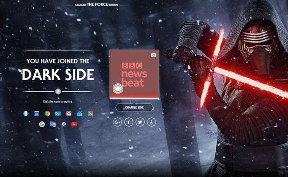
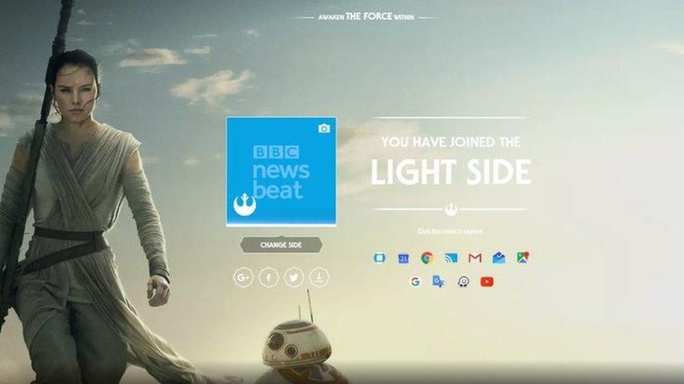
Once a side has been selected, your Google apps will be gradually transformed to show a variety of Star Wars-related themes and Easter eggs.
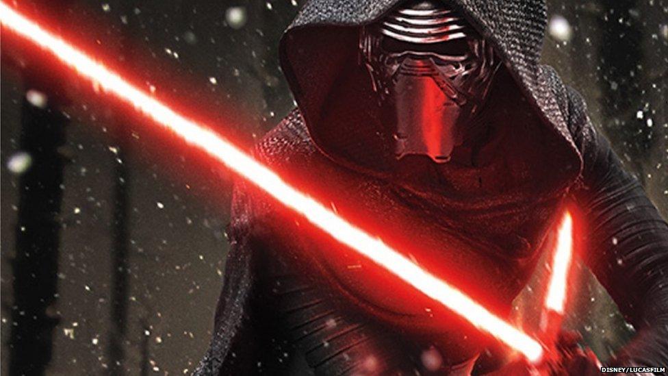
That means, if you pick dark your homepage will be dark and you'll see a menacing picture of Kylo Ren.
Or...

If you move over to the light side your background will feature a strong looking Rey with BB-8.
Other features include the progress bar in a YouTube video becoming a lightsaber and mousing over the volume icon causes a lightsaber sound and your Google Calendar will fill with Star Wars-related events - which are apparently easily removed.
In Google Maps the pegman becomes a First Order Stormtrooper or Resistance Pilot, and flies to your destination in either a TIE fighter or X-wing.
If that's not enough to keep you occupied in the weeks running up to the film's release, there's also a feature in the mapping app Waze where C-3PO can offer you voice guidance.
Fans are being encouraged to post their choice of sides on social media using the hashtag #ChooseYourSide.
Donald's choosing the light side., external
And Andrew the light., external
Picking a side will apparently help to power the indicator on the homepage that shows the balance of the forces.
But which will you choose?
For more stories like this one you can now download the BBC Newsbeat app straight to your device. For iPhone go here, external For Android go here, external