Is this the worst graph of the election?
- Published
- comments

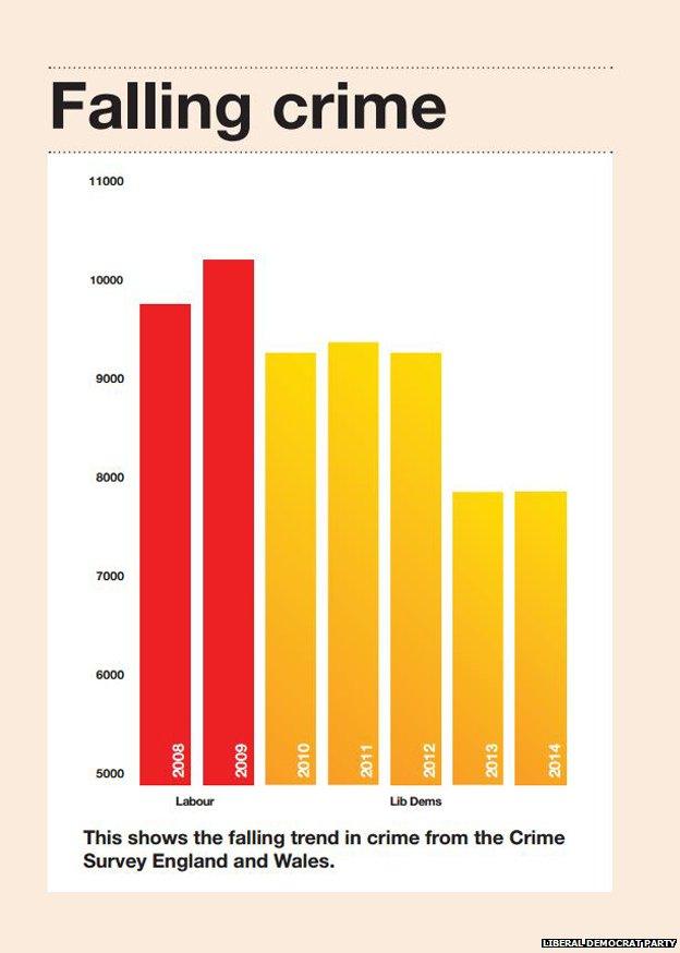
Is this the worst graph of the election? It is given a whole page in the Liberal Democrat manifesto but frustrates on so many levels.
PROBLEM 1:
The third column, labelled Lib Dems 2010, is for the financial year 2009/10 which finished a month before the Liberal Democrats joined the government.
PROBLEM 2:
The last column, labelled 2014, should actually be much LOWER than depicted. Strange…
PROBLEM 3:
The Y-axis doesn't start at zero. This sends statisticians into frenzies. By clipping the height of the bars, it makes small changes look much bigger.
PROBLEM 4:
The graph focuses on a small part of the time series available. A longer period would give a much better understanding of the crime trend.
PROBLEM 5:
The graph suggests that Liberal Democrat policies caused crime to fall. The fall in crime over the last two decades, experienced across the developed world, does not correlate to any particular criminal justice policies.
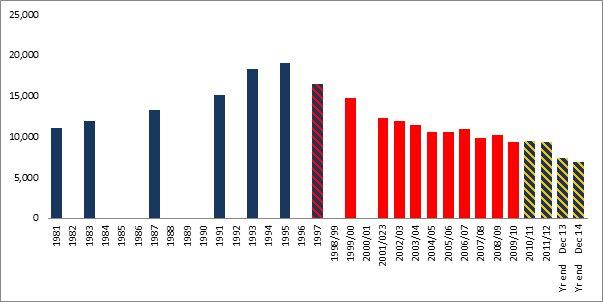
So what might the graph have looked like?
If we accept that the party affiliation of the government in office across the last 35 years has some relevance to crime trends (marginal at best, in my view), this would have been a more accurate representation of the story of crime and party of government in England and Wales (although still open to criticism).

Source: BCS / CSEW
The problem with this whole exercise, however, is that we cannot know what would have happened if there had been no change in government or their policies. Without a control group, claims by any party to take credit for a fall in crime are meaningless. Using the best measure available, crime in England and Wales has fallen by a quarter since the election. But would a different government have seen it fall faster or slower? We will never know.