How the BBC News website has changed over the past 20 years
- Published
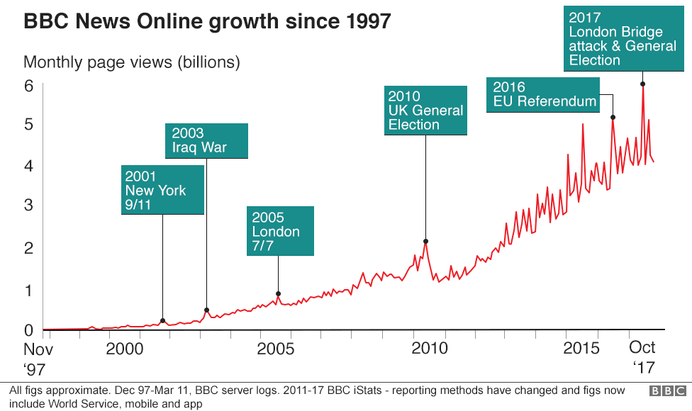
Twenty years ago this week, when the BBC News website launched, there were fewer than eight million people online in the UK - there are now about 60 million.
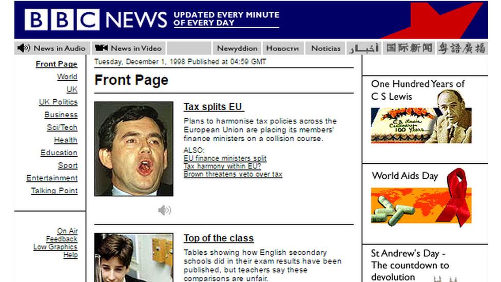
In 1997, it was the age of Tamagotchis, Minidiscs and PalmPilots.
Mobile phones at the time included the Nokia 6110 and the futuristic Motorola StarTAC flip phone.
Most people used dial-up internet connections with top speeds of up to 56Kbps.
On desktop, screen resolutions were pretty small - but they would get bigger.
Below there's a selection of the website's pages from 1997 to 2017, showing how it has evolved to meet the changing needs of users while still offering the latest news, features and analysis.

1997 - Rising star
BBC News Online launched in November 1997, following several forays on the internet, covering:
the Budget in 1995
the Olympics in 1996
the general election in May 1997
the funeral of Diana, Princess of Wales, in September 1997
CNN 's website was already up and running. The Guardian was also among the early internet pioneers.
The BBC News website was only 620 pixels wide at its launch - that is slightly more than half the width of the current site.
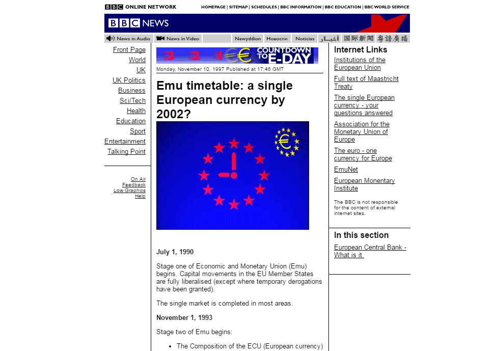

In the first week or so, stories published on the new website included:

1999 - Blue to red
In November 1999, the site had its first revamp. The old blue banner and red star was replaced with a red header more in line with the rest of BBC News, and the search function moved to the top of the page.
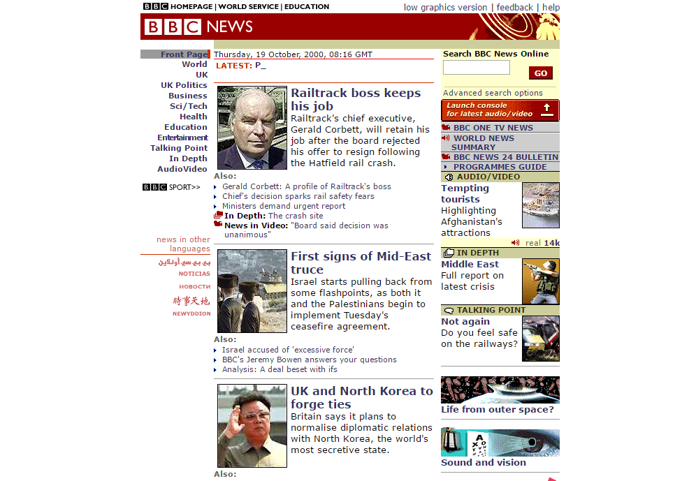

The website's then executive editor, Mike Smartt, explained the changes, external to users and promised "ambitious plans for audio and video news".

2001 - Terror attack
The attack on the Twin Towers in New York in September 2001 shocked the world, and large numbers turned to the BBC News website to find out the latest information.
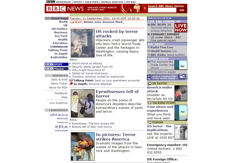

Several years before social media, thousands of people emailed the website with their thoughts - including many caught up in the attacks.
For the first time, content from users became central to online coverage, with compelling witness accounts and photos published in stories and in a special report on the disaster. , external

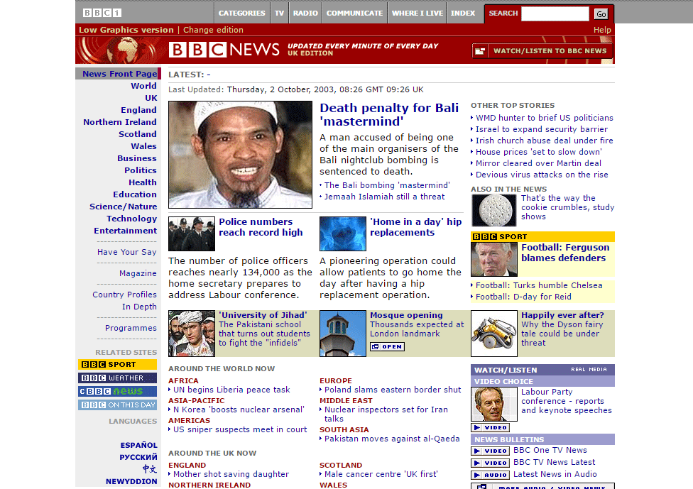
2003 - Major overhaul
In 2003, the old linear format was dropped in favour of a wider, horizontal layout. The aim was to make the site easier for users to find their way around, external and see more stories at first glance.


2008 - Cleaning up
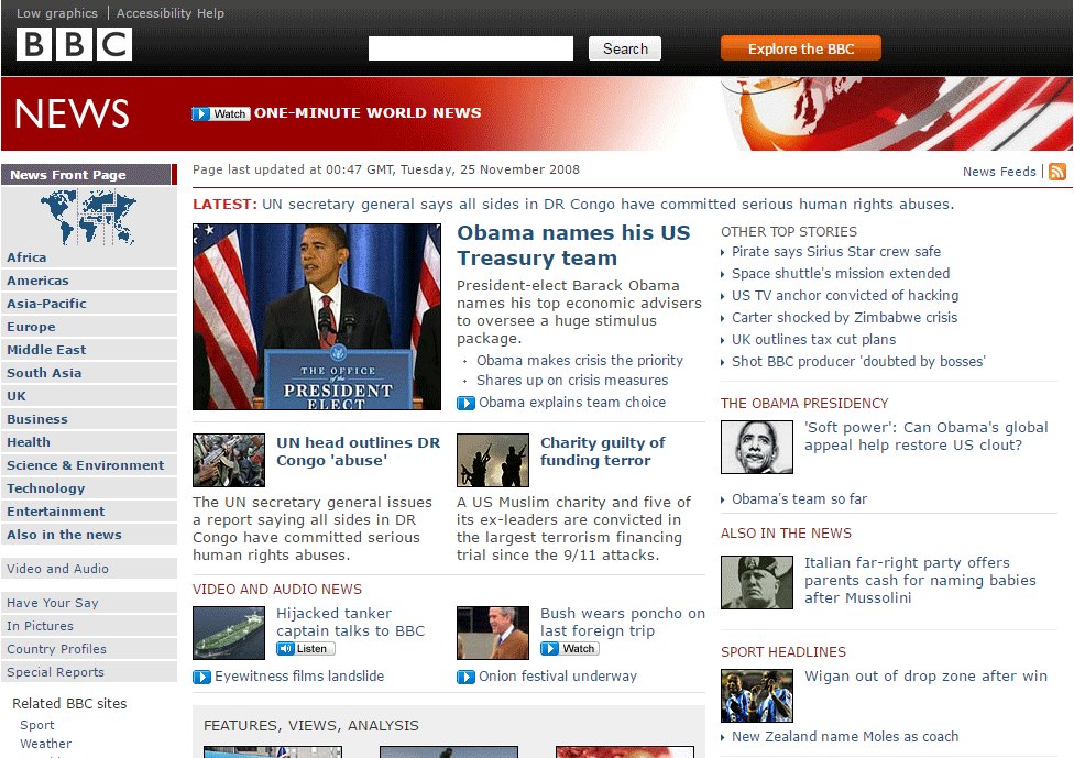
In 2008, the site got even wider, and for the first time video could be played from within story pages. The world map in the navigation was dropped a couple of years later.


2010 - Major revamp
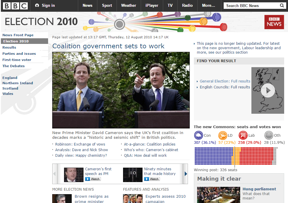
In 2010, the website got a "fresh, updated design", which also offered "easier ways to share stories with others", according to the then editor, Steve Herrmann.
By now, increasing numbers of users were coming to the news website from Facebook and Twitter.
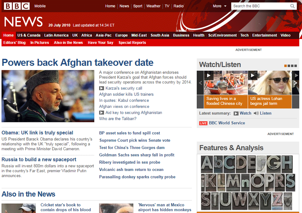
The BBC News app was launched in July 2010, giving users quick access to all the latest headlines from across the world while they were on the move.
The biggest story of the year was the UK general election, which had its own special report site.


2015 - Mobile friendly
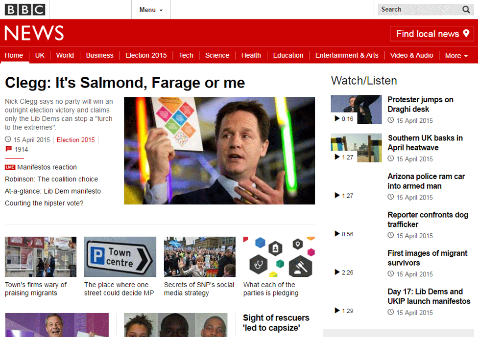
In 2015, the website became "responsive" - meaning its layout was designed to display well on different devices and screen sizes. By this point, about 65% of users were coming to the news website from mobiles and tablets.


NHS tracker 1999 v 2017
The look might change, but that doesn't mean we're not covering the same important issues.
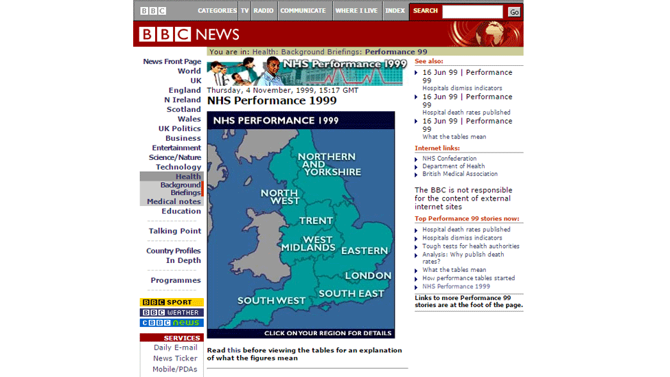
Here's the NHS performance tracker, external from 1999, when the government of the day published a new set of clinical indicators giving death rates in individual hospitals in England for the first time.
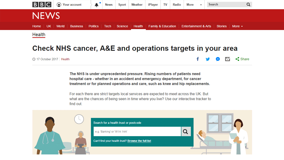
With the NHS under unprecedented pressure today, we still give users the chance to examine data on how services in their area are doing, using a more detailed, interactive tracker.
Slice and easy
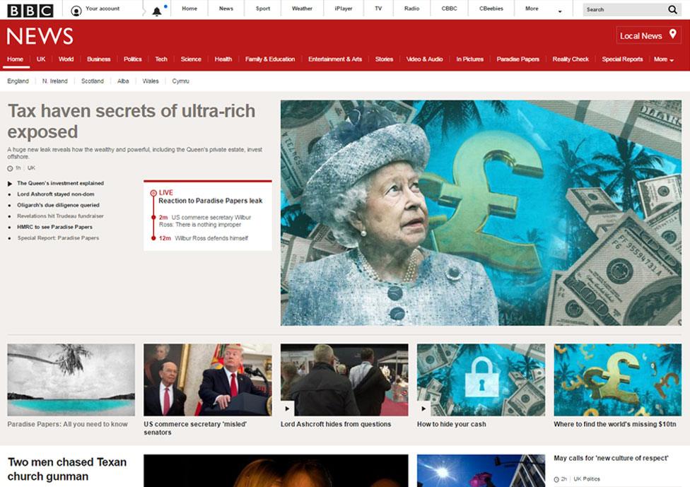
We managed to squeeze in a further redesign for 2017. News editors can change the number of stories in the full-width, horizontal slices, with the option of "dialling up the volume" during major news events.
We can now offer a more visual front page. Dropping the right hand side column and going full-width means video and news stories are integrated on the page.

.
- Published10 November 2017
