BCP council logo: New design revealed
- Published

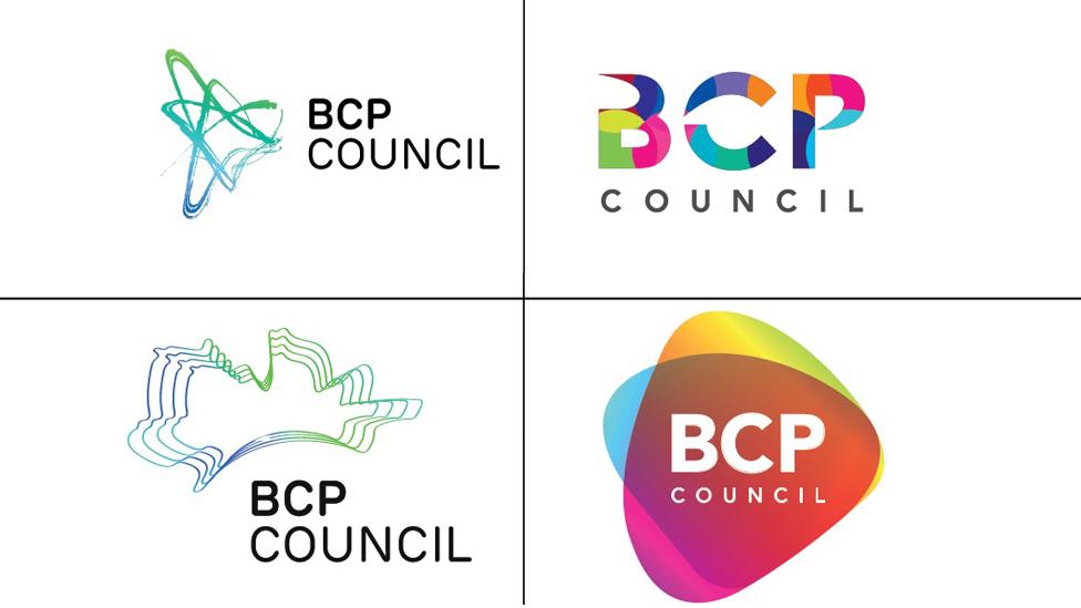
The logo is said to represent the land and coastline
A new logo design for a council has been revealed after previous suggestions were criticised.
The £8,000 logo was created for Bournemouth, Christchurch and Poole (BCP) councils, which are due to merge in April.
The shadow authority said it was proud of its "recognisable" logo which "creatively showed" its new area.
It has been branded a "snowstorm" by one councillor, although it was described as "brave" on social media.
Allow X content?
This article contains content provided by X. We ask for your permission before anything is loaded, as they may be using cookies and other technologies. You may want to read X’s cookie policy, external and privacy policy, external before accepting. To view this content choose ‘accept and continue’.
The shadow authority initially released four prospective designs in November but they were criticised as looking like they were "knocked up by a five-year-old".
It said the new logo represented the area and coastline with 113 dots for the 76 councillors, 33 wards, three towns, and one council.
However, councillor Mark Howell, of Poole People and Independent Group, said: "It makes me shiver when I look at it.
"How does an authority for an area with a strong summer tourist industry end up selecting a logo that looks like a snowstorm?"

Residents Annabel House and Stefan Nagiel were unimpressed by the new logo
Christchurch resident Annabel House said: "It's not very good - it does [look like a snowstorm], perhaps we need a different one for the summer."
Stefan Nagiel from Boscombe said: "'BCP Council' doesn't tell you what it is, why don't they write in the words? It doesn't do anything for me."
However there was positive reaction on social media. Tom Lintern-Mole tweeted, external: "Looks great! Well done BCP!" and James Meachin posted, external it was a "creative interpretation".

The four initial logos were released in November
The authority said it had been "designed in-house with some external creative design from one of the area's graphic agencies".
"We know that design is always very subjective and everyone has different tastes and opinions.
"We are happy that the chosen design has taken as many different views into account as possible, and is a strong and recognisable logo for the new council and we are very proud of it."
The logo will be used on the new local authority website, social media and stationery, as well as some staff uniforms.
- Published20 November 2018
- Published31 October 2018
- Published20 July 2012