London Underground's typeface to change 'for digital age'
- Published
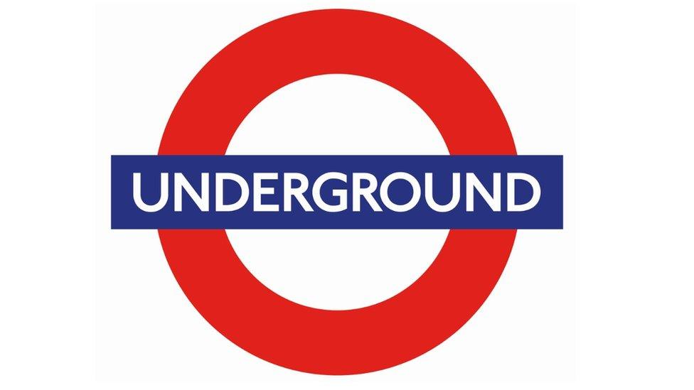
Here is the new lettering on the London Underground roundel, but can you see the changes?
The familiar typeface used for all London transport is changing, although travellers may have to look hard to spot the difference.
The original font, introduced in 1916 by calligrapher Edward Johnston, has been adapted to create "Johnston100".
Transport for London (Tfl) said it "contains subtle changes to make it fit for purpose in the 21st century".
But only the slightest adjustments are to be made, and will appear on maps and in stations later this year.
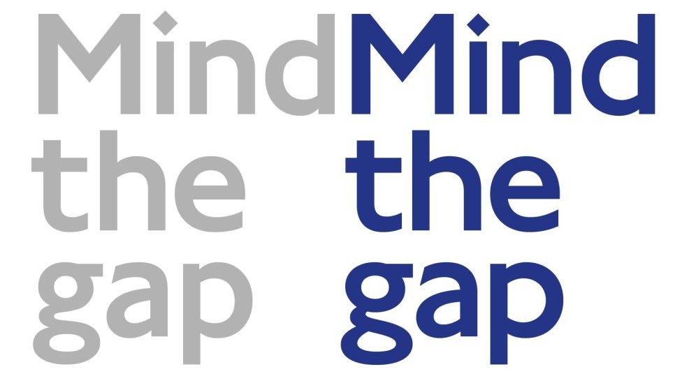
Spot the difference: the old typeface (in grey) beside the new Johnston100 lettering (in blue)
So subtle are the changes that, at first glance, a casual observer might miss them.
But a closer inspection reveals minor differences to the shape of the lettering, which have been revealed in images comparing the two fonts.
Tfl said the new style retains the "soul" of the original lettering.
As well as new symbols such as the hashtag and "at" sign, extra-thin weights of the typeface have been created so that the same lettering can be used for mobiles as in stations.
Jon Hunter, head of TfL design, said updating the typeface was "an important step forward" in an an age of social media and apps.
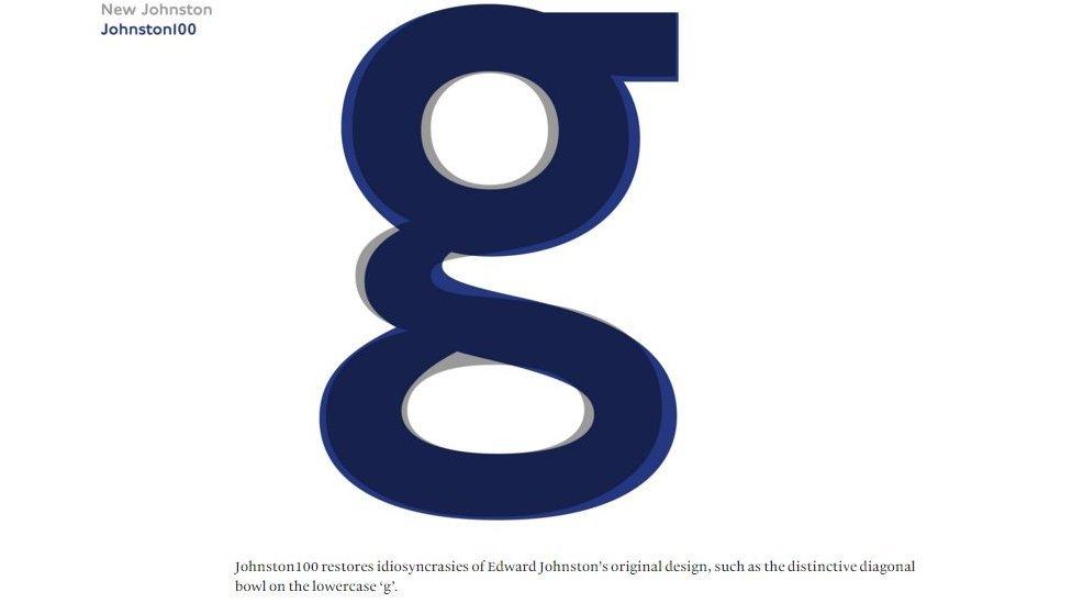
The changes are more apparent when the old typeface (in grey) is overlaid with the new typeface (in blue)
"As social media has become more important, hashtags and at signs are more important. Johnston never designed those because they were never needed," he said.
When Edward Johnston's original lettering was unveiled a century ago it was considered revolutionary.
"Johnston Sans combined readability, beauty, simplicity," Donna Steel, the curator of an exhibition about Edward Johnston at the Ditchling Museum of Arts and Crafts said.
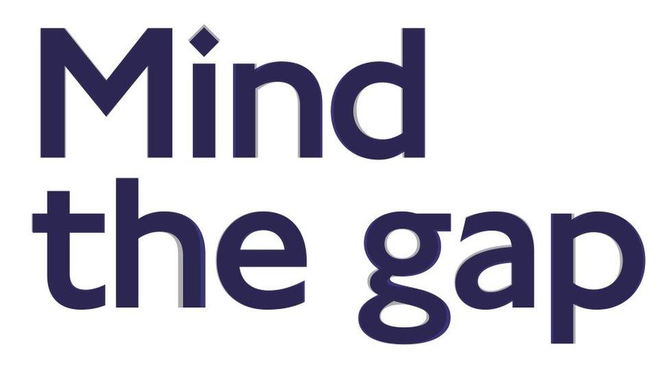
The greatest change can be seen in the shape of the "g"
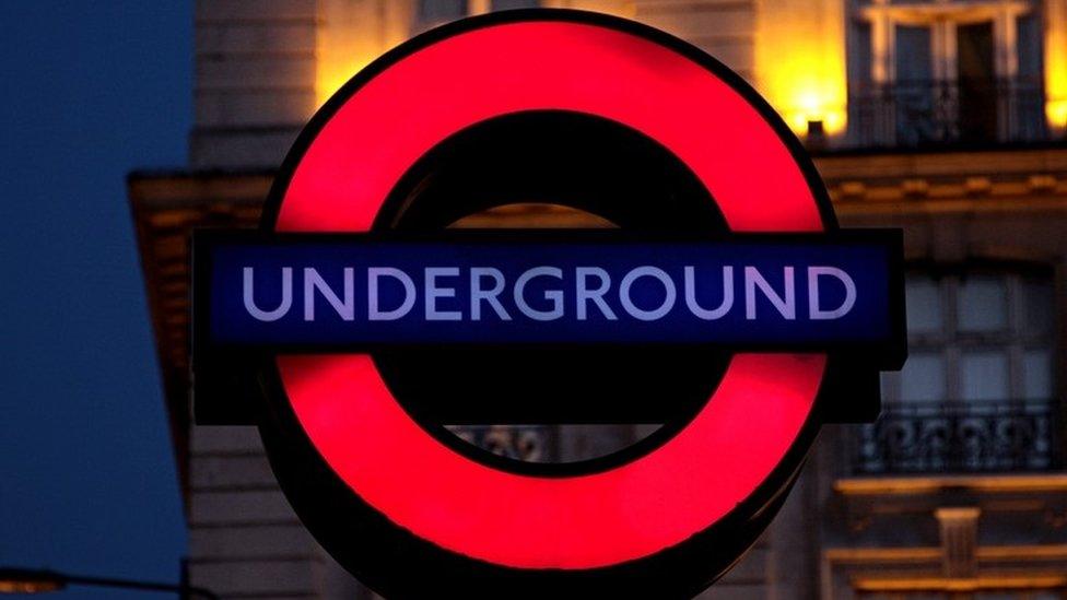
The typeface was last updated for changes in printing technology more than 25 years ago
Monotype, the firm who have adapted the lettering, said designers had studied old posters to "maintain the soul of the typeface" and bring back some of its "idiosyncrasies".
In a blog, external, type director Malou Verlomme said letters like the lowercase "g" had become "a little bit uniform" over the years.
"We hope this version of the 'lettering of London' for the digital age will last for another 100 years and beyond," Mr Hunter said.

The history of London Underground's typeface
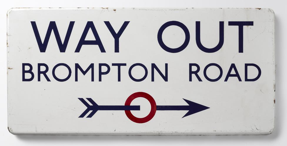
In 1913 London Transport's managing director Frank Pick commissioned Edward Johnston to create a typeface to bring visual uniformity to the transport network
Johnston's new typeface, known as Johnston Sans, was introduced in 1916 and became the basis for the text used today
Designer Eicchi Kono updated the typeface in the 1970s to adapt it to new printing technology, making changes like turning full stops into diamonds
In 2016 Johnston100 is introduced to make a digital friendly font and includes new # and @ symbols
Source: TfL

- Published30 March 2016
- Published1 September 2015
