Tokyo 2020 Olympics logo revealed: 'Pretty neat' or 'truly awful'?
- Published
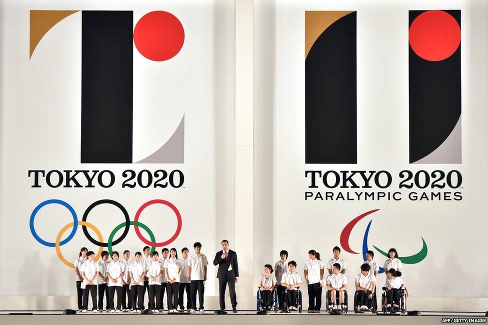
Tokyo has unveiled the logo for the 2020 Olympic and Paralympic Games. The Olympic emblem is the letter T, with upended quote marks to represent equality, organisers say.
"The red of the circle represents the power of every beating heart," the organising committee says, though it also, conveniently, resembles part of the Japanese flag.
Designed by the Japanese artist Kenjiro Sato, the emblem "reflects the vibrant nature of the city and the welcoming spirit of its citizens," says International Olympic Committee Vice-President John Coates.
But what do ordinary people think?
Oh.

Who agrees?
Surely there must be some more positive reaction out there?

Quite a few users in Japan remarked how similar it looks to the logo for Japan's main football league...

Most people tweeting in Japanese praised the design though - in particular its font and "classic" look.
One Twitter user saw something else, however:

He may have a point...

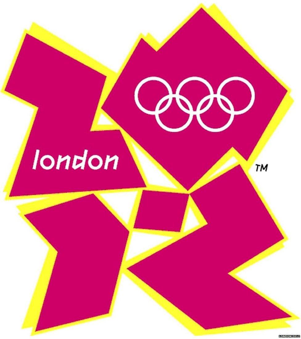
So how does Tokyo 2020 compare to the most recent Olympics' logos? You decide.
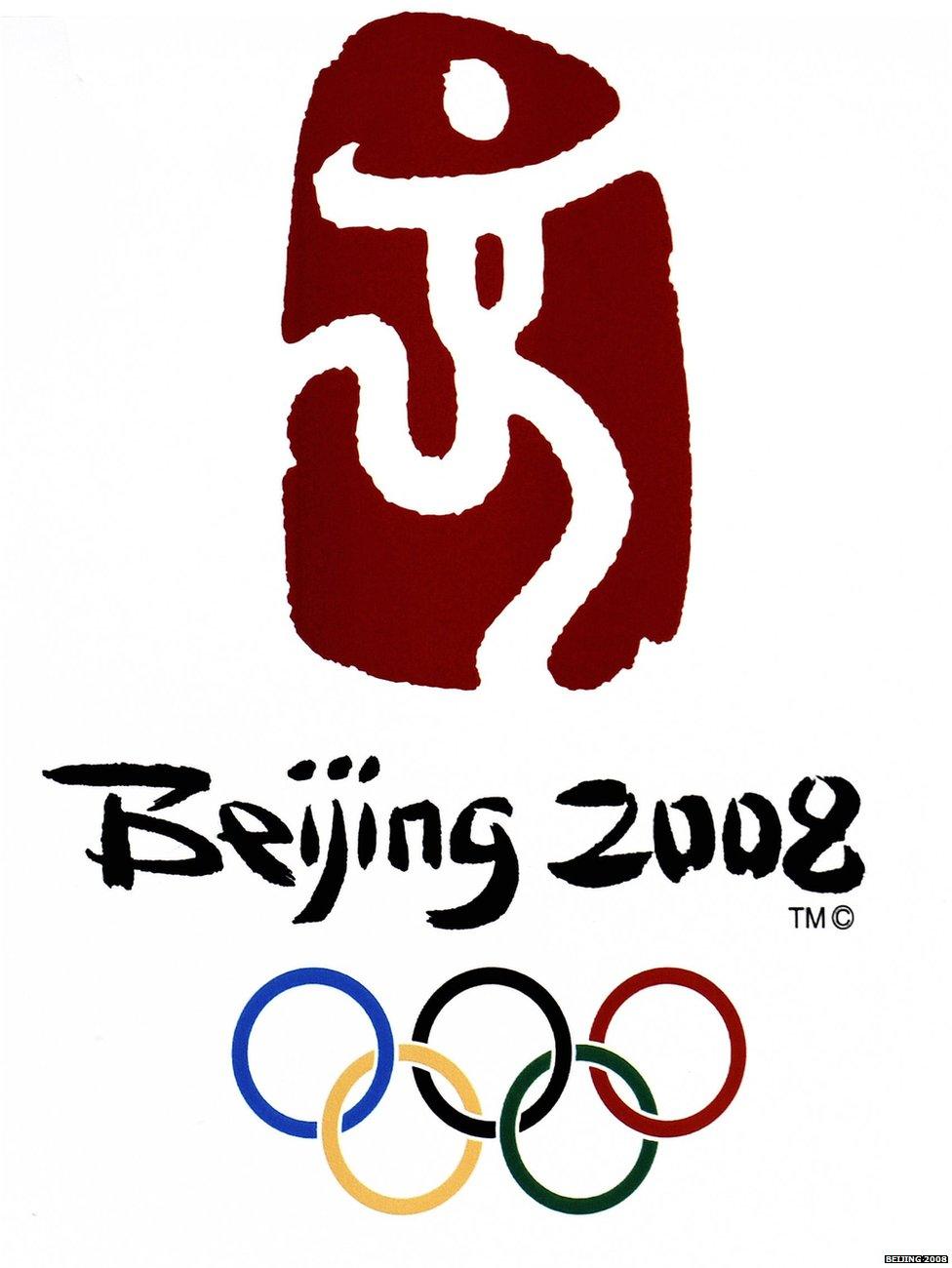

Atlanta's 1996 Olympic logo - has it dated well?
- Published17 July 2015
