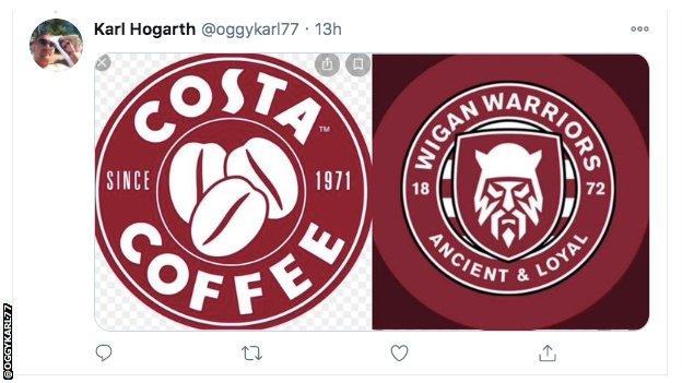
Wigan Warriors' new badge: Nod to history or coffee shop logo? Fans' opinion split
- Published
The jury is still out
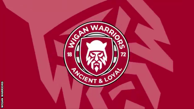
Super League club Wigan Warriors unveiled their new badge design this week and not everyone is a fan.
As the sport of rugby league celebrates its 125th anniversary, the Warriors have had a bit of a brand refresh. They explained the new design here.
Allow X content?
This article contains content provided by X. We ask for your permission before anything is loaded, as they may be using cookies and other technologies. You may want to read X’s cookie policy, external and privacy policy, external before accepting. To view this content choose ‘accept and continue’.
The video explains that the hoop is, "inspired by the Northern Soul emblem". So far, so uncontroversial.
The biggest update is that the old crest, featuring a castle and two lions, has been ditched and, in its place, there's a bearded warrior instead.
"We discovered that Iron Age warriors in the North of England were called Brigantes," explains the video.
The Brigantes were a pre-Roman Celtic tribe that inhabited Wigan and large parts of northern England - although it has been pointed out more than once that they had strong connections with Yorkshire.
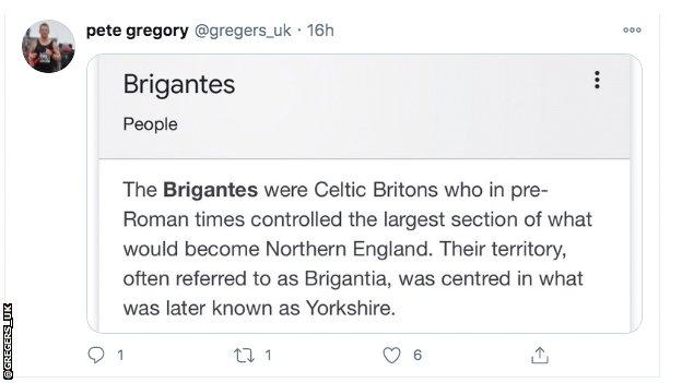
Wigan is in Greater Manchester, and was historically part of Lancashire...
Some fans had their own objections too.
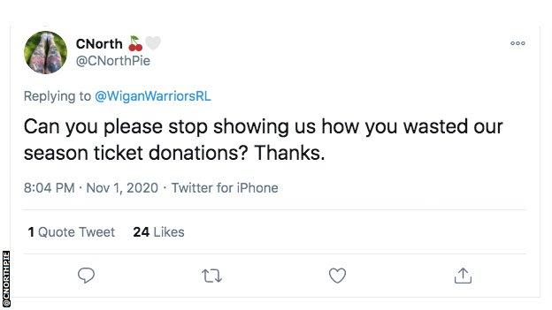
Say what you mean, why don't you?
Others drew parallels with badges elsewhere.
Some offered alternatives that capture the heritage of the town.
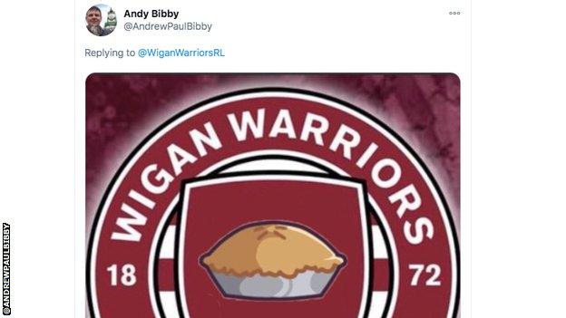
What's not to like?
Of course, not everyone's a critic.
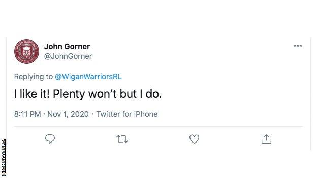
Horses for courses, hey?
As we know by now, these things are not always set in stone. Just ask Leeds United fans. After a new badge was released for them in 2018, there was uproar and the design was eventually scrapped.