Six Nations rebrand gets mixed reception from fans

The rebrand for 2025 coincides with the 25th anniversary of the inclusion of Italy in 2000 to create the first Six Nations
- Published
A new logo for the men's Six Nations which aims to encapsulate the "electrifying action" of the tournament has attracted derision from many fans.
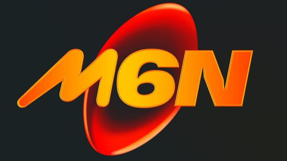
Organisers unveiled the rebranding of the tournament on Saturday, with an orange ball symbol and 'M6N' in the foreground, saying it was inspired by "the vital spark of connection" created by the Six Nations.
"The modern brand signifies the optimism fans feel when they come together at the end of winter to experience the Six Nations," they said.
However, supporters on social media were unconvinced.
"Absolutely shocking", "terrible" and "the ugliest thing I've ever seen" were among the reactions on X, with users comparing it with the branding for a Mars bar, the credits for 1996 film Space Jam and entries into a primary school competition.
A minority of comments praised how the logo echoes that of the women's Six Nations which, having run alongside the men's event until 2021, now has its own calendar.
"The launch of the new identity is intended to articulate the evolution of the Championship and modern game of rugby," added Six Nations organisers.
"The electrifying action and experiences that fans look forward to and enjoy every year, is expressed through the versatile new identity that has been informed by feedback from all corners of the game."
Rob Alderson, editor of Design Week,, external said the rebrand caught him off-guard, but added that it may age better than fans expect.
"I was surprised, it didn’t feel to me like the Six Nations," he told BBC Sport. "But that might be exactly what they are going for.
"If they are trying to expand the Six Nations to reach new people, something that doesn't feel like the Six Nations is probably quite a smart move.
"The problem is we get this stuff as a visual, without the context of what they were going for or how it will be used.
"We haven't seen it in context, on kit, in stadiums or in on-screen graphics.
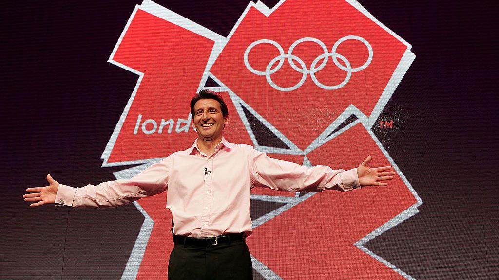
"The most famous example in the design world was the London 2012 logo – people hated that logo when it came out in 2007, but by the time the Games came round and people saw it on different things and around London, minds had changed and it had become sort of loved.

Several MPs called for the London 2012 logo to be replaced after it was unveiled in 2007
"People took a lot of patriotic, creative pride in it. That does happen once you see things in context.
"In some ways, it is a good sign you get a strong reaction, because that shows people care. If you roll out a new logo and everyone shrugs, you haven't done a good job or people don't care that much about what it is attached to."
The logo will be used across next year's tournament, which begins with France taking on Wales in Paris on 31 January.
