How real is Trump's jobs 'miracle'?
- Published

A successful American political strategist once said "it's the economy stupid" or something very similar.
It was a statement about the key issues a good election campaign needs to focus on.
Just a few days before the Congressional elections, President Trump had some helpful economic news - on employment - to put some wind into his sails.
The final bit of major economic news before the election showed another month of strong gains in jobs and the unemployment rate staying at its lowest in almost half a century.
Employment is perhaps the economic variable that matters most politically.
What did the new figures show?
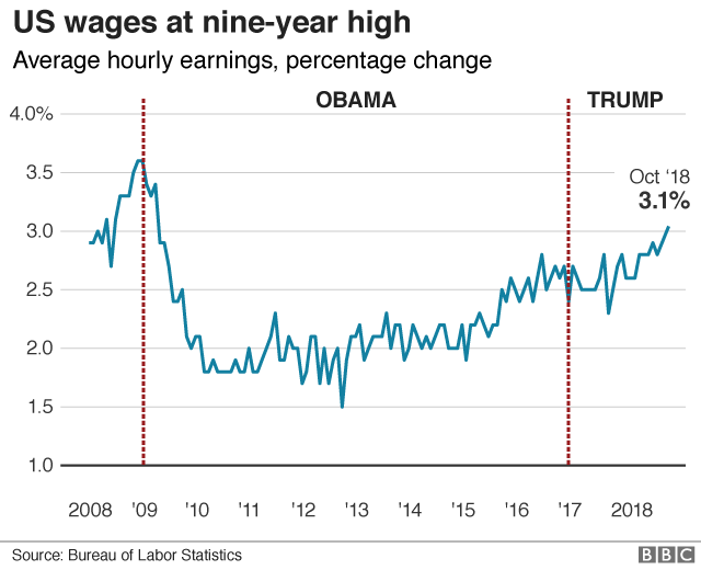
The number of people with jobs increased by a quarter of a million in October and the unemployment rate was 3.7%. Average hourly earnings were 3.1% higher than a year earlier.
The unemployment rate hasn't been lower since December 1969.
How has the US done in terms of job creation since the financial crisis?
The recovery in employment since the financial crisis and recession it caused has been impressive.
The number who do have jobs hit a low in February 2010. By the time the White House changed hands last year, the number had increased by 16 million. Another four million have been added since.
What about the unemployment figures?
Strong job creation obviously helps bring unemployment down, but you can't read directly from one to the other. The population is growing, and there is a third way of classifying people - "not in the labour force". More on that last group below.
The unemployment rate peaked at 10% in 2009, and was down to 4.7% by the time President Trump took over from Barack Obama. The decline has continued.
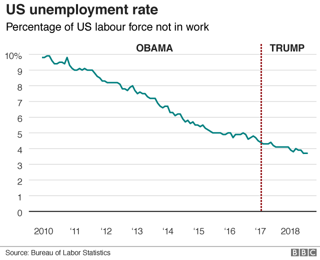
The low unemployment rate is particularly striking. Many economists think that there is an unemployment rate below which inflation will pick up; it's sometimes called the natural rate, or the non-accelerating inflation rate of unemployment. To the extent that this theory is right, if unemployment goes below that level, you are likely to get a problem with increasingly rapid price rises.
Many thought that the US would run into that problem long before it got to current unemployment rates. It hasn't happened.
What about earnings?
Wage rises have gathered pace however, after several years of sluggish performance.
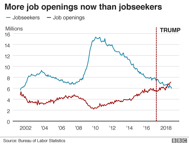
The new figures are the strongest since April 2009 and well above inflation, which means they suggest rising real pay. The rise in pay may reflect the fact that over the last few months, official figures show more job openings than people seeking them.
So all is rosy in the US jobs market?
Not quite, though it is worth repeating that the market is very strong. The unemployment rate doesn't tell the whole story. The US Bureau of Labor Statistics classifies people as unemployed "if they do not have a job, have actively looked for work in the prior four weeks, and are currently available for work". This is based on a widely used definition known as ILO (International Labour Organization) unemployment.
People who have not actively looked for work are classed as "not in the labour force".
There are many reasons people can come into that category. They may not want to work, if they are retired or are a full-time housewife or househusband. They may have other caring responsibilities that prevent them taking paid employment.
But they may have simply given up looking if they don't think there's any realistic chance of getting work. Or their own health may be the reason.
One way of getting a quantitative handle on this is to look at the percentage of the adult population who are in work. The latest figure is 60.6%. That's higher than when President Trump took office and a lot better than the low it hit after the financial crisis. But it is still significantly below the levels of before the crisis.
Another measure we can look at is called the participation rate. That is made up of people who are employed or unemployed; that is people working or seeking work. There's a similar pattern. Much better than the low point after the recession, but still short of the levels before that.
Now there is no question that an important part of this story is the ageing of the US population. You would expect that to be reflected in more people retired, not wanting to work and thus being classified as "not in the labour force".
But it is not the whole story. The chart shows the history of the participation rate among people aged 25 to 54. After the Second World War it rose strongly as more women got jobs.
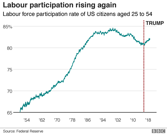
The peak was in the late 1990s, the latter part of a long boom. Since then it has drifted down, though there has been a pick up since 2015.
There can be good or welcome reasons for people not being able to work. They may be unavailable because they are spending more time in full time education.
But there is a view that part of the explanation is the US opioid crisis, the widespread misuse of painkilling drugs.
A study by Professor Alan Krueger of Princeton University, external found that "the opioid crisis and depressed labour force participation are now intertwined in many parts of the United States".
And (again) what about earnings?
Earnings, in real terms, took a long time to recover from the damage inflicted by the recession, so strong growth is widely welcomed.
One measure of average weekly earnings adjusted for rising prices, finally got back to its previous high right at the end of the Obama presidency, and has risen further since.
Even so, it is still only 6% higher than at the turn of century. In the same period US economic activity per person has increased by 21%.
- Published2 November 2018

- Published26 October 2018
- Published24 October 2018
- Published3 November 2020
