Hockney redesigns the Sun's logo
- Published

Here's an exclusive first look at David Hockney's masthead for Friday's edition of the Sun. What do you think?
Newspapers are forever doing cool stunts with their front pages and mastheads.
When he was editor of the Independent (my former parish), Simon Kelner designed several memorable front pages, often with the help of celebrities such as Bono or Tracey Emin.
In my time as editor we had the odd stunt too. They tended to be aimed at promoting charitable causes. Sometimes proceeds from the sale of the paper would go to charity.
For the Sun on Friday, this is more about boosting circulation with a souvenir edition.
For Hockney, it will help to raise awareness of his forthcoming exhibition at Tate Britain, which opens on 9 February.

David Hockney's Sun logo in more detail
For what it's worth, I think the redesigned logo is terrific. It is true to the essence of the original but takes it in a playful and childish (in the best sense of that word) direction.
Hockney was photographed for Friday's edition in his Los Angeles studio by Arthur Edwards, the Sun's celebrated royal photographer.
In my view, newspapers should do front page stunts much more often. They generally have a relationship with their readers that is sufficiently deep and trustful for them to get away with it - and they do have the habit of turning particular editions into souvenirs, which can help boost circulation and increase impact on our culture.
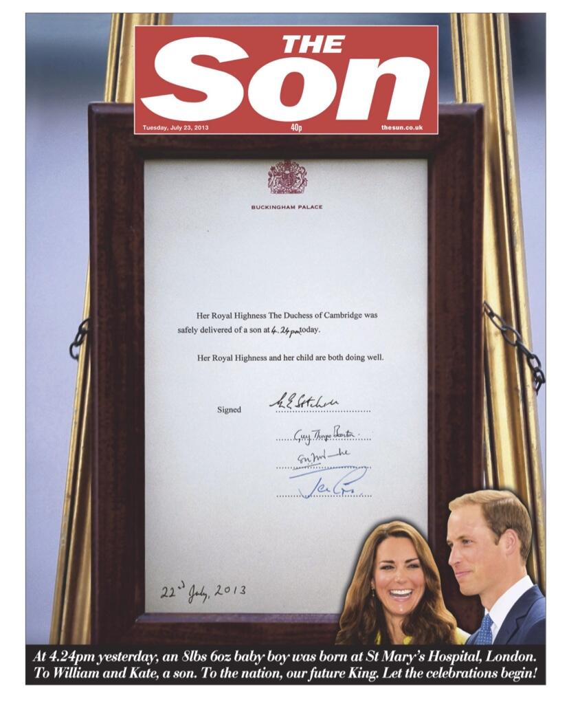
Indeed the Sun's front page on the birth of Prince George was, to my mind, close to genius, external. Of course, editors have to decide how often is too often.