Coronavirus: How many people have died in the UK?
- Published
- comments

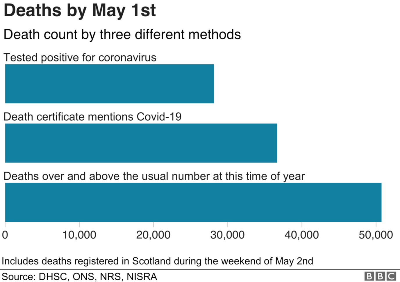
The number of people who have died because of Covid-19 is nearly twice as high as the figure we hear announced every day.
By 1 May, the number of coronavirus deaths announced by the UK government was just over 28,000.
Looking back at death registrations filed then, the figure is higher: just over 36,000 death certificates mentioned Covid-19.
The measure preferred by statisticians, counting all deaths above what would be expected, was even higher: more than 50,000.
Each measure answers different questions.

Why should I not rely on the government's daily figure?
Every day the Department for Health and Social Care (DHSC) reports on the number of coronavirus deaths that have been reported to it across the UK.
This is the figure read out at the daily press conference, and the figure used on most international comparison sites.
But it only includes deaths of people who test positive for coronavirus.
That is fine for scientists who want to monitor patterns in the growth of the epidemic precisely: the rate of increase and time spent at the peak are useful measures, says Prof Sylvia Richardson, who is president-elect of the Royal Statistical Society and based at the University of Cambridge.
But it's a poor measure of the overall death toll because it misses people who never had a test.
When testing was largely limited to hospitals in the UK, those daily figures were missing most deaths in the community.
On top of this, different countries use different definitions.
For example, England excluded deaths outside hospitals from its daily count until a few weeks ago. Scotland, Wales and Northern Ireland didn't.
And Belgium includes suspected cases of coronavirus in its daily count, which makes their figures look unusually high compared to other countries.
That makes it hard to do precise like-for-like comparisons between countries, and scientists warn against reading too much into small absolute differences in these daily statistics.
When every country counts things differently, statisticians turn to a different measure - with a simpler definition.
Looking at all deaths
If you look at all deaths in a country, irrespective of cause, you will capture the deaths missed by lab testing, the misdiagnosed deaths and the deaths caused by the strain the virus puts on our society.
Of course, you'll capture the heart attacks and car accidents that might have happened anyway.
But the total number of deaths registered in a week normally follows a predictable pattern.
It has shot up since the end of March, running far higher than the previous weeks or what would be expected at this time of year. That number has fallen in recent weeks but we're still seeing more deaths than would be expected at this time of year.

And it's these extra or "excess" deaths, the difference between the number we normally see and what we're seeing at the moment, that statisticians use to capture the true toll of the coronavirus.
What does it tell us?
Adding the weekly excess up over the weeks of the epidemic and it comes to just over 50,000 by 1 May, higher than either the number of death registrations that mention Covid-19 or the UK government's daily count.
About three-quarters of this excess can be accounted for by deaths that mention Covid-19 on the death certificate - that total was just over 36,000.

But there are still nearly 14,000 deaths, itself a significant spike, that could be undiagnosed deaths caused directly by the coronavirus or those caused by it indirectly.
That gives a clearer picture of the total cost of the virus.
It can also be a better measure for comparing countries because it doesn't depend on which deaths get counted.
Making comparisons
But it still "needs to be put into perspective" says Prof Richardson.
The UK releases deaths data every week, but that's not the case for all countries.
Some publish data daily, some monthly or quarterly, making it difficult to compare from a similar starting point.
The things that make coronavirus dangerous also differ between countries.
You would expect to see more excess deaths in Italy, where the average age is 47, than in Ireland, where it's 40.
That's all before you get to the actions that governments take to address the virus: how quickly and how hard they lock down or how effectively they test and track and quarantine cases of the virus and how the health system copes.

THE R NUMBER: What it means and why it matters
AIR TRAVELLERS: The new quarantine rules
GLOBAL SPREAD: Tracking the pandemic
RECOVERY: How long does it take to get better?
A SIMPLE GUIDE: What are the symptoms?

Without that extra qualitative information on how these measures are taken "you could miss something pretty obvious" warns Prof Richardson.
"You need to understand the social context of the measures and how they have been implemented."
Just calculating who is worst hit doesn't tell you why they're worst hit.
And it only tells you how countries are doing right now.
We won't have a full picture of who has had the worst epidemic until countries have passed through it.
There will still be deaths caused by second peaks or by the damage done by any lockdowns.
The lack of a single number right now that gives the definitive picture of who's been hardest hit or who is coping best doesn't mean we should avoid all comparisons.
But, says Prof Richardson: "You need several numbers - and some understanding."
- Published5 July 2022

- Published11 May 2020
