England football kit 'should connect people'
- Published
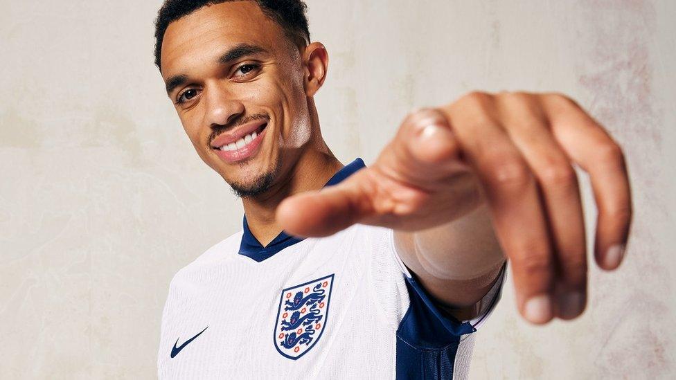
England's new kit, modelled by Trent Alexander-Arnold, is billed as "a modern take on a classic white strip"
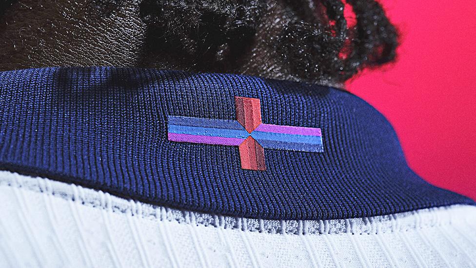
Nike's "playful interpretation" of the St George's Cross on England's new football kit has ignited a row about national identity. Critics have branded the design "disrespectful", among other things, but battles over England shirts have a long and literally colourful back story.
England taking on Brazil at Wembley is one of the great sporting occasions. Two proud footballing nations boasting instantly recognisable kits. But the build-up to their latest clash has been dominated by a tiny cross on the neck of the home team's new shirt.
Manufacturer Nike has changed the cross of St George, with its horizontal bar now a combination of blues and purples rather than the red of the original flag.
Political leaders, including the prime minister and leader of the opposition, have added their voices to a row which has reignited the passions that regularly erupt with each redesign of what is, in essence, a plain white shirt.
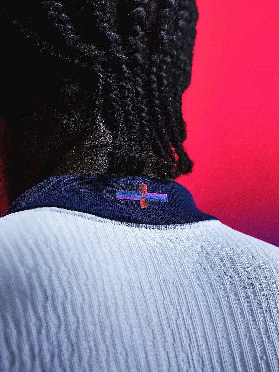
What Nike called a "playful interpretation of the flag of St George" has provoked strong feelings
As the FA pointed out on Friday, "it is not the first time" different colours have been used, with the 2010 jersey being a case in point.
The man behind that design, Peter Saville CBE, says the red cross immediately posed him a challenge.
Earlier this week, Prime Minister Rishi Sunak called the flag a "source of pride" which "we shouldn't mess with", while Labour leader Keir Starmer described it as a unifying symbol that doesn't need changing. The FA said this week that the flag "unites and inspires us".
In 2010, Saville felt markedly different.
He says it had, in his eyes, "come to represent a particular type of bloody-minded person - usually with a degree of what we might call aggressive patriotism".
"That was really a problem [for me]," says the graphic designer behind some of Factory Records' most famous covers in the 1980s.
"You can't ignore the fact it's the national symbol and you realise you're dealing with it straight away, [but] I felt that symbol had become marginalised and when I saw it I didn't relate to it.
"Yet there's nothing wrong with the symbol in any way. It's not even overtly Christian, it's just a shape like a square or a circle."
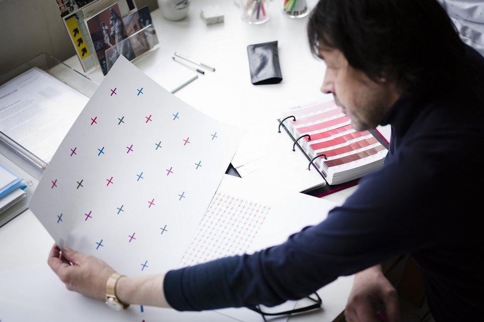
In 2010, Peter Saville's initial intention had been to use large red, blue, green and purple crosses all over the shirt
Given the brief of designing a "colourful white strip" by then-manufacturer Umbro, he likened the job to making a new flag for the nation - "in some ways bigger".
Determined to avoid what he describes as "gratuitous pattern-making", he instead looked to signify "modern England" in a "provocative but positive" manner.
To that end, he hit upon using the shape in an array of colours across the entire shirt.
"If I can put it diplomatically, it's a very colourful nation," he said. "I live in a very colourful society.
"I wanted the shirt to be for everyone because when the national team are playing it is for everyone. No-one should be excluded.
"It's interesting we're talking about it in 2024. I thought it was pretty topical 10 years ago; maybe it's more so now."
'You can't see it'
Viewing the national side's famous white shirt as an "extraordinary canvas", Saville's design process proved intriguing but ultimately dispiriting as, he says, his concept was "neutralised".
"I never knew how it landed with the FA. I remember at one point a little bit of negative feedback attributed to [England's then-manager] Fabio Capello, but whether it was from him or not who knows?
"He didn't want the crosses too big [I was told], so the pattern got smaller and smaller and ended up just on the shoulder panels. You can't see it on a TV screen.
"As an experience it was quite an anti-climax because I felt there would be some discussion or feedback, but almost nobody talked about it. To some extent because almost nobody noticed it."
But among those who did spot it, he says some of the reaction - especially on internet forums - was "eye-opening" and "vitriolic".
Umbro did not respond to a request for comment on Saville's criticisms, but the designer maintains he wanted to capture the pride he feels when he sees the diversity in England teams as they take to the field.
"It's cool when you see the England team. That's kind of what I wanted to celebrate with this and it's just disappointing that it got pushed under the radar."
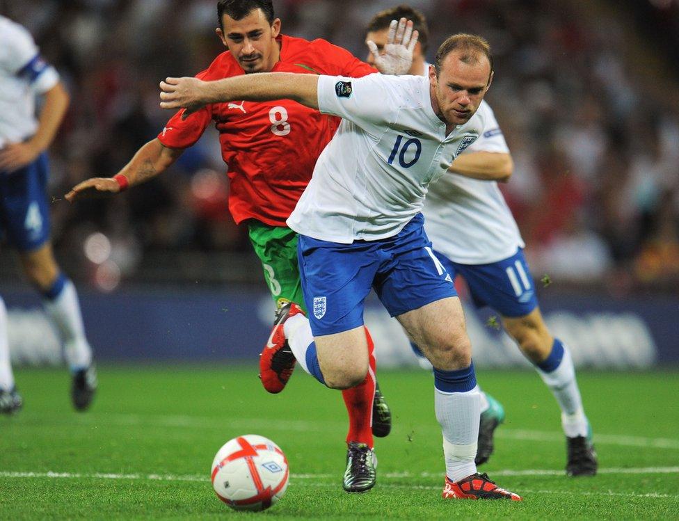
Saville's multicoloured cross concept ended up appearing only on the shirt's shoulder area
The reaction was even stronger this week when Nike released its latest England home and away efforts as part of a reported £400m deal with the FA.
To be be worn by England's men's, women's and para teams, the change kit sees purple used for the first time, while the home shirt is marketed as "a modern take on a classic white strip".
The use of navy, light blue and purple alongside red in the cross on the back of the shirt's collar was described by Nike as "a playful interpretation" and an attempt to "unite and inspire".
But, as with Saville's design, critics have branded it "disrespectful" and an example of "virtue signalling".
The FA has defended the kit and said on Friday: "We are very proud of the red and white St George's cross - the England flag. We understand what it means to our fans, and how it unites and inspires, and it will be displayed prominently at Wembley tomorrow - as it always is - when England play Brazil."
Nike was unable put anyone forward for interview despite requests in the months leading up to the new kit's release.
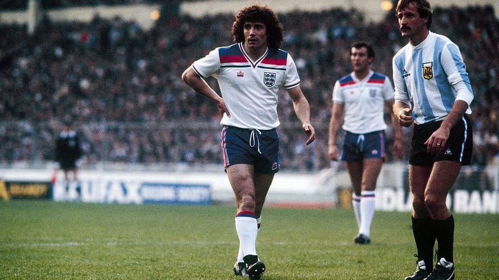
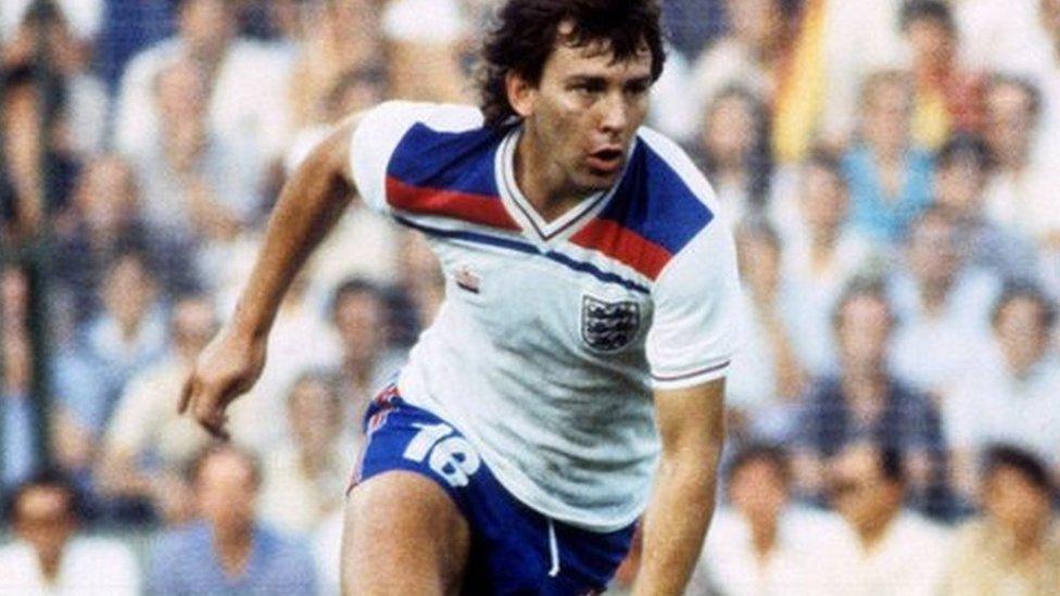
England's early 80s jersey had more than a passing nod to the union jack
Disagreements over imagery and flags on England shirts stretch back more than 40 years to when Leicestershire-based Admiral broke with a century of tradition to launch a kit with large, distinctive red, white and blue bands below the shoulders.
As the side took on an Argentina team featuring a teenage Maradona at Wembley in 1980, BBC commentator Barry Davies said dryly: "England tonight unveiling their new strip. Though quite why the England shirt should have the colours of the union jack remains a mystery."
Initially derided - and with Nottingham Forest manager Brian Clough comparing it to "one of my mother's old pinnies" - it is now widely seen as one of the team's greatest kits.
But with the St George's flag becoming more prominent among supporters in the stands from the mid-90s onwards, it is the red cross - or elements of it - which have featured on jerseys from the turn of the century onwards.
While some have been relatively subtle, Rob Warner, Umbro's former creative director, says the firm's 2012 home kit which ditched the use of blue completely was, ironically, just as divisive.
"As I recall it got more flak than the one before because people said these aren't the traditional colours of the England kit."
With strict regulations in place around the use of national symbols in football kits, he says Umbro were "really clever in how they integrated it", often as shoulder detailing or stripes.
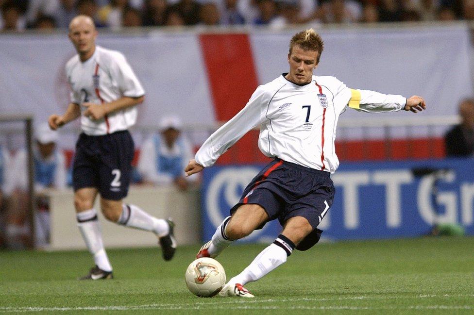
Launched in 2001, this Umbro kit was the first of several in which the firm began to reference the St George's Cross more strongly
But why has the team's latest release caused such an uproar?
Warner, who co-founded Spark Design Academy for aspiring kit creators, believes the debate is in part affected by the nature of social media and a wider discourse present in the country; one that he sees as less confident.
"It's not necessarily something I relate to, but I can see it," he says.
"The country feels like a completely different place to how it did when I started making kits at Umbro in 2010 in the lead up to the London Olympics.
"The flag on the collar is relatively insignificant. It's not like the St George's Cross has always been on the shirt and it's not like a multicoloured one is going to be on people's passports or flown in front of Buckingham Palace."
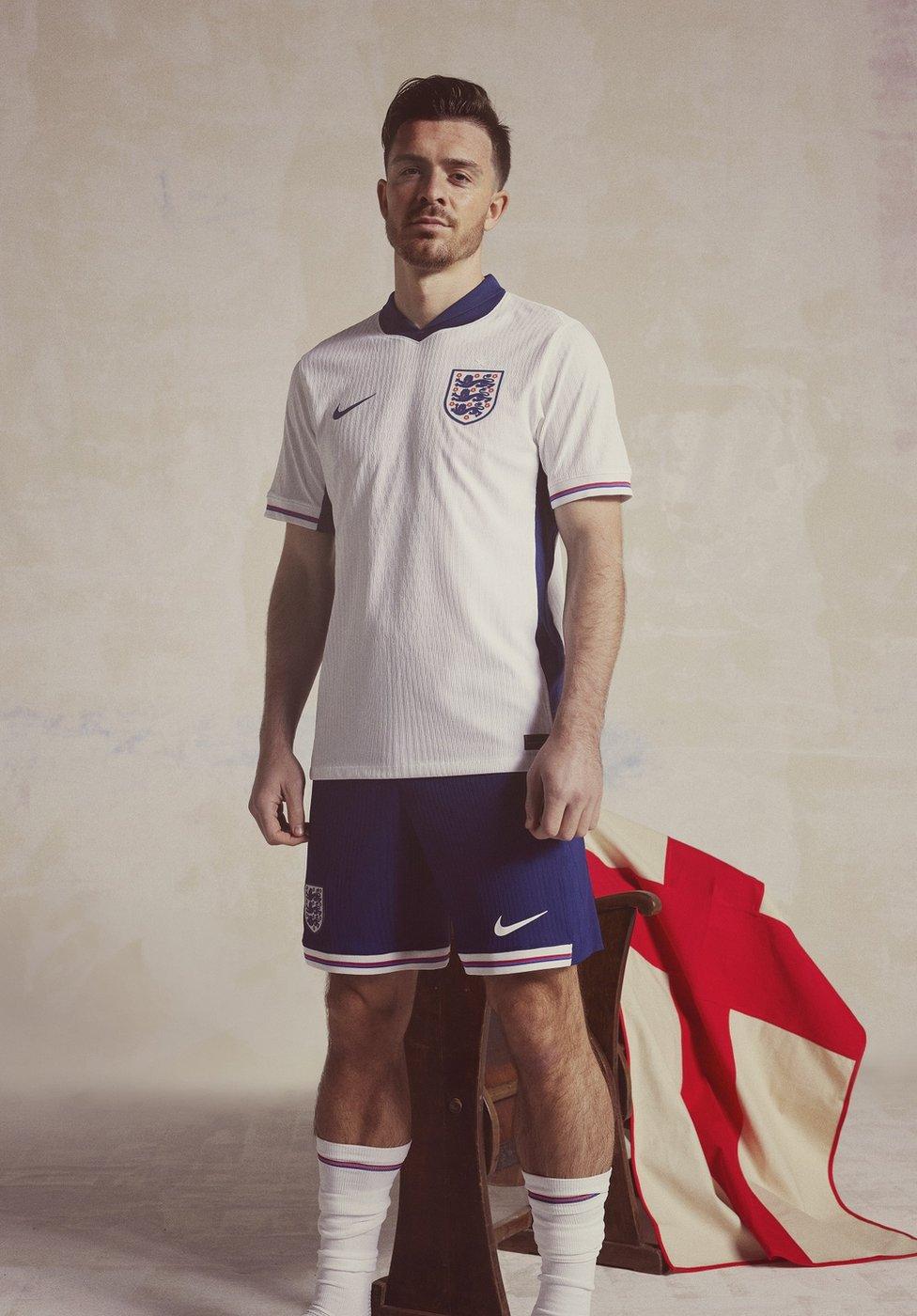
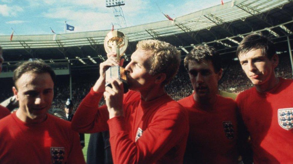
Nike says the red, blue and purple trim on the new kit "takes its cues from the training gear worn by England's 1966 heroes"
But, as Admiral and Umbro discovered, these storms pre-date social media and exist in a world where inference and implication can differ wildly.
Despite the criticism he faced, Saville remains adamant the national side's kit should be "more than a design act".
"Some of them are really awful," he says disdainfully of previous efforts. "One or two you think 'it's ok' or 'it's so wrong it's right', but a lot of them are just ugly.
"But the shirt is engaged with by the public on a mass scale.
"The national team's football kit is something people do pay attention to and there is the potential for it to be about something that connects people."
Related topics
- Published22 March 2024
- Published26 April 2023
- Published13 May 2020
