Stirling Prize: University of Limerick Medical School
- Published
Built on a tight budget, Stirling Prize judges say the new development at the University of Limerick "punches well above its weight" in terms of design.
Prof Michael Larvin is in love. From his office on the top floor of the new Limerick Medical School, he gazes out at the grey limestone and the rolling countryside. Light floods his office and the dissected plastic bodies downstairs fit perfectly into their well-organised nooks.
"I'm a hard-nosed surgeon, I know nothing about architecture and have really never had any interest in it - but I'm having a love affair with this building," he says, misty-eyed.
"For the first time in my career I look forward to coming in in the morning and walking through the building and up to my office. Coming back from leave recently, I realised I had missed the building."
The new medical school, designed by Dublin-based Grafton Architects, is part of a wider redevelopment at the university.
Also in the running are Astley Castle, Bishop Edward King Chapel, Giant's Causeway Visitor Centre, Newhall Be and Park Hill Phase 1.
Grafton also designed three blocks of student housing, a bus stop and a public square, which sit together to create a space of calm order within what is otherwise widely regarded as "a hotchpotch university campus of disappointing sheds" - the verdict of the Guardian's art and design critic Oliver Wainwright, external.
All built for a budget of 13.25m euros (about £11m) the whole project ties together to form the Stirling Prize entry.
The judges described the buildings as "heroic" for their ability to appear strong and spacious, whilst being modest in size and lean in budget.
Larvin, head of the medical school, started at Limerick last year. "In my experience you get what you pay for, but here we seem to have been given so much more," he says.
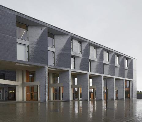
The limestone exterior of the teaching facilities...
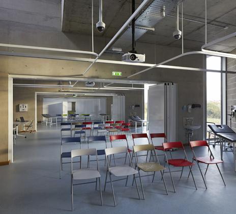
... and inside a clinical skills laboratory
The success of the project is due in some part to the Irish economy. The recession means contractors are working for much less money than they would be elsewhere.
But Grafton also has years of experience building schools for the Irish Department of Education.
"As a new practice we sought out school building projects, it was our bread pudding for many years," says Shelley McNamara, a director at Grafton. "It taught us how to work on lean budgets - it takes an awful lot of time and an awful lot of care and commitment."
The economy comes in the planning of the buildings. They are rectangular and compact. Money has been saved on complex structural engineering of difficult shapes and curves. But large windows mean light fills the spaces, making them feel large.
''The design is clearly a product of architects, and the client behind them," says John Hicks, from architectural consultancy provider Aecom. "Delivery of a complex design amid a fierce Irish recession no doubt played a significant part in delivering value at a lower price.''
As a medical school Limerick is forward-thinking.
Students must have a prior degree - anything ranging from art to philosophy - and the learning is problem based. Tutors are there to guide, but it is the students who must discover the answers for themselves through discussion and curiosity.
It is the theory that has inspired the building. It is a space made for loitering. A wide staircase rises through the centre, inviting people to ignore the lifts, which are more concealed. "We want people to stop and chat on the stairs," says McNamara.
High windows carve light that floods through the large open atrium and on to desk and study spaces that lead directly from it.
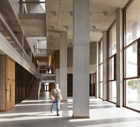
The interior of the central space with its inviting staircase...
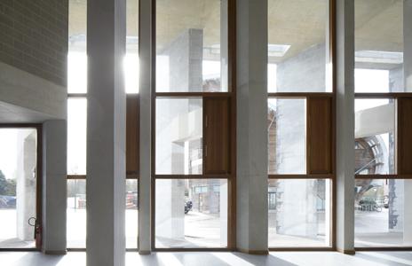
... and the view out the windows
The average age of a first year student is 29. "They are grown-ups with a grown-up building," says Larvin.
It also means that the adjacent student housing has to accommodate families if required. Every room has a double bed and the blocks are designed to look like large houses rather than the nondescript hotels that so many schemes can resemble.
In Building Design magazine's 2013 Carbuncle Cup - a competition for the worst building of the past year - student halls came in first and second.
Beating Oxford University's Castle Mill development to first place was University College London's accommodation at Caledonian Rd, north London. Built behind the period facade of an 1874 warehouse, the modern glass building sits 2m back and the windows do not line up.
At Limerick, the bedrooms were planned before the buildings even took shape. Thought was given to where the desks would go to avoid glare on the computer screen and how students could work with an open window while avoiding the irritation of having papers blown around by gusts of wind. And a sturdy shelf fit for hefty medical books was incorporated.
"We gave the rooms an awful lot of thought," says McNamara. "We discussed the fabrics, the wardrobe, the beds, the shelf - we built little models of them."
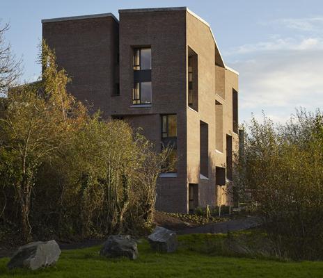
Postgraduates can live in two- and four-bedroom apartments on site...
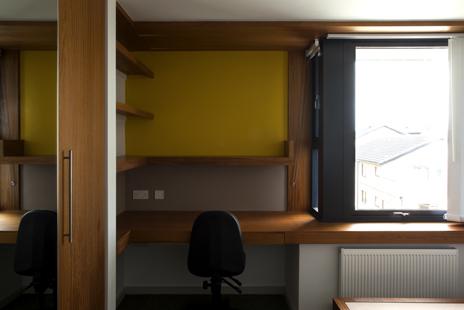
... in which each bedroom doubles as a study
The accommodation blocks each have a large front door and the bedroom windows are clustered, meaning the facade has fewer, larger openings rather than lots of smaller ones - McNamara says she wanted it to feel like a "big generous house".
"The usual attitude seems to be that because students are only there for a short time they are somehow undeserving," says Ellis Woodman, executive editor of Building Design magazine.
"A lot of student accommodation has that stack 'em high mentality because it can be very hard to organise a facade that needs so many windows."
The accommodation buildings are brick-built (unlike the medical school which is made of locally quarried limestone) with angled, deeply recessed windows.
But it is the attitude that a comfortable home life and beautiful, considered study areas can aide learning that is foremost in this project.
"Students tell me they find it easier to learn now," says Larvin.
Evolution of the design

An early sketch of the site, with the River Shannon to the south and existing buildings to the south and north-east, with pencil shading to indicate a possible shape for the new piazza
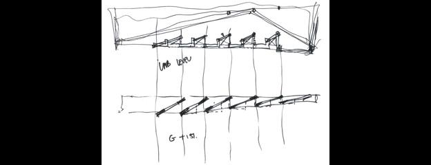
A study of the upper and lower levels of the medical school colonnade, exploring its geometry and the potential for shading at ground level and "bay windows" for laboratories on the upper floors
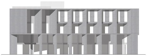
A study for the folded walls of the teaching block, designed to offer protection from the elements - made of limestone in reference to the geology of County Clare, in which this side of the campus is located
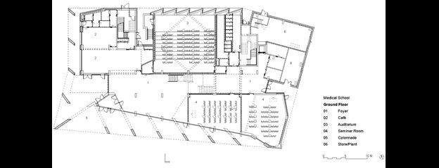
A cafe and auditorium are on the first floor of the teaching block, with anatomy and clinical skills rooms, offices and a roof courtyard on the floors above
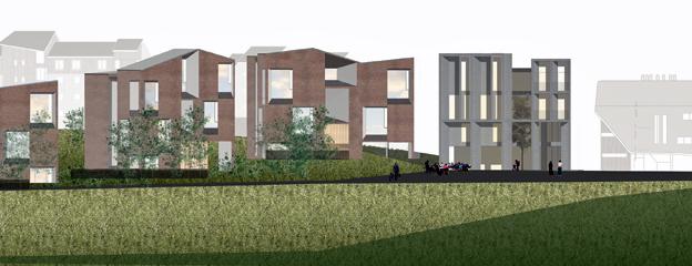
The new buildings join a sports pavilion, the Irish World Academy of Music and Dance and a health sciences building on the expanded campus on the banks of the River Shannon
Video by: John Galliver
You can follow the Magazine on Twitter, external and on Facebook, external